Chapter 11 - Designing Web Sites
This chapter shifts focus from individual page elements to the broader process of planning and designing an effective website. You'll learn how to plan site structure to organize content logically and support easy navigation, along with core design principles that guide effective visual communication. The chapter covers how to choose colors and typography that create a cohesive, readable, and visually appealing site. The chapter also addresses accessibility, ensuring sites are usable by people of all abilities, before moving into the practical side of site development. It wraps up with mobile development, covering how to design and build sites that work well across devices of different sizes.
11.1 - Site Structure
Site Structure
Whether you are developing Web pages for personal use or you become involved in commercial Web ventures the point arrives where you need to become conscious of Web site design. You will need to bring organization and logic to the proliferation of pages. Site design is not an exacting science; still, there are organizing principles and design strategies that can help you produce a more manageable site that assists your visitors in navigating its pages to find the information they desire or that you intend.
Web Site Goals - TOP
It should go without saying, but a Web site should have a purpose. There are few Web activities as frustrating as navigating a site that is a hodge-podge a pages with no apparent focus. You probably have visited sites that contain one very long Web page intermixed with content and links that seemingly have little relationship to one another; or you have encountered sites at the other extreme, with tiny content pages within a labyrinth of links that leave you isolated at its farthest reaches, staring at irrelevant content, and with no apparent way to get back to where you came from.
Both of these extremes show a lack of foresight and planning. The site designer probably had no notion of its intent other than to create a Web presence. Therefore, the site evolved in helter-skelter fashion, creating an unpleasant navigational journal for visitors.
A key factor in site design, then, is to have a clear idea of its purpose. That purpose can be modest or elaborate. In either case, you should be able to frame its purpose verbally or in writing. Even for a personal Web site it is helpful to produce a statement of intent. Consider, for instance, the following statements of purpose:
- To present a personal resume of education, experience, and work portfolio for reference by prospective employers.
- To create a family Web site to summarize current activities of family members.
- To create a Web site to document vacation travels.
- To maintain a geneology of the family.
- To manage classwork related to my Web development.
Each of these statements brings focus to the site while permitting it to grow within reasonable bounds. You avoid the risk of creating a single site that tries to incorporate all aspects of your personal life in a conglomeration of unrelated pages and links.
If you are, or become, a professional Web developer, then the statement of purpose is usually easier to define. It often derives from an organization's vision statement or mission statement, the guiding purpose for the organization. In a commercial enterprise, for example, common Web site purposes include
- To market and sell the primary product line of the company.
- To provide technical support services to customers.
- To increase public awareness of the company and its products.
- To lower business costs through electronic transactions with suppliers and distributors.
- To enhance in-house communications of company directions and activities.
Like the personal goals described above, these objectives set the boundaries of the site. It becomes clearer whether or not particular content or links contribute to the purpose.
Web Site Content - TOP
Being able to define the purpose of a Web site also helps to determine the type of content to be presented and its organization. The process of structuring the content of a Web site is not unlike the process of designing a database. You can, in fact, think of a Web site as a database of information composed of pages of content arranged by their linked relationships. In database parlance, your task is to create "entity-relationship" models of the information to be presented; in Web parlance the task is to create "content-link" models of the information.
A good statement of purpose for your Web site will help you determine items of content appropriate to the site. In the same way that database designers identify the major entities -- the objects of informational interest -- to be included in a database, you need to identify the major objects of informational interest in your Web site. Taking the example above of a personal site to manage classwork for a course you are taking, the major items of interest might be
- textbook reading summaries
- lecture notes
- assignment solutions
- projects
- grades
- calendar
Although you may think of other informational entities related to a class, this list presents a good start in breaking down the purpose of the site into those content areas related to its purpose -- and only those areas related to its purpose. At this point it is not necessary to know all the informational details about your site. It is important only to identify the major topics around which the site will be developed. Analogous to writing a report, you need to outline your topic to determine the main headings that will be expanded later into paragraphs, sentences, and words.
Web Site Structure - TOP
The topics, or informational entities, that comprise a Web site are logically related in some fashion. At least they should be related since they are derived from a common purpose. Further, these topics eventually need to be physically packaged as Web pages with links between them; plus, the physical arrangement of pages and links needs to parallel their logical relationships.
There are three primary ways in which to organize topics and their container Web pages -- hierarchical, linear, and mixed. Any of these structures, or their combinations, are devised for your content to become Web accessible.
Hierarchical Structure
A hierarchical, or tree, structure of topics is the most common arrangement of Web pages. A tree structure arranges topics from general to specific -- or from summary to detail -- from the top to the bottom of the hierarchy.
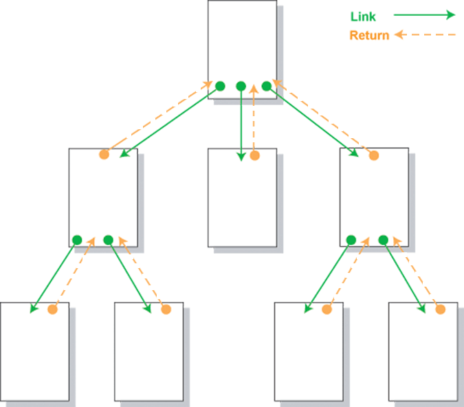
Figure 11-1. Hierarchical arrangement of Web pages.
The top page in the hierarch is usually the "home" page providing an overview of the site, with links to the main topical subdivisions. Each of these subdivisions, in turn, link to pages containing more detail about the topic. Navigation, then, tends to be down the hierarchy with returns links up the hierarchy that retrace the same downward path. There can be occasional crosslinks between topics at the same level of the tree, but not usually. This structure brings logical organization to a site and permits visitors to find information in a rational top-down fashion.
Linear Structure
A linear, or sequential, structure of Web pages is most appropriate where the topical information needs to be accessed in a particular order.
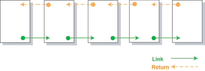
Figure 11-2. Linear arrangement of Web pages.
In presenting a story, a time-line of events, or the steps in a process, a linear sequence of Web pages probably works best. The links are from one page to the next with return links retracing the sequence. If necessary, additional links can be made between the opening page and each of the detail pages for jumping into and out of the sequence. Still, the basic structure is linear.
Mixed Structure
Most likely, a Web site is not exclusively hierarchical or linear, although one of the structures dominates. It is common to find an overall hierarchical structure with linear sequences of pages at the detail level.
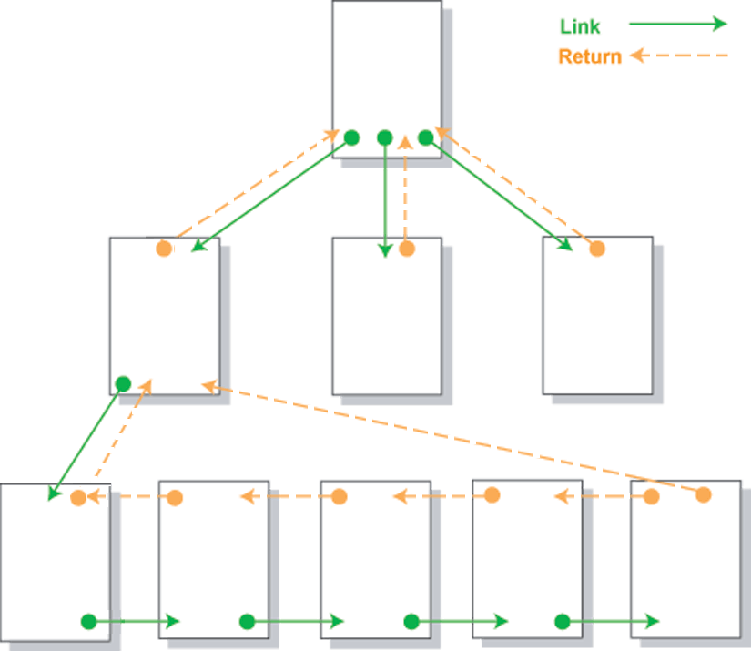
Figure 11-3. Mixed arrangement of Web pages.
Random Structure
A Web site that offers no clear path through the site is said to have a random structure. A random structure is not as common as the hierarchical, linear, or mixed structures. This type of site structure is not recommended for commerical Web sites.
The above organizational structures are not meant to imply that Web content must be shoe-horned into these arrangements. They are presented as conceptual schemes only; you will need to determine the best arrangement of pages for presenting your content in an organized fashion. By keeping them in mind, however, you are forced to think about how the information itself is structured and to devise compatible linkage structures for offering it in the clearest and most logically consistent manner.
Web Site Navigation - TOP
The following are considered best practices when creating Web site navigation:
- Easy to follow navigation menus
- Short Pages
- Table of Contents
- Site Maps
TOP | NEXT: Design Principles
11.2 - Design Principles
Design Principles
As you develop the structural layout of your Web site you also begin packaging its content as individual Web pages with specified links between them. A common way of modeling the content and links between Web pages is called storyboarding. This technique visually maps Web content to Web pages and describes the links that implement the logical relationships between topics. Storyboarding forces you to flesh out your topics and refine their relationships.
Content Packaging - TOP
Consider the following illustration of a portion of the structure of this HTML tutorial. This diagram represents the layout of the first section of tutorials with topics identified along with menu links to the associated pages.
Figure 11-4. Structure of portion of HTML tutorial.
Since the pages appear inside frames there is no need for return links. The menu is always accessible for direct linkage to any page. Although additional linear links between pages would be an option, these extra links would be redundant.
Design Drawings
You shouldn't pay a lot of attention to the format and symbols used in the high-level storyboard in Figure 12-4. There are no formal graphical standards for storyboarding. You might, in fact, draw your layout in crayon on the back of a grocery bag and accomplish your purpose just as well. Sometimes professional developers become overly committed to using formal graphical tools to make design drawings and lose sight of their purpose, which is to construct mental models, or abstractions, of designs in order to manipulate them intellectually. The purpose is not to produce pretty drawings. Pick the symbols and techniques that work best for you. Of course, if you work professionally as a site designer, there may be in-house architectural standards for design drawings. However, you can always reproduce your conceptual drawings as design documentations when that time comes.
With this structural layout in hand the next step is to elaborate the content appearing on each page. One way to do this is with a text outline of topics, subtopics, and "talking points," much like you would do for a written report. For instance, the first page of this tutorial can be outlined as follows.
Internet History and Usage
- Introduction
- ARPANET
- Origins of ARPA
- Purposes of ARPANET
- Distributed packet switching (Leonard Kleinrock)
- ARPA network growth
- TCP/IP
- NSFNET
- Origins and purpose
- Defunding implications
- Internet definition
- WWW
- Hypertext concept (Ted Nelson)
- World Wide Web beginnings (Tim Berners-Lee)
- Browser development
- Technical Convergence
- Protocols
- Formatting language
- Internet Usage Statistics
- Country ranking by usage
- Regional ranking
- Internet Technologies
- Connection speeds
- Browser version
- Screen resolution
- Color depth
Figure 11-5. Outline of first page of HTML tutorial.
Since a Web page can be as much a visual experience as a textual one, some Web page authors utilize graphical storyboarding in addition to text outlines to indicate page content. This technique roughs out the main formatting characteristics of the page as well as organizes the content. The following illustration is one way to graphically characterize the first portion of the opening page of this tutorial.
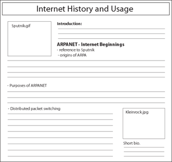
Figure 11-6. Storyboard for a Web page.
Although it is shown here as a graphic image, the storyboard for a page can be a hand drawing or an HTML layout of the page. You might wish to use WYSIWYG editors such as FrontPage or Dreamweaver to produce "quick and dirty" layouts. The purpose is not to generate specific content but to indicate some beginning page design thoughts. You might wish to note the main headings that appear on the page, any graphics or tables that need to be included, a rough estimate of the amount of space to be devoted to different topics, and any links to internal pages or external sites.
You should, though, at this point begin to firm up the basic, common design that will be used across all pages. In order to visually and operationally tie your pages together with a common "look and feel" it is appropriate to settle on design considerations such as page margins and paragraph styles, color schemes, heading sizes and colors, text fonts and sizes, link formats, and other general design characteristics that will be common to your pages.
One of the advantages of using HTML editors at this point is that you can experiment with different designs. As you settle these overall design issues you also can begin constructing the Cascading Style Sheets that will be applied to your pages. Use a linked style sheet for overall design and formatting with embedded or in-line style sheets to alter or enhance styles for particular pages.
Design Issues - TOP
The following are other design issues that you should keep in mind when storyboarding and developing a Web site:
- Repetition
- Contrast
- Proximity
- Alignment
- Load Time
- Horizontal Scrolling
- White Space
- Screen Resolution
Page Sizes - TOP
One major design issue relates to the appropriate size for a Web page. The width of the page needs to take into account the width of the browser window which, in turn, is determined by the user's screen resolution. Standard horizontal and vertical screen resolutions are 800x600, 1024x768, and 1280x1024 pixels.
Currently, 1366x768 is the most common screen resolution. Unless you have reason to do otherwise -- knowing, for example, that your population of visitors uses other resolutions -- then it makes sense to target your pages to 1366x768 screens. In short it is good practice to optimize Web pages for 1366x768, but use a liquid layout that stretches well for any resolution, from 800x600 to 1280x1024.
The browser window, though, contains borders, menu bars, status bars, scroll bars, and other trappings that reduce the amount of space within which a Web page is displayed. The following table gives the dimensions of the effective sizes of browser display windows under different screen resolutions.
| Screen Resolution | Browser Window Size |
| 800x600 | 778x430 |
| 1024x768 | 1004x598 |
| 1200x1024 | 1259x553 or more |
Figure 11-7. Monitor creen resolutions and browser window sizes.
Horizontal Sizing
The browser word-wraps free-flowing text so that it always stays within page margins. Other page elements, however -- such as graphics or text containers that are of fixed sizes -- may not fit within these boundaries. The problem that is caused is a horizontal scroll bar on the browser window, something that should be avoided on all Web pages. There are few things more irritating, or unproductive for that matter, than having to scroll back and forth to view Web page content.
The following browser window illustrates the problem and the solution. The first shaded division has a width setting of 760 pixels, proper for a screen resolution of 800 x 600. However, when displayed in a browser on a 640 x 480 screen, the division extends beyond the page margin and introduces a horizontal scroll bar to view its entire width.
Page Widths - TOP
Here is a text paragraph. By default the browser word wraps text to keep it within the boundaries of the browser window. Other page elements, however, can extend beyond the margins of the page.
Page Widths
"Here is a text paragraph. By default the browser word wraps text to keep it within the boundaries of the browser window. Other page elements, however, can extend beyond the margins of the page."
<div style="width:760px; height:75px"</div><div style="width:100%; height:60pxpx"</div>Figure 12-8. Managing page widths.
The best solution for sizing text blocks is to use a percentage measure as is done in the second division. The width shown here is 100%. Therefore, the division will extend only to the width of the page margins irrespective of screen resolution.
When displaying graphics, horizontal sizing is a little more problematic since adjusting widths may distort the picture or cause pixelization when forced to widths larger than its original size. It is always best to size the picture itself rather than adjusting it with style settings. Pick a size that fits within a 600 x 400 window to ensure that it fits properly within any other browser window.
Vertical Sizing
Obviously, there's not a lot that can be done about the vertical sizes of Web pages. They expand to encompass the amount of content. Of course, you can always subdivide your content into separate, shorter pages with links between them. The trade-off becomes one of vertical scrolling versus link clicking, neither of which has particular priority for user friendliness.
Design Mythologies
You may encounter page design guidelines that recommend nonscrolling pages in all cases -- that all pages should fit within the browser window without even vertical scrolling. Not only does this guideline make it difficult for the designer to find physical page breaks where none my logically exist, it introduces excessive clicking and linking that can disrupt the reader's flow of thought. It is best never to let physical containers dictate the flow of their content. Use reasoned judgement to determine how best to package your information.
Page Organization - TOP
Recognize that the reader's first impression is produced by what is seen at the top of the page when it first loads. In newspaper parlance this is the page area "above the fold" which provides the first clues about page content. This is the most important real estate on the page when it comes to serving the browsing needs of visitors.
Visitors arrive at a Web page looking for information. The initial page load should either provide that information or quickly direct visitors to it. A typical design for the top of each page includes,
- A common identity -- a banner, logo, and/or headings -- to tie the page visually to other pages of the site.
- The most important information on the page or a summary, possibly with links down-page to sections of detail information.
- A common menu of links to other major sections of the site.
- A menu of links pertinent to the content of the page.
Readers should know at first glance whether this page contains the information they are looking for. If so, they can scroll down to find it; if not, they can immediately navigate to other pages.
Page Layout Techniques - TOP
Fixed or Absolute Design
A fixed design utilizes CSS to configure a fixed-width block level element or page wrapper to format the page. A fixed design page is aligned with the left margin and the width of the page is set using a fixed unit such as pixels. The right hand side of the browser window will often contain empty or white space. When using a fixed page layout, it is possible to configure a page to look best at a certain screen resolution such as 1024 by 768. A disadvantage of the fixed design is that a page is designed to be optimized for a specific screen resolution. Viewing the page at other resolutions will include large amounts of white space on the right hand side of the browser window and horizontal scrolling will occur at lower screen resolutions.
A fixed layout is often preferred if you want tighter control over the appearance of your pages. Pages that contain lots of graphic images or other elements that are absolutely positioned, tend to benefit from a fixed page layout. If a fixed layout is used, the fixed dimensions should be set at reasonable levels to accomodate the most common screen resolution settings used by page visitors. This will help to prevent horizontal scrolling and a layout bordered by a sea of white space.
Fixed Width Page optimized for 800 X 600 screen resolution. Height and Width of the page are fixed and will not change to accomodate other screen resolutions. When viewed at higher screen resolutions, large amounts of white space appear on the right side of the browser window.
Width: 778 px
Height: 430 px
A wrapper division is often used to set the page dimensions
    #wrapper {width:778px;height:430px}

    <div id="wrapper">

    Page content goes here

    </div>
Liquid or Relative Design
A liquid design results in a web page layout that takes up 100% (or other percentage values) of the browser window regardless of the user's screen resolution. Unlike the fixed design, a liquid design uses percentages or a relative unit of measure to set the page width. With the liquid design there is no blank margin on the left or right side. A site that uses a liquid layout will expand and contract to fit the size of the browser window. A Web page with a width of 80% will always span 80% of the browser window regardless of the screen resolution.
Liquid Width Page. The Width of the page is set to 100% and will expand and contract to accomodate all screen resolutions. The Height of the container will expand to accomodate its contents. Otherwise, an absolute Height value can be set.
Width: 100%
A wrapper division is often used to set the page dimensions
    #wrapper {width:100%;height:430px}

    <div id="wrapper"

    Page content goes here

    </div>
Jello Design
A jello design involves centering all content on the page. This design can be configured using a fixed width or liquid width. Regardless of the screen resolution, the content is always centered on the page. This is accomplished by using the "margin-left" and "margin-right" CSS properties.
Jello Design. The Width of the page is set to 75%. The container or wrapper is centered using the CSS margin-left and margin-right properties. Setting these properties to "auto" will center the wrapper in the browser window. The Height of the container will expand to accomodate its contents. Otherwise, an absolute Height value can be set.
Width: 75%
A wrapper division is often used to set the page dimensions
    #wrapper {width:75%;height:430px;margin-left:auto;margin-right:auto}

    <div id="wrapper">

    Page content goes here

    </div>
When designing a page, there is no simple answer to which layout technique will work best. Designing for different resolutions can sometimes seem like you are standing between a rock and a hard place. The use of one method over the other will not solve all your problems. Regardless of which technique is used, it is important to always test your pages under a reasonably high resolution and a low resolution to see how it appears. In most cases, you will have to live with some imperfections when your site is viewed under extreme settings.
TOP | NEXT: Choosing Colors
11.3 - Choosing Colors
Page Colors
Colors draw attention to a Web page. They focus interest on page elements and help to highlight important information. Colors can also be distractive. Improperly used they can draw attention to themselves and away from central page content. One of the most important choices you make as a page designer, then, is a color scheme to complement or enhance information appearing on a Web page.
Color Wheel - TOP
A color wheel is a chart that shows how colors are related to make it easier to choose harmonious color combinations that attract attention to page content. The color wheel is divided into three categories of colors.
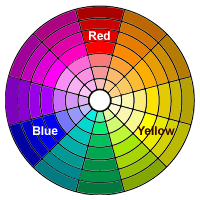 Figure 11-9. Color wheel.
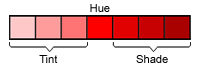 Figure 11-10. Tints and shades.
The primary colors are red, yellow, and blue. These are the foundation colors from which all other colors derive. They are called primary colors because no other colors can be mixed to create these colors. They are evenly spaced around the color wheel.
Secondary colors are produced by combining any two of the primary colors. The three secondary colors are orange (red + yellow), green (yellow + blue), and violet (red + blue).
Tertiary colors are produced by mixing a primary color and an adjacent secondary color. The six tertiary colors are red-orange, red-violet, yellow-green, yellow-orange, blue-green, and blue-violet.
The purest value of a color is its hue. A color's tint is a lighter value of the hue made by adding white; a color's shade is a darker value of the hue made by adding black.
Color Selection - TOP
When choosing colors for a website, it is best to select only a few colors. You do not want to overpower and detract from the information contained on the page; you want to complement or emphasize it. Generally, you will pick a dominant color along with other colors that are analogous to it or that contrast with it. There are standard color-matching schemes that can be followed in picking these colors. Additionally, tools like Coolors, allow you to quickly generate color palettes using integrated color theory.
Other useful color scheme tools include
Monochromatic
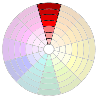
Figure 11-11. Monocromatic colors.
A monochromatic color scheme uses a single hue with various tints and shades for contrast. Normally you will pick darker colors for text presentation and lighter colors for backgrounds. The various tints and shadings range from bold to subtle, and you need to choose the combination that works well for the message you are trying to get across and the mood you are trying to set.
Monochromatic Table Colors
Section Hue Hex Value RGB Value Header Red (dark) #CC6666 204, 102, 102 Column Red (light) #FAC8C8 250, 200, 200 Background Red (light) #F6E1E1 246, 225, 225 Figure 11-12. Examples of monocromatic colors.
Analogous
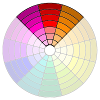
Figure 11-13. Analogous colors.
An analogous color scheme uses adjacent hues and their tints and shadings. All of the colors share a common hue, for example, red-violet, red, and red-orange. The presentation and feeling is similar to a monochromatic scheme with a larger assortment of hues from which to choose.
Analogous Table Colors
Section Hue Hex Value RGB Value Header Red-Violet (dark) #C4028F 196, 2, 143 Column Red-Orange (light) #FFAD5B 255, 173, 91 Background Red (light) #FFCCCC 255, 204, 204 Figure 11-14. Examples of analogous colors.
Complementary
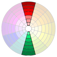
Figure 11-15. Complementary colors.
A complementary color scheme uses a hue on the opposite side of the color wheel from the dominant color. This color combination provides the greatest contrast and makes both colors more intense and brighter than when they are used alone.
Complementary Table Colors
Section Hue Hex Value RGB Value Header Red (dark) #C4028F 196, 2, 143 Column Green (dark) #02D0BF 2, 208, 191 Background Green (light) #D0F2E0 208, 242, 224 Figure 11-16. Examples of complementary colors.
Split-Complementary
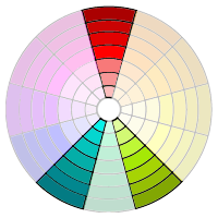
Figure 11-17. Split-complementary colors.
A split-complementary color scheme uses a hue along with two colors that are adjacent to its complement. For example, if the dominant color is red, then split-complementary hues are yellow-green and blue-green.
Split-Complementary Table Colors
Section Hue Hex Value RGB Value Header Red (light) #FF6666 255, 102, 102 Column Blue-Green (dark) #25EADA 37, 234, 218 Background Yellow-Green (light) #E6FBC6 230, 251, 198 Figure 11-18. Examples of split-complementary colors.
Triadic
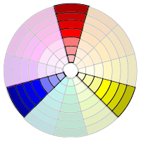
Figure 11-19. Triadic colors.
A triadic color scheme uses three hues that are evenly spaced from each other on the color wheel. For example, if the dominant color is red, then blue and yellow hues are the triadic complements. Like the complementary color scheme, this one also emphasizes the colors through their contrasts.
Triadic Table Colors
Section Hue Hex Value RGB Value Header Red (light) #FF7575 255, 117, 117 Column Blue (light) #7676FB 118, 118, 153 Background Yellow #FFFF99 255, 255, 153 Figure 11-20. Examples of triadic colors.
Achromatic
Although they do not appear in the color wheel, don't forget about black, white, and the range of gray tints that can be applied to highlight or emphasize page content. These achromatic tones can offer high contrast or subtle shading.
Achromatic Table Colors
Section Hue Hex Value RGB Value Header 50% Gray #818181 255, 117, 117 Column 25% Gray #C1C1C1 193, 193, 193 Background 5% Gray #F6F6F6 246, 256, 256 Figure 11-21. Examples of achromatic colors.
Selecting a Color Palette - TOP
A half-dozen or so colors is normally a good starting point for building a palette of analogous or complementary colors for a page color scheme. In some cases, you pick the colors based on preferences or existing standards.


 United States Grand Prix
Indianapolis - 2003
Figure 11-22. Selecting a triadic color scheme.
When working with photographs, a good starting point is to select colors based on those appearing in the picture. In the accompanying illustration, a palette of five colors, plus black and white, have been chosen from the picture. Various muted shades of red and blue—part of the triadic color scheme—produce the subtle contrast needed between text and background. The intent is to recede the text in order to bring the picture to attention. These colors were extracted from the photograph using the Photoshop eyedropper tool.
As a general rule, it is probably best to stay away from pure hues as is used in the second illustration. Pure colors tend to be garish, with high contrast that can confuse the eye as to the point of focus. In this case, the boldness of the text tends to draw attention away from the picture and towards the upper and lower portions of the illustration. If that is the look you are going for, then fine, although there are better ways to emphasize text without high-contrast colors.

 United States Grand Prix
Indianapolis - 2003
Figure 11-23. Selecting pure hues.
With 16 million or so colors to choose from, it can be difficult to pick the half-dozen you need for your pages. An effective way of choosing colors is with various types of color-wheel tools that are available. Tools like, Coolors, allow you to quickly generate color palettes using integrated color theory.
TOP | NEXT: Typography
11.4 - Typography
Typography
Usually, Web pages are meant to be read rather than viewed. This means that you need to devote thought to the text styling that can make your pages most legible and readable while fitting in with other design considerations. Typography is this relationship between letterforms on a page, playing a dual role in the visual design of the page and in enhancing its readability.
The term font has become the catch-all term to denote text characteristics employed on a page. More accurate, the term typeface refers to a consistent visual design for the symbols of the alphabet; a font family is a related set of typefaces, including their rendering in bold, italic, and other typographical off-shoots. The following illustration shows some common terminology used in describing text styling.
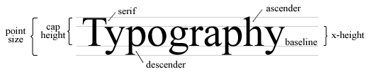
Figure 11-24. Typographic terminology.
Outline Fonts - TOP

Figure 11-25. Rasterizing outline fonts.
Most digital fonts -- such as Microsoft TrueType and Adobe PostScript -- are stored as character outlines using mathematical descriptions of the characters. Use of these outline fonts means that only one outline per character is needed to produce all the sizes of that character; it can be scaled to different sizes and even skewed and rotated without losing its characteristic shape.
In order to be displayed on a computer screen or on printed paper, the outlines need to be "filled in," or rasterized as pixel points. Rasterizing software performs this function as shown in the accompanying illustration.
Font Families - TOP
It is important to remember that a Web page can only display those fonts that are installed on the user's computer Therefore, nonstandard fonts should be avoided. The table below contains common PC and MAC fonts.
Windows Fonts MAC Fonts Arial
Arial Black
Courier New
Georgia
Impact
Times New Roman
Trebuchet MS
Tahoma
VerdanaHelvetica
Arial Black
Courier New
Georgia
Impact
Times
Helvetica
Geneva
VerdanaFigure 11-26. Typical core fonts installed on desktop computers.
Of course, most users have other software installed on their systems which come with additional fonts to support those applications. Those fonts may or may not be accessible for browser display.
Fonts can be classified as serif and sans-serif (without-serif) styles. Serifs are the small "tick marks" at the end of character strokes. You can see this difference in the Times New Roman (serif) and Arial (sans-serif) fonts shown below:
Serif Sans-SerifListing 11-1. Serif and non(sans)-serif type faces.
Generally one serif font for text and one sans serif font for headings (or vice-versa) are a good combination. A page should contain no more than two different typefaces or four different type variations such as type size and bold or italic style.
Font Size
Readability is affected by font sizes. Print type is traditionally measured in points, which is 1/72 of an inch (on paper). However, computer screens are based on pixels, rather than points, so rendering software must translate point sizes to pixels units taking into account screen resolution. You can see from the two lines below how 12-point type size equates to approximately 16-pixel type size on the screen.
12pt Times New Roman (print)
16px Times New Roman (screen)
Listing 11-2. Point and pixel type sizes.
While print type size is based on absolute units of measure such as points and pixels,relative units such as percentages and em (preferred), should be used in web documents since absolute font sizes render inconsistently across platforms and can't be resized by the browser.
1 em unit is equivalent to 12 points. A type size of 1 em makes for comfortable reading by most people. If smaller sizes are necessary, then choose fonts with wider spacing and larger x-heights. The x-height is the height of lower-case letters measured from the baseline. The following two lines are displayed at .67em size in Arial and Verdana type faces. The latter line is not as crowded at that size and is easier to read.
A quick brown fox jumps over the lazy dog.
A quick brown fox jumps over the lazy dog.
Listing 11-3. Comparison of type faces and type size.
Incidentally, Verdana is becoming a popular Web font because it is designed to map accurately to pixel positions on a screen. Also, a non-serif font such as Arial or Verdana is easier to read on screen, while a serif font such as Times New Roman is easier to read on paper.
While print type size is based on absolute units of measure such as points and pixels, relative units such as percentages and em (preferred), should be used in web documents since absolute font sizes render inconsistently across platforms and can't be resized by the browser.
1 em unit is equivalent to 12 points.
Line Size
Readability also depends on line height and line length. In general, default spacing in the browser provides decent spacing between lines. A line length of approximately 60 to 80 characters permits good tracking of the eyes from the end of one line to the beginning of the next. The following lines contain approximately 75 Verdana characters at 9-pt size.
The standard Lorem Ipsum passage, used since the 1500s: "Lorem ipsum dolor sit amet, consectetur adipisicing elit, sed do eiusmod tempor incididunt ut labore et dolore magna aliqua. Ut enim ad minim veniam, quis nostrud exercitation ullamco laboris nisi ut aliquip ex ea commodo consequat. Duis aute irure dolor in reprehenderit in voluptate velit esse cillum dolore eu fugiat nulla pariatur. Excepteur sint occaecat cupidatat non proident, sunt in culpa qui officia deserunt mollit anim id est laborum."
Lorem Ipsum is simply dummy text of the printing and typesetting industry. Lorem Ipsum has been the industry's standard dummy text ever since the 1500s, when an unknown printer took a galley of type and scrambled it to make a type specimen book. It has survived not only five centuries, but also the leap into electronic typesetting, remaining essentially unchanged.
Listing 11-4. Typical font size, line length, and line spacing.
White Space
A prevelant mistake of page authors is to crowd too much information between tiny margins. It can be monotonous and tiring reading line after line of text from border to border without breaks. Make sure you leave plenty of white space in the margins and that sufficient numbers of headings and graphics break up the monotony of the page.
Text Color
Color can be used for text variety. As in the case with graphic images, choose a small number of coordinated colors and be consistent in their use. Readers tend to see colors, as they do text sizes, as visual clues with logical meaning. For instance, you will normally use different font sizes for different levels of headings. The size of the font comes to mean a certain type of topical change in content. By the same token, colors take on expected meanings. Be consistent in the color cues you give to readers.
 ecorative Fonts - TOP
One way to introduce nonstandard fonts on a Web page is to use graphic images of letterforms like the character "D" in the previous heading. This technique ensures that the font will be displayed irrespective of the visitor's installed fonts, and it introduces variety to the page. Use graphic letters selectively, though, since they increase page download times and they increase the risk of cluttering the page with hard-to-read characters.
Dynamic Style Settings
The current page is rendered in 10pt Arial font. You can see how changing fonts and sizes changes the appearance and readability of this page by clicking the following buttons:
Arial
Verdana
Georgia
Times New Roman
Courier New.67em (8pt)
.75em (9pt)
.83em (10pt)
1 em (12pt)
1.2 em (14pt)
Enhancing the Usability of A Page - TOP
The following guidelines should be used to help increase the readability of your Web pages:
- Use common fonts such as Arial (Helvetica), Verdana, or Times New Roman (Times). San serif fonts are easier to read on a computer screen, whereas serif fonts are easier to read in print. Use the CSS media types - @print and @screen to set appropriate fonts for each media type.
- Avoid long blocks of text and long paragraphs. Be concise
- When possible use relative units such as the em when setting font size - 1 em = 12 pt.
- Hyperlink keywords or phrases, not entire sentences
- Avoid the use of the words "click here"
- Always check grammar and spelling
TOP | NEXT: Accessibility
11.5 - Accessibility
Accessibility
Web technologies are forever forging ahead. Each day brings new gadgetry and wizardry to the browsing experience, opening up reams of electronic information and entertainment at an accelerating pace for those with the technical where-with-all to access it. Yet, many Web citizens are not in a postion to reap the advantages because of both technical deficiencies and physical disabilities for experiencing the content as originally conceived and presented.
Web accessibility issues pertain to page design for users who
- may not be able to see, hear, move, or may not be able to process some types of information easily or at all.
- may have difficulty reading or comprehending text.
- may not have or be able to use a keyboard or mouse.
- may have a text-only screen, a small screen, or a slow Internet connection.
- may not speak or understand fluently the language in which the document is written.
- may be in a situation where their eyes, ears, or hands are busy or interfered with (e.g., driving to work, working in a loud environment, etc.).
- may have an early version of a browser, a different browser entirely, a voice browser, or a different operating system.
Web developers should consider these situations during page design. Granted, there may be situations where it is impractical or unwise to compromise a design for accessibility purposes. A Web site that features inaccessible technologies need not apologize for lack of presentation alternatives if none are truly available to duplicate the experience in other ways. There are also cost and marketing considerations. It may be resource-prohibitive to create a parallel site for a small population of users and a competitive disadvantage to delay available until it is completed.
Still, the search for presentation alternatives should continue. In some cases there are technical solutions to accessibility problems. In other cases there are page coding remedies.
Assistive Technologies
Assistive technologies provide mechanical and software means to overcome physical or cognitive disabilities. Examples include
- Eye movement mouse. A camera mounted on the computer monitor focuses on the user's eye. The mouse cursor is positioned where the user is looking and mouse clicks are performed with an eye blink.
- Foot control mouse. A foot control mouse uses two pedals, one for cursor movement and the other for mouse clicks.
- Head tracking mouse. A signal from atop the computer monitor tracks a reflector placed on the user's head or eyeglasses. Movement of the user's head controls the direction and distance of cursor movement.
- Touch sensitive keyboard/mouse. The keyboard works with the slightest touch of a hand-held wand or mouth stick requiring no force of pressure. The mouse function works like a standard mouse but requires no hand dexterity.
- Mouth controlled joy stick. A pointer controls cursor movement on the screen; "sipping" or "puffing" on the mouth stick simulates mouse clicking.
- Touch screen. Screen overlays are sensitive to finger and wand touch to track cursor movement and activate mouse clicks.
- Screen and text readers. Software reads aloud or converts to brail information appearing on the monitor screen or speaks text entered through the keyboard or appearing in documents such as text files, email messages, or word processing documents.
- Screen magnification. Software enlarges screen display to as high as 16x magnification.
- Sign language communicator. Converts text or speech to video sign language or computer-generated voice.
- Speech recognition. Devices and software to control computers through spoken words and phrases; assistive writing by coverting speech into text without use of pencil and paper.
- Cognitive planners/reminders. Assist users in accessing and remembering information; provides on screen cueing and planning assistance for people with memory and attention disorders, keeping them on schedule with graphic displays, selection menus, and personalized verbal and audio signals.
Most of these solutions take place on the end-user side. They must be purchased and installed on individual computers. The Web developer has little or no impact on whether Web content may be accessible by these methods. The developer can, however, assist many of these assistive technologies by following compatible site design and coding practices when creating Web pages.
W3C Accessibility Guidelines - TOP
The World Wide Web Consortium (W3C) produces a set of Web Content Accessibility Guidelines (http://www.w3.org/TR/WCAG10/) on how to make Web content accessible to people with disabilities. By following these guidelines content developers can create pages that remain accessible despite the constraints of physical, sensory, and cognitive disabilities. Some general keys to designing such pages include:
- Separate structure from presentation. Recognize that the information content of a Web page is different from, and usually separate from, its visual appearance.
- Provide text alternatives to audio and video content. Text can be rendered in ways that are available to almost all browsing devices and accessible to almost all users.
- Create documents that do not rely on one type of hardware. Pages should be usable by people without mice, with small screens, low resolution screens, black and white screens, no screens, and with only voice or text output.
The W3C provides fourteen guidelines under three priority levels commensurate with their impact on accessibility. Some of these guidelines refer to technologies or techniques that are not covered in this tutorial.
Priority 1 guidelines must be satisfied; otherwise, one or more groups will find it impossible to access information in the document.
Priority 2 guidelines should be satisfied; otherwise, one or more groups will find it difficult to access information in the document.
Priority 3 guidelines may be satisfied; otherwise, one or more groups will find it somewhat difficult to access information in the document.
The following discussion summarizes these guidelines. You should visit the W3C accessibility site for complete details.
Guideline 1. Provide equivalent alternatives to auditory and visual content.
This guideline emphasizes the importance of providing text equivalents of non-text content (images, pre-recorded audio, video). The power of text equivalents lies in their capacity to be rendered in ways that are accessible to people from various disability groups using a variety of technologies. Text can be readily output to speech synthesizers and braille displays, and can be presented visually in a variety of sizes on computer displays and paper.
Coding Practices:
-
Provide a text equivalent for every non-text element. For example, use alt text for the
<img>tag. For complex content where alt text does not provide a complete text equivalent, provide a link to a text description. For image maps use the alt attribute with<area>tags. [Priority 1] -
Until user agents can automatically read aloud the text equivalent of a visual track, provide an auditory description of the important information of the visual track of a multimedia presentation. [Priority 1]
-
For any time-based multimedia presentation (e.g., a movie or animation), synchronize equivalent alternatives (e.g., captions or auditory descriptions of the visual track) with the presentation. [Priority 1]
-
Until user agents render text equivalents for image map links, provide redundant text links for each active region of a client-side image map. [Priority 3]
Guideline 2. Don't rely on color alone.
Ensure that text and graphics are understandable when viewed without color. If color alone is used to convey information, people who cannot differentiate between certain colors and users with devices that have non-color or non-visual displays will not receive the information. When foreground and background colors are too close to the same hue, they may not provide sufficient contrast when viewed using monochrome displays or by people with different types of color deficits.
Coding Practices:
-
Ensure that all information conveyed with color is also available without color, for example from text context or markup. [Priority 1]
-
Ensure that foreground and background color combinations provide sufficient contrast when viewed by someone having color deficits or when viewed on a black and white screen. [Priority 2].
Guideline 3. Use markup and style sheets properly.
Mark up documents with the proper and intended use of XHTML elements, that is, as information structuring devices rather than styling techniques. Control presentation with style sheets rather than with attributes. Using markup improperly hinders accessibility.
Coding Practices:
-
When an appropriate markup language exists, use markup rather than images to convey information. Avoid using images to represent text -- use text and style sheets instead. [Priority 2]
-
Create documents that validate to published XHTML standards. [Priority 2]
-
Use style sheets rather than deprecated attributes to control layout and presentation. [Priority 2]
-
Use relative measurement units (percentages) rather than absolute units (pixels) in markup attribute values and style sheet property values. [Priority 2]
-
Use header elements to convey document structure, not for style effects. For example, use H2 to indicate a subsection of H1, not because of size differences in the fonts. [Priority 2]
-
Nest OL, UL, and DL list items properly. [Priority 2]
Guideline 4. Clarify natural language usage
Use markup that facilitates pronunciation or interpretation of abbreviated or foreign text. When content developers code natural language in a document, speech synthesizers and braille devices can automatically switch to the new language, making the document more accessible to multilingual users. Also, natural language markup allows search engines to find key words and identify documents in a desired language.
Coding Practices:
-
Clearly identify changes in the natural language of a document's text and captions. For example, use "xml:lang" in page prologs. [Priority 1]
-
Specify the expansion of each abbreviation or acronym in a document where it first occurs. [Priority 3]
Guideline 5. Create tables that transform gracefully.
Ensure that tables have necessary markup to be transformed by accessible browsers and other user agents. Tables should be used to mark up truly tabular information ("data tables") and should be avoided to lay out pages ("layout tables"). Tables for any use present special problems to users of screen readers.
Coding Practices:
-
For data tables, identify row and column headers. Use
<td>to identify data cells and<th>to identify headers. [Priority 1] -
For data tables that have two or more logical levels of row or column headers, use markup to associate data cells and header cells. Use
<thead>,<tbody>, and<tfoot>to group rows and use</col>and<colgroup>to group columns. [Priority 1] -
Do not use tables for layout unless the table makes sense when presented in a linear (across rows and down columns) fashion. Otherwise, provide an alternative presentation. [Priority 2]
-
If a table is used for layout, do not use any structural markup for the purpose of visual formatting -- do not use the
<th>element to cause the content of a (non-table header) cell to be displayed centered and in bold. [Priority 2] -
Provide text summaries for tables where practical. [Priority 3]
Guideline 6. Ensure that pages featuring new technologies transform gracefully.
Ensure that pages are accessible even when newer technologies are not supported or are turned off. Although content developers are encouraged to use new technologies, they should know how to make their pages still work with older browsers and people who choose to turn off features.
Coding Practices:
-
Organize documents so they may be read without style sheets. For example, when an HTML document is rendered without associated style sheets, it must still be possible to read the document. [Priority 1]
-
Ensure that equivalents for dynamic content are updated when the dynamic content changes. [Priority 1]
-
Ensure that pages are usable when scripts, applets, or other programmatic objects are turned off or not supported. If this is not possible, provide equivalent information on an alternative accessible page. [Priority 1]
-
Ensure that dynamic content is accessible or provide an alternative presentation or page. [Priority 2]
Guideline 7. Ensure user control of time-sensitive content changes.
Ensure that moving, blinking, scrolling, or auto-updating objects or pages may be paused or stopped. Some people with cognitive or visual disabilities are unable to read moving text quickly enough or at all. Movement can also cause such a distraction that the rest of the page becomes unreadable for people with cognitive disabilities. Screen readers are unable to read moving text. People with physical disabilities might not be able to move quickly or accurately enough to interact with moving objects.
Coding Practices:
-
Until user agents allow users to control flickering, avoid causing the screen to flicker. [Priority 1]
-
Until user agents allow users to control blinking, avoid causing content to blink [Priority 2]
-
Until user agents allow users to freeze moving content, avoid movement in pages. [Priority 2]
-
Until user agents provide the ability to stop the refresh, do not create periodically auto-refreshing pages. [Priority 2]
-
Until user agents provide the ability to stop auto-redirect, do not use markup to redirect pages automatically. [Priority 2]
Guideline 8. Ensure direct accessibility of embedded user interfaces.
Ensure that the user interface follows principles of accessible design: device-independent access to functionality, keyboard operability, self-voicing, etc. When an embedded object has its "own interface", the interface -- like the interface to the browser itself -- must be accessible. If the interface of the embedded object cannot be made accessible, an alternative accessible solution must be provided.
Coding Practices:
-
Make programmatic elements such as scripts directly accessible or compatible with assistive technologies [Priority 1 if functionality is important and not presented elsewhere, otherwise Priority 2.]
Guideline 9. Design for device-independence.
Use features that enable activation of page elements via a variety of input devices. Device-independent access means that the user may interact with the user agent or document with a preferred input (or output) device -- mouse, keyboard, voice, head wand, or other.
Coding Practices:
-
Provide client-side image maps instead of server-side image maps except where the regions cannot be defined with an available geometric shape. [Priority 1]
-
Ensure that any element that has its own interface can be operated in a device-independent manner. [Priority 1]
-
For scripts, specify logical event handlers rather than device-dependent event handlers. [Priority 2]
-
Create a logical tab order through links, form controls, and objects. [Priority 3]
-
Provide keyboard shortcuts to important links, form controls, and groups of form controls. [Priority 3]
Guideline 10. Use interim solutions.
Use interim accessibility solutions so that assistive technologies and older browsers will operate correctly. For example, changing the current window or popping up new windows can be very disorienting to users who cannot see that this has happened.
Note. The following checkpoints apply until user agents (including assistive technologies) address these issues. These checkpoints are classified as "interim", meaning that the Web Content Guidelines Working Group considers them to be valid and necessary to Web accessibility as of the publication of this document. However, the Working Group does not expect these checkpoints to be necessary in the future, once Web technologies have incorporated anticipated features or capabilities.
Coding Practices:
-
Until user agents allow users to turn off spawned windows, do not cause pop-ups or other windows to appear and do not change the current window without informing the user. [Priority 2]
-
Until user agents support explicit associations between labels and form controls, for all form controls with implicitly associated labels, ensure that the label is properly positioned immediately precedits its control on the same line. [Priority 2]
-
Until user agents (including assistive technologies) render side-by-side text correctly, provide a linear text alternative (on the current page or some other) for all tables that lay out text in parallel, word-wrapped columns. [Priority 3]
-
Until user agents handle empty controls correctly, include default, place-holding characters in edit boxes and text areas. [Priority 3]
-
Until user agents (including assistive technologies) render adjacent links distinctly, include non-link, printable characters (surrounded by spaces) between adjacent links. [Priority 3]
Guideline 11. Use W3C technologies and guidelines.
Use W3C technologies and follow accessibility guidelines. Where it is not possible to use a W3C technology, or doing so results in material that does not transform gracefully, provide an alternative version of the content that is accessible.
Coding Practices:
-
Use W3C technologies when they are available and appropriate for a task and use the latest versions when supported. [Priority 2]
-
Avoid deprecated features of W3C technologies. [Priority 2]
-
Provide information so that users may receive documents according to their preferences (e.g., language, content type, etc.) [Priority 3]
-
If, after best efforts, you cannot create an accessible page, provide a link to an alternative page that uses W3C technologies, is accessible, has equivalent information (or functionality), and is updated as often as the inaccessible (original) page. [Priority 1]
Guideline 12. Provide context and orientation information.
Provide context and orientation information to help users understand complex pages or elements. Grouping elements and providing contextual information about the relationships between elements can be useful for all users. Complex relationships between parts of a page may be difficult for people with cognitive disabilities and people with visual disabilities to interpret.
Coding Practices:
-
Title each frame to facilitate frame identification and navigation. [Priority 1]
-
Describe the purpose of frames and how frames relate to each other if it is not obvious by frame titles alone. [Priority 2]
-
Divide large blocks of information into more manageable groups where natural and appropriate. [Priority 2]
-
Associate labels explicitly with their controls. [Priority 2]
Guideline 13. Provide clear navigation mechanisms.
Provide clear and consistent navigation mechanisms -- orientation information, navigation bars, a site map, etc. -- to increase the likelihood that a person will find what they are looking for at a site. Clear and consistent navigation mechanisms are important to people with cognitive disabilities or blindness, and benefit all users.
Coding Practices:
-
Clearly identify the target of each link. Link text should be meaningful enough to make sense when read out of context -- either on its own or as part of a sequence of links. Link text should also be terse.[Priority 2]
-
Provide metadata to add semantic information to pages and sites. For example, indicate the document's author, the type of content, etc.[Priority 2]
-
Provide information about the general layout of a site (e.g., a site map or table of contents). [Priority 2]
-
Use navigation mechanisms in a consistent manner. [Priority 2]
-
Provide navigation bars to highlight and give access to the navigation mechanism. [Priority 3]
-
Group related links, identify the group (for user agents), and, until user agents do so, provide a way to bypass the group. [Priority 3]
-
If search functions are provided, enable different types of searches for different skill levels and preferences. [Priority 3]
-
Place distinguishing information at the beginning of headings, paragraphs, lists, etc. [Priority 3]
-
Provide information about document collections (i.e., documents comprising multiple pages.). Another way to create a collection is by building a zipped archive of the multiple pages. [Priority 3]
-
Provide a means to skip over multi-line ASCII art. [Priority 3]
Guideline 14. Ensure that documents are clear and simple.
Ensure that documents are clear and simple so they may be more easily understood. Consistent page layout, recognizable graphics, and easy to understand language benefit all users. They help people with cognitive disabilities or who have difficulty reading. Ensure that images have text equivalents for people who are blind, have low vision, or for any user who cannot or has chosen not to view graphics.
Coding Practices:
-
Use the clearest and simplest language appropriate for a site's content. [Priority 1]
-
Supplement text with graphic or auditory presentations where they will facilitate comprehension of the page. [Priority 3]
-
Create a style of presentation that is consistent across pages. [Priority 3]
It is impossible in this tutorial to give examples of all of the above coding techiques to assist in Web page accessability. A comprehensive set of example HTML code, however, is provided at the W3C Web site: Techniques for Web Content Accessibility Guidelines.
There are a number of Web sites that provide software for testing pages against accessibility guidelines. For example, bobby.watchfire.com permits you to enter the URL of your page and receive a report on its compatibility with W3C and other guidelines.
Section 508 Requirements - TOP
Under Federal law, U.S. agencies must make their Web sites accessible to people with vision and hearing impairments, with limited dexterity, and with other disabilities. Section 508, an amendment to the Rehabilitation Act of 1973, mandates that people with disabilities be given comparable access to Web-accessible government information as other users; the Act also pertains to organizations which receive funds from the federal government.
There are sixteen general rules for accessible Web pages in the Section 508 Standards. In brief, the rules for accessible Web pages are:
- Text Tags: A text equivalent for every non-text element shall be provided.
- Multimedia Presentations: Equivalent alternatives for any multimedia presentation shall be synchronized with the presentation.
- Color: Web pages shall be designed so that all information conveyed with color is also available without color, for example from context or markup.
- Readability: Documents shall be organized so they are readable without requiring an associated style sheet.
- Server-Side Image Maps: Redundant text links shall be provided for each active region of a server-side image map.
- Client-Side Image Maps: Client-side image maps shall be provided instead of server-side image maps except where the regions cannot be defined with an available geometric shape.
- Data Tables 1: Row and column headers shall be identified for data tables.
- Data Tables 2: Markup shall be used to associate data cells and header cells for data tables that have two or more logical levels of row or column headers.
- Frames: Frames shall be titled with text that facilitates frame identification and navigation.
- Flicker Rate: Pages shall be designed to avoid causing the screen to flicker with a frequency greater than 2 Hz and lower than 55 Hz.
- Text-Only Alternatives: A text-only page, with equivalent information or functionality, shall be provided to make a web site comply with the provisions of this part, when compliance cannot be accomplished in any other way. The content of the text-only page shall be updated whenever the primary page changes.
- Scripts: When pages utilize scripting languages to display content, or to create interface elements, the information provided by the script shall be identified with functional text that can be read by assistive technology.
- Applets and Plug-Ins: When a web page requires that an applet, plug-in or other application be present on the client system to interpret page content, the page must provide a link to a plug-in or applet.
- Forms: When electronic forms are designed to be completed on-line, the form shall allow people using assistive technology to access the information, field elements, and functionality required for completion and submission of the form, including all directions and cues.
- Navigation Links: A method shall be provided that permits users to skip repetitive navigation links.
- Time: When a timed response is required, the user shall be alerted and given sufficient time to indicate more time is required.
Details about these guidelines along with links to other resources for Section 508 compatibility are at the Federal government site www.section508.gov/.
TOP | NEXT: Site Development
11.6 - Website Development
Website Development
Website Development Job Roles - TOP
The task of developing a major website is rarely undertaken by a single individual. In most cases, development teams are established and work is divided among experts or individuals with certain job roles. The following are some job roles that are typically necessary for the successful development of a large scale Web development project. In smaller projects, a single individual may take on multiple roles.
- Project Manager
- Manages the Web site development project and coordinates all team activities. The project manager creates the project schedule and plan. The project manager must ensure that all project milestones are met and that all outcomes are met.
- Information Architect
- The information architect clarifies the mission and goals of the Web site, determines the functionality of the site, helps define site organization, layout, and navigation.
- Marketing or Public Relations Representative
- The PR representative works with the Web developers to help define the look and feel for the Web site that aligns with the organization's marketing goals. PR representatives may also assist with editing the Web site content.
- Multimedia Designer
- Assists with determining the appropriate graphics, colors, and layout for the site. Creates page layout and designs graphics and other multimedia content.
- Database Administrator
- Creates databases, tables, stored procedures, writes SQL statements, and maintains control and access to databases.
- Network or Systems Administrator
- Configures, maintains, and secures the Web server. Installs and maintains hardware and systems level software.
- Web Developer
- Writes the HTML code and client or server-side scripts.
Like any significant technology development, Web sites are developed by following a project development methodology or step-by-step plan that encompasses the life cycle of a project from start to finish. Websites are often developed using a variation of the traditional Systems Development Life Cycle (SDLC). The Web Systems Development Life Cycle consists of the following phases:
- Conceptualization - Identify opportunity, what is the motivation for the site, identify audience, determine purpose and goals of the site
- Analysis - Determine functional requirements, determine environmental requirements, determine content requirements, estimate costs, review competitors' sites
- Design - choose site organization, storyborad the design, create page layout, document each page
- Production - select Web authoring tool, organize site files, develop and test components
- Testing - test site on different browsers, test with different screen resolutions, test from different locations, test using mobile devices, accessibility testing, site validation
- Launch - Publish site to live production Web server
- Maintenance - enhancements, modifications, additions to the site over time
- Evaluation - review site to ensure that it meets goals
Web Site Hosting - TOP
A Web site hosting service is a type of Internet hosting service that allows individuals and organizations to make their own Web site accessible via the World Wide Web. Web hosts are companies that provide space on a server they own or lease for use by their clients as well as providing Internet connectivity, typically in a data center.There are various types of web hosting solutions. Depending on your needs, you could choose from one of several web hosting solutions and therefore it is important to research and evaluate the services to select the most appropriate option. Some of the most common types of web hosting services available include:
- Shared Hosting -Shared web hosting (also called virtual hosting) is the most common type of hosting service used. Under this hosting, the website is placed on the same server as many other sites, ranging from a few to hundreds or thousands. The Hosting company manages the server to ensure uptime, upgrading hardware and software.
- Dedicated Hosting - dedicated web hosting solutions allow a client to lease the complete computer and have access to all its resources to host one or multiple websites. The user gets his or her own Web server and gains full control over it, however, the user typically does not own the server.
- Virtual Private Server (VPS) Hosting - divides server resources into virtual servers, where resources can be allocated in a way that does not directly reflect the underlying hardware. Each server looks and acts like a dedicated server.
- Managed Web Hosting - the user gets his or her own Web server but is not allowed full control over it, however, they are allowed to manage their data via FTP or other remote management tools
- Free Web Hosting - offered by different companies with limited services, sometimes supported by advertisements, and often limited to basic Web Hosting services
A number of issues should be considered when choosing a Web host, including bandwidth, disk storage space, technical support, availability of server-side scripting languages (ASP.NET, PHP, Java, Coldfusion), database server availability (MySQL, MS SQL Server), type of Web server (IIS, Apache), and the server operating system (Windows, Linux). The host may also provide an interface or control panel for managing the Web server and installing scripts as well as other services like e-mail. Some hosts specialize in certain software or services (e.g. e-commerce). They are commonly used by larger companies to outsource network infrastructure to a hosting company.
Domain Name Selection - TOP
A domain name is an identification label that defines a realm of administrative autonomy, authority, or control on the Internet, based on the Domain Name System (DNS). An important purpose of domain names is to provide easily recognizable and memorizable names to numerically addressed Internet resources (i.e., www.maconstateit.net instead of 74.208.73.193). The right to use a domain name is delegated by domain name registrars which are accredited by the Internet Corporation for Assigned Names and Numbers (ICANN), the organization charged with overseeing the name and number systems of the Internet. After determining the availablity of a domain name, you can register the domain name through a domain name registrar or through your Internet Hosting Company. The best way to determine whether a domain name is available is to use the Domain Name Look up Tool provide by Whois.
The following are basic guidelines to following when selecting a domain name:
- Select a domain name that is as short as possible
- Select a domain name that is as generic as possible, but related (resale value, trademarks etc.)
- Avoid using hyphens, numbers or misspellings in the domain name
- A domain name that is easy to remember
- A domain name that is easy to spell
- A .com domain is universally recognized and remembered. The newer extensions such as .biz, .lastname etc will take a few years to be accepted.
- Avoid doubling up of letters - e.g. www.websiteengine.com. Instead use www.websitengine.com.
Website Marketing - TOP
After your website is hosted and accessible via the World Wide Web, various marketing techniques can be incorporated to help promote and increase access to your site. Some common and easy to implement Web marketing techniques are listed below:
- Keyword Rich Page Titles
- META Description and Keywords Tags
- Include ATL attribute with the
<img/>tag - Create a Site Map
- Submit Site to Directories and Search Engines
- Use Social Networking to Promote Web Site
- Use Online Forums
An example of a keyword rich page tile and meta description and keyword tags is shown below:
<head><title>Web Development Tutorials - XHTML, CSS, JavaScript, ASP.NET, PHP</title><meta name="description" content="Web Development tutorials for ASP.NET, XHTML, JavaScript,"DHTML, and XML"/><meta name="keywords" content="ASP.NET 2.0, XHTML, ASP, Xml, HTML, JavaScript, DHTML,Tutorial, Web Development, Active Server Pages" /> "</head>Listing 11-5. Title element with keywords.
TOP | NEXT: Mobile Development
11.7 - Mobile Development
Mobile Web Development
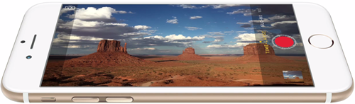
All of human knowledge in this thing?
First generation computers relied on vacuum tubes. These early computers were typically very large, sometimes as big as a room, and relatively slow by modern standards. As Moore's Law has continually progressed over the years we've now got nearly the breadth of all human knowledge available at our fingertips every day. They've gone by a few different names over the years but typically when we say Smartphone we recognize the distinction between these small hand-held devices and what is just a mobile phone. Typically a smart phone has much more capability in what it could do compared to a mobile phone. Now (2015) we have a wide range of mobile devices consisting of smartphones, tablets, and watches that access websites and run software applications.
Device Resolutions - TOP
On a desktop computer, the user can typically set a resolution that works best for them. The monitor itself may have a specific aspect ratio in which many specific resolutions may apply. Typically a maximum resolution will make items smaller, but clearer. If you use an resolution smaller than the maximum supported items may look larger relatively but possibly less clear. In the late stages of CRT monitors' prevalence most monitors seemed to only go as high as 1024x768 pixels but today many modern High Definition (HD) monitors display at 1920x1080 pixels or higher.
Smartphones (and tablets) come in a wide range of sizes and resolutions. Many smartphones have resolutions smaller than 1024x768 (an old CRT monitor) but since the phone's size is much smaller than a CRT's screen size we get very clear images even at these smaller resolutions.
Responsive Design with Media Queries
Using Media Queries is a technique that allows certain CSS to apply under specific circumstances. This helps designers of websites to adjust CSS properties of the site to create a better browsing experience for the user.
To start using Responsive Design:
- Set the Viewport using into the
<head>section of your HTML page. This sets the width of the browser window for the Media Query. - Create a Media Query to hold a set of CSS that can apply at specific ranges. W3C Schools suggests using a Mobile First approach so that designs can start small and get more complex as more room is opened up at larger widths.
Mobile First Example - TOP
This examples shows a bar that is 20px tall and changes colors based on the width of the browser. It starts as green and changes as the width gets larger. Try resizing your browser window to see the bar change colors.
<style>.colorChanger { width:60%; margin:0 15%; height:20px; background-color:green; } @media only screen and (min-width:600px) { .colorChanger { background-color:orange; } } @media only screen and (min-width:900px) { .colorChanger { background-color:blue; } } @media only screen and (min-width:1200px) { .colorChanger { background-color:red; } } @media only screen and (min-width:1500px) { .colorChanger { background-color:yellow; } }</style><div class="colorChanger"></div>Listing 11-6. Code for resizing sections of a page with browser size.
Choosing Breakpoints - TOP
In the above example we wrote Media Queries at fairly random intervals (every 300px) to achieve the color change. These breakpoints aren't really standardized and requires the developer to use some judgement as to when a breakpoint is needed. In a mobile first design a developer may choose to add breakpoints to open up the page for more content or to rearrange the design into a 2 or 3 column layout.
It is a free and open internet to all. It is not suggested to write media queries to target specific device resolutions. Instead, write media queries along the range of width that make it look good across devices in the range. It may take actually testing these devices to make sure it performs as intended.