Chapter 6 - Applying Special Styles
This chapter introduces several CSS techniques that help developers gain greater control over the appearance and layout of web pages. You will learn how to customize lists, apply borders and padding to create visual separation and improve readability, and control the size of page elements using CSS sizing properties. These styling techniques are essential for transforming plain HTML content into visually appealing and professional-looking web pages. The chapter also explores element positioning, a fundamental concept in modern web design. By learning how CSS determines the placement of elements on a page, you will be able to create more organized layouts and better manage the relationships between page components. Together, these skills provide the foundation for building web pages that are both attractive and easy for users to navigate.
6.1 - Styling Lists
Previously you were introduced to some of the basic style properties used to format page elements. The following sections add to your repertoire of properties by focusing on ways to add special styling to page elements. In this section, various ways of adding special styles to list structures are discussed.
Styling Unordered Lists - TOP
One of the list structures is an unordered list: a series of items preceded by bullet characters and set off from surrounding text by single blank lines. The list is single spaced and indented from the left margin. An example unordered list is coded and displayed below.
<ul><li>List Item 1</li><li>List Item 2</li><li>List Item 3</li></ul>
- List Item 1
- List Item 2
- List Item 3
Figure 6-1. An unordered list.
Bullet types can be specified by using the deprecated type="disc|circle|square" attribute of the <ul> tag. Preferably, style sheet properties should replace this attribute. For unordered lists, there are two style properties that can be used to designate the type of bullet symbol with which to prefix list items. These properties and their associated values are shown in Figure 6-2.
| Property | Value |
|---|---|
| list-style-type | disc circle square none |
| list-style-image | url(url) |
Figure 6-2. List-style bullet types.
Specifying Bullet Characters
The unordered list shown in Figure 6-3 uses the list-style-type property to display a circle as the bullet type. Styling is given in an embedded style sheet entry for the ul selector.
<style type="text/css">ul {list-style-type:circle}</style><ul><li>List Item 1</li><li>List Item 2</li><li>List Item 3</li></ul>Listing 6-1. Code for list-style bullet type.
- List Item 1
- List Item 2
- List Item 3
Figure 6-3. Unordered list with circle bullets.
Of course, by using the simple selector ul in the stylesheet, all unordered lists on the page will have circle bullets. It might be preferable to use ID selectors so that different lists can be assigned different bullet characters. The following style sheet identifies three such lists, each with its own prefix character.
<style type="text/css">ul#List1 {list-style-type:disc}ul#List2 {list-style-type:circle}ul#List3 {list-style-type:square}</style>Listing 6-2. Embedded style sheet for list-style bullet types.
A particular list structure takes on a bullet type by assigning the associated id to its <ul> tag. That is, a list identified with the tag <ul id="List3"> will have square characters as bullets.
Setting Margins for Unordered Lists
Normally, unordered lists are indented a fixed number of pixels from the left margin. In certain cases, you may not wish the list of items to be indented. You can include a margin-left style setting to move items to the left margin (the margin setting for the list equates to the margin setting for its container). In the following code, this margin setting is added to the ul selector to align bullets at a page margin of 20 pixels.
<style type="text/css">ul {list-style-type:circle; margin-left:20px}</style>Listing 6-3. Aligning an unordered list at the page margin.
Suppressing Display of Bullet Characters
You may wish to use other than the supplied bullet characters to prefix your list. In the following example, the list-style-type property is set to none to remove display of bullets. Then each list item is prefixed with an arrowhead character from the Webdings font (the numeric character "4" displays the right-arrowhead symbol in this font family).
<style type="text/css">ul {list-style-type:none; margin-left:20px}</style><ul><li><span style="font-family: webdings">4</span> List Item 1</li><li><span style="font-family: webdings">4</span> List Item 2</li><li><span style="font-family: webdings">4</span> List Item 3</li><ul>Listing 6-4. Aligning an unordered list at the page margin.
- 4 List Item 1
- 4 List Item 2
- 4 List Item 3
Figure 6-4. Unordered list with arrowhead characters as bullets.
In this example, the default bullet character is not replaced by the arrowhead. Instead, visibility of bullets is suppressed and the arrowhead character is added to the beginning of each list item. Even though bullet display is suppressed, room for the hidden character still occupies space on the line. Therefore, a margin-left setting is needed to move the list items back to their normal positions.
Consider the following list in which the right-arrowhead character has been added in front of the items, but the display of default bullets has intentionally not been suppressed.
<style type="text/css">ul {margin-left:20px}</style><ul><li><span style="font-family: webdings">4</span> List Item 1</li><li><span style="font-family: webdings">4</span> List Item 2</li><li><span style="font-family: webdings">4</span> List Item 3</li><ul>Listing 6-5. Code for unordered list without suppression of bullet character.
- 4 List Item 1
- 4 List Item 2
- 4 List Item 3
Figure 6-5. Unordered list with visible bullets and arrowhead characters.
When list-style-type:none is added to the style sheet, the default disc characters are not displayed; however, the space occupied by these characters remains. In order to move the list and the arrowheads to the left to occupy that space and retain normal indention of list items, the margin-left property is added to the style sheet. A left margin of approximately 20 pixels aligns the right-arrowhead characters at the position previously occupied by the bullets.
Using Graphic Images for Unordered Lists
Rather than using text characters as bullets, you can use graphic images to prefix list items by coding the list-style-image:url(url) property. If the image is in the same directory as the page containing the list, then the url is simply the name of the graphic file. In the following example an image named Bullet.gif is used to prefix list items. Browser output is shown in Figure 6-6.
<style type="text/css">ul {list-style-image:url(Bullet.png); vertical-align:middle}</style><ul><li>List Item 1</li><li>List Item 2</li><li>List Item 3</li><ul>Listing 6-6. Code for unordered list with graphic image as bullets.
- List Item 1
- List Item 2
- List Item 3
Figure 6-6. Unordered list with graphic image as bullets.
Depending on the size of the image you may have to adjust vertical alignment of the list items to align properly with the image. Normally, text aligns at the bottom of an in-line image. In this example the vertical-align:middle property is applied to the image to align its accompanying text with the middle of the image. Also, text-top and text-bottom values can be used to vertically align text with the top or bottom of an image.
Styling Ordered Lists - TOP
An ordered list is a series of items preceded by sequence numbers and set off from surrounding text by single blank lines. The list is single spaced and indented from the left margin in the same way as an unordered list. A default ordered list is coded and displayed as shown below.
<ol><li>List Item 1</li><li>List Item 2</li><li>List Item 3</li><ol>Listing 6-7. Code for an ordered list.
- List Item 1
- List Item 2
- List Item 3
Figure 6-7. An ordered list.
Style sheet settings can be used to designate the type of numbering symbol to prefix list items. The list-style-type property can be applied using the values shown in Figure 6-8. The decimal value is default.
| Property | Value |
|---|---|
| list-style-type | decimal upper-alpha lower-alpha upper-roman lower-roman none |
Figure 6-8. List style types of numbering symbols.
Specifying Number Characters
The following ordered list is numbered with upper-roman numerals. Browser output is shown in Figure 6-9.
<style type="text/css">ol {list-style-type:upper-roman}</style><ol><li>List Item 1</li><li>List Item 2</li><li>List Item 3</li><ol>Listing 6-8. Code for an ordered list with upper-roman characters.
- List Item 1
- List Item 2
- List Item 3
Figure 6-9. An ordered list with Roman numeral numbering.
Nested Ordered Lists
Ordered lists can be nested inside each other with each list having its own numbering scheme. In the following example, an outer list is numbered with upper-case Roman numerals and an inner list is numbered with lower-case Roman numerals. Numbering characters are assigned to particular lists by using ID selectors.
<style type="text/css">ol#List1 {list-style-type:upper-roman}ol#List2 {list-style-type:lower-roman}</style><ol id="List1"><li>List Item 1</li><li>List Item 2<ol id="List2"><li>List Item 2a</li><li>List Item 2b</li></ol></li><li>List Item 3</li><ol>Listing 6-9. Code for nested ordered lists.
- List Item 1
- List Item 2
- List Item 2a
- List Item 2b
- List Item 3
Figure 6-10. Nested ordered lists with Roman numeral numbering.
Styling Definition Lists - TOP
A definition list is a series of terms and definitions offset from surrounding text by a single blank line. The terms in the list are blocked at the left margin; definitions are indented and words wrapped on the following lines.
Recall that a definition list is enclosed inside <dl> tags and contains one or more <dt> tags listing the terms to be defined. Each term has an associated <dd> tag surrounding its definition. An example definition list is coded below and displayed in Figure 6-11.
<dl><dt>Term 1</dt><dd>This is the Term 1 definition. The definition term appears on a line by itself and is followed by a definition text block. The definition is indented and word wrapped.</dd><dt>Term 2</dt><dd>This is the Term 2 definition. The definition term appears on a line by itself and is followed by a definition text block. The definition is indented and word wrapped.</dd></dl>Listing 6-10. Code for a definition list.
- Term 1
- This is the Term 1 definition. The definition term appears on a line by itself and is followed by a definition text block. The definition is indented and word wrapped.
- Term 2
- This is the Term 2 definition. The definition term appears on a line by itself and is followed by a definition text block. The definition is indented and word wrapped.
Figure 6-11. A definition list.
There are no style properties specifically designed for definition lists. Fortunately, you can apply other formatting styles to a list to give it a different look and alignment. In the following example, the above list is given additional spacing between items by applying margin settings to the <dd> tags.
<style type="text/css">dd {margin-top:10px; margin-bottom:10px}</style><dl><dt>Term 1</dt><dd>This is the Term 1 definition. The definition term appears on a line by itself and is followed by a definition text block. The definition is indented and word wrapped.</dd><dt>Term 2</dt><dd>This is the Term 2 definition. The definition term appears on a line by itself and is followed by a definition text block. The definition is indented and word wrapped.</dd></dl>Listing 6-11. Code for a definition list with margin settings.
- Term 1
- This is the Term 1 definition. The definition term appears on a line by itself and is followed by a definition text block. The definition is indented and word wrapped.
- Term 2
- This is the Term 2 definition. The definition term appears on a line by itself and is followed by a definition text block. The definition is indented and word wrapped.
Figure 6-12. A definition list with top and bottom margins surrounding list items.
Contextual Selectors - TOP
List structures present a good opportunity to discuss an additional method -- an addendum to ID selectors -- to apply selective styling to XHTML elements. Consider this scenario for two lists requiring different stylings: the list items in an unordered list are displayed in a different color from those in an ordered list.
The two lists could apply different color settings through their tag selectors. That is, the ul selector could take on a different color from the ol selector with the following code.
<style type="text/css">ul {color:red}ol {color:blue}</style><ul><li>Red Item 1</li><li>Red Item 2</li><li>Red Item 3</li></ul><ol><li>Blue Item 1</li><li>Blue Item 2</li><li>Blue Item 3</li></ol>Listing 6-12. Code to display unordered and ordered lists in different colors.
- Red Item 1
- Red Item 2
- Red Item 3
- Blue Item 1
- Blue Item 2
- Blue Item 3
Figure 6-13. Unordered and ordered lists displayed in different colors.
The <ul> list is displayed in red and the <ol> list is displayed in blue. An alternative is to focus on differences in the <li> tags between the two lists. The <li> tag appearing in the <ul> list needs to be assigned a different color from the <li> tag appearing in the <ol> list. The need is to differentiate between the <li> tags appearing in the two lists. This differentiation is made with the following style sheet format.
<style type="text/css">ul li {color:red}ol li {color:blue}</style>Listing 6-13. Using contextual selectors.
The pairs of selectors -- ul li and ol li -- describe the combination of tags that must occur for the associated style to be applied. These contextual selectors -- two or more selectors separated by blank spaces -- provide the tag relationships that must occur before the style is applied. The preceding code sets the color to red where an <li> tag follows a <ul> tag, and the color is set to blue when an <li> tag follows an <ol> tag. That is, the <li> tag takes on a style depending on its context, whether it is associated with a <ul> tag or with an <ol> tag.
Contextual selectors can also include ID selectors to further differentiate styles. The following code uses id values to distinguish two unordered lists for the purpose of applying different bullet styles. At the same time, the two sets of list items are assigned different colors depending on which unordered list they appear in.
<style type="text/css">ul#ListA {list-style-type:disc}ul#ListB {list-style-type:circle}ul#ListA li {color:red}ul#ListB li {color:blue}</style><ul id="ListA"><li>Item 1</li><li>Item 2</li><li>Item 3</li></ul><ul id="ListB"><li>Item 1</li><li>Item 2</li><li>Item 3</li></ul>Listing 6-14. Using contextual selectors to differentiate unordered lists.
The two lists are differentiated in the style sheet by id values assigned to their <ul> tags. The first two style settings apply different bullet styles to the identified ul selectors. The last two style settings apply different colors to the li selector depending on which ul list it is contained in. The li color style depends on the ul ID context. Browser output of this code is shown in Figure 6-14.
- Item 1
- Item 2
- Item 3
- Item 1
- Item 2
- Item 3
Figure 6-14. Unorder lists displayed with different bullets and colors.
Use of contextual selectors is not limited to styling list structures. There will be numerous occasions throughout these tutorials where they are used to differentiate all manner of tag combinations.
Using Lists and CSS for Navigation Layout - TOP
Semantically speaking, since a navigation menu is a list of hyperlinks, it is much better to use unordered lists to configure a navigation menu. The following code block demonstrates how to use a list to create a navigation menu:
<div id="menu"><ul><li><a href="home.htm">Home</a>/li><li><a href="about.htm">About Us</a></li><li><a href="products.htm">Products</a></l<li><a href="contact.htm">Contact Us</a></li></ul></div>
The list-style-type CSS property can be set to none to prevent the browser from displaying the bullets. In addition, the CSS display property can be used to configure the list structure as an inline element. By default, a list structure is a block level element that displays each list item vertically down the page. Setting each list item to display inline will create a horizontal list of navigation items. The code to accomplish this is shown below:
.menu li {display: inline; list-style-type:none}
Additional spacing between each menu item can be added using the margin property.
TOP | NEXT: Borders and Padding
6.2 - Borders and Padding
Borders and Padding
Nearly all HTML elements can have borders, and can include padding (white space) around their contents. This is the case whether or not there are normally borders around the element or whether padding space is a normal characteristic of the tag.
Border Styles - TOP
Border styles include properties pertaining to the type of border, its width, and its color. The following table lists these properties.
| Property | Value |
|---|---|
| border-style border-top-style border-right-style border-bottom-style border-left-style |
dashed dotted double groove inset none outset ridge solid |
| border-width border-top-width border-right-width border-bottom-width border-left-width |
thin medium thick npx |
| border-color border-top-color border-right-color border-bottom-color border-left-color |
#000000 - #FFFFFF color name rgb(r,g,b) |
| border | border:style size color |
Figure 6-15. Border styles and properties.
Border style, width, and color properties can be applied to all four sides of an XHTML element or they can be selectively applied to individual sides. For example, the five types of border style properties are
border-style - applies to all four sides border-top-style - applies only to the top edge border-right-style - applies only to the right edge border-bottom-style - applies only to the bottom edge border-left-style - applies only to the left edge
When a border specification applies to all four sides of an element, the shortcut border property combines and separates with spaces the following values within a single property declaration: style, width, and color, in that order. In other words, instead of coding the three separate specifications,
border-style:solid
border-width:1px
border-color:black
these settings can be combined within a single border property:
border:solid 1 black
All three of these values do not have to be given, but the remaining ones must be in the correct order: border:solid 1px (unspecified color).
There are eight border styles from which to choose. These styles are shown in Figure 6-16 with their widths set to 3 pixels. Smaller border widths do not display some of the styles.
solid dashed dotted double groove inset outset ridge
Figure 6-16. Border styles.
Borders are normally applied to tags such as <div>, <p>, and <span> tags, those that are containers for text. You can, however, experiment with other tags to see their border effects.
To illustrate styling variations, the following division is displayed with a border that has different styles on all four sides. The division encloses a paragraph that has its own border settings and includes a text string with its own border.
<style type="text/css">div#A {border-width:7px;border-color:red;border-top-style:solid;border-right-style:dashedborder-bottom-style:ridge;border-left-style:double}p#B {border:dashed 3px blue}span#C {border:solid 4px green}</style><div id="A"><p id="B">This is a <span id="C">text string with borders</span>inside a paragraph with borders inside a division with four differentborders.</p></div>Listing 6-15. Code for various border styles.
This is a text string with borders inside a paragraph with borders inside a division with four different borders.
Figure 6-17. Borders surrounding page elements.
Since the enclosing division displays different borders on each of its four sides, individual specifications are given for each side. Since identical borders appear around all sides of the paragraph and spanned text, the shorthand border property is declared for these containers. Although you probably will not go to this extreme in adding borders to page elements, this example shows the different border settings that can be made.
Border Radius - TOP
An alternative to regular borders would be the use of border-radius. This property adds a beveled appearance to the corners of the contents of a container.
Unlike regular borders, border-radius allows more customization. For instance, with this property, you can customize every corner at once, each one individually, or you can use a combination of beveled and regular corners to achieve a varied look. Additionally, containers styled using border-radius can still have a regular border around it. Figure 6-19 shows examples of these applications.
The style properties for adding a border-radius to a container is shown in Figure 6-18.
| Property | Value |
|---|---|
| border-radius border-top-left-radius border-top-right-radius border-bottom-left-radius border-bottom-right-radius |
npx nem |
Figure 6-18. Borders surrounding page elements.
It is worth noting that while the border-radius property works well on container elements, such as div or span, it does not always display properly when applied to images. Therefore, to achieve an rounded corner appearance on an image, it is sometimes necessary to first wrap the image in a containing element, such as a div or span, and apply the border-radius property to that.
<style type="text/css">div#A{width: 5em;height: 5em;background-color: red;border: solid 2px blue;border-radius: 1em;}div#B{border-top-right-radius: 2em;border-bottom-left-radius: 2em;}</style><div id="A"></div><id="B" img src="DinosaursWithLasers.jpg">Listing 6-16. Code for adding border radius to various objects.
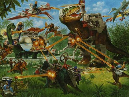
Figure 6-19.
Border-radius application examples.
Padding Styles - TOP
In the above styling example, borders are collapsed around the text they enclose. In most cases, for visual attractiveness and readability, you will wish to leave space between the text and its border. This is accomplished by introducing padding inside the text container. Padding is the amount of space between the borders of a container and its enclosed content.
Padding is added to a container with the style properties shown in Figure 6-20. The padding property introduces white space around all four sides of the container; padding-top, padding-right, padding-bottom, and padding-left selectively apply padding to each of the four sides.
| Property | Value |
|---|---|
| padding padding-top padding-right padding-bottom padding-left |
npx nem |
Figure 6-20. Padding style properties.
The following code is a repeat of the previous division with padding added to the <div>, <p>, and <span> tags to introduce additional space between the text and its enclosing borders. Different effects can be achieved by specifying different padding amounts on each of the four sides.
<style type="text/css">div#A {padding:7px;border-width:7px;border-color:red;border-top-style:solid;border-right-style:dashed;border-bottom-style:ridge;border-left-style:double}p#B {padding:7px; border:dashed 3px blue}span#C {padding:2px; border:solid 4px green}</div><div id="A"><p id="B">This is a <span id="C">text string with borders</span>inside a paragraph with borders inside a division with four differentborders.</p></div>Listing 6-17. Code for adding border radius to various objects.
This is a text string with borders inside a paragraph with borders inside a division with four different borders.
Figure 6-21. Padding surrounding text elements.
Image Borders - TOP
Borders can be displayed around a picture by coding a border style. The following code produces a ridge border 7 pixels wide as shown on the left in Figure 6-23.
<img src="Stonehenge.jpg" style="border:ridge 7px red">

Figure 6-22. Pictures with borders.
Figure 6-23. Pictures with borders.
You cannot separate the border from the picture by introducing padding around the picture itself. You can enclose an image inside another container, say a <span> tag, and add padding to this container. This technique is coded below and shown on the right in Figure 6-23.
<span style="border:ridge 7px red; padding:10px; display:inline-block"><img src="Stonehenge.jpg"></span>Listing 6-18. Code for padding surrounding an image.
Margins, Borders, and Padding - TOP
The illustration in Figure 6-23 gives you a visual sense of the margin, border, and padding components of page elements. Each of these component parts can be sized the same around all four sides of a container, or individual sides can take on different measurements. In combination with container size and placement styles discussed, next you should be able to arrange and style containers for very precise placement and for enhanced readability of page content.
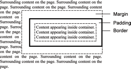
Figure 6-23.
Margins, padding, and borders surrounding page elements.
TOP | NEXT: Sizing Elements
6.3 - Sizing Elements
Element Sizing
Unless they are styled otherwise, text containers such as <div>, <p>, and <span> tags are sized to fit the contents they contain. It is often the case that you wish to have more control over the sizes of container tags, and you can with the style settings shown in Figure 6-24. You were introduced to the height and width properties in a previous tutorial. Here they are combined with the overflow property to control the size and visual appearance of text containers.
| Property | Value |
|---|---|
| height | npx n% auto |
| width | npx n% auto |
| overflow | visible hidden scroll auto |
Figure 6-24. Element size style properties.
Container Widths and Heights
In previous tutorials, height and width settings are applied to images and horizontal rules to give them specific sizes. The same can be done with virtually any XHTML tag, including text containers. For instance, the following paragraph is sized at 50% of the width of the browser window rather than expanding by default to the entire page width. A border is added to visualize the effect, and padding is used to keep the border from closing in around the text. This paragraph is displayed in the browser as shown in Figure 6-25.
<style type="text/css">p#Sized {width:50%; border:solid 1px; padding:10px}</style><p id="Sized">This is a paragraph with its width set to 50% of the width of the browser window. Still, the text wraps within these boundaries. Since its width is set as a percentage, the paragraph resizes to remain at 50% of the page width when resizing the browser window.</p>Listing 6-19. Code to size and pad a paragraph.
This is a paragraph with its width set to 50% of the width of the browser window. Still, the text wraps within these boundaries. Since its width is set as a percentage, the paragraph resizes to remain at 50% of the page width when resizing the browser window.
Figure 6-25. Paragraph with its width set to 50% of the page width.
The width of the paragraph always remains at 50%. Since no height styling is applied, the height of the paragraph expands to encompass the amount of text contained within it.
Container Overflows - TOP
By default, the height of a container always expands to display its contained text, irrespective of its specified height setting. In order to set the exact height of a container, you must also indicate how to handle text "overflow," where the container is not sized large enough to display all of its content. You must supply an overflow property to deal with potential "hidden" text beyond the boundaries of the container.
There are four possible values for the overflow property, the results of which are shown in the following examples of paragraph styling.
Page content can appear within containers as well as flow throughout the main document. With tags such as <div>, <p>, and <span> to contain content, these elements can, if so chosen, be sized to various heights and widths.
Page content can appear within containers as well as flow throughout the main document. With tags such as <div>, <p>, and <span> to contain content, these elements can, if so chosen, be sized to various heights and widths.
Page content can appear within containers as well as flow throughout the main document. With tags such as <div>, <p>, and <span> to contain content, these elements can, if so chosen, be sized to various heights and widths.
Page content can appear within containers as well as flow throughout the main document. With tags such as <div>, <p>, and <span> to contain content, these elements can, if so chosen, be sized to various heights and widths.
width:125px;
height:100px;
overflow:visiblewidth:125px;
height:100px;
overflow:hiddenwidth:125px;
height:100px;
overflow:scrollwidth:125px;
height:100px;
overflow:auto
Figure 6-26. Text container overflow settings.
A setting of overflow:visible displays all content irrespective of the specified height of the container (the default setting); overflow:hidden applies the specified height setting even if part of the text remains hidden; overflow:scroll displays horizontal and vertical scroll bars whether needed or not to view hidden text; overflow:auto displays a vertical scroll bar if needed to view hidden text.
The overflow:auto style is the most generally useful and visibly pleasing for displaying potential scrolling text within a container of a specified width and height. Coding for the above <p> tag with overflow:auto is shown below.
<style type="text/css">p#OFLOW {overflow:auto;width:125px; height:100px; padding:5px;border:solid 1px}</style><p id="OFLOW">Page content can appear within elements as well as flow throughout the main document. With tags such as <div>, <p>, and <span> to contain content, these elements can, if so chosen, be sized to various heights and widths.</p>Listing 6-20. Code to handle overflow text within a paragraph.
This particular paragraph has id="OFLOW" to differentiate it from the other three paragraphs which have their own id values. The paragraph has width and height settings that do not permit full display of the entire paragraph. Therefore, it is also given an overflow:auto style so that a vertical scroll bar appears for accessing the hidden text.
Floating Containers - TOP
Floating Containers - TOP
This is a division with its width set to 250 pixels and its height set to 200 pixels. It has a ridge border 5 pixels in width, padding of 10 pixels, and a background color of gray. The division floats to the right of the page. Its left margin is set at 20 pixels for separation from the text on the page.
Since all of the text cannot display within the specified height and width, the division is given a style setting of overflow:auto to create a vertical scroll bar.
In many cases, text containers are sized at less than their default widths and heights to create "sidebar" comments to display boxed text that appears along side the main textual contents on a page. A sidebar division is shown in Figure 6-27. It floats to the right with word wrap around it.
Like graphic images, text containers can be positioned at either the left or right of the page by applying the float style. When coding a floating container, make sure the code for the container appears first, and is followed by any text that wraps around the container.
Coding for the floating division in Figure 6-27 is shown below. Styling is given by a class selector within an embedded style sheet. Division code appears immediately before the text that wraps around the container.
<style type="text/css">.FLOAT {float:right; width:250px; height:200px; overflow:auto; color:white;background-color:gray; margin-left:20px; padding:10px; border:ridge 5}h3 {text-align:center}</style><div class="FLOAT"><h3>Floating Containers</h3><p>This is a division with its width set to 250 pixels and its height set to 200 pixels. It has a ridge border 5 pixels in width, padding of 10 pixels, and a background color of gray. The division floats to the right of the page. Its left margin is set at 20 pixels for separation from the text on the page.</p><p>Since all of the text cannot display within the specified height and width, the division is given a style setting of overflow:auto to create a vertical scroll bar.</p></div>... wrapped text ...Listing 6-21. Code for a floating division.
Notice that only about half of the content is visible within the division's width and height settings. Therefore, the overflow:auto property is added to the division's style sheet to display a vertical scroll bar for accessing all text. A border is added for visibility.
The above code is a good illustration of using the block-level <div> tag to enclose and style other text blocks as a single unit of page content. In this case, the <div> tag encapsulates a heading and two paragraphs. Its purpose is to identify this collection of content to receive styling in the form of a floated, bordered container inside of which the content can scroll.
TOP | NEXT: Positioning Elements
6.4 - Positioning Elements
Element Positioning
Content on a Web page normally appears in the physical order in which it is coded in HTML. In addition, elements can be floated to the left or right of the page with word wrap around them. You may, however, wish to have additional control over placement of page elements. You can, indeed, have precise pixel control over element positioning with the style properties listed in Figure 6-28.
| Property | Value | Description |
|---|---|---|
| position | static relative absolute fixed |
Places an element in a static (default), relative, absolute, or fixed position |
| left | npx n% |
Sets how far the left edge of an element is to the right/left of the left edge of the parent element |
| right | npx n% |
Sets how far the right edge of an element is to the left/right of the right edge of the parent element |
| top | npx n% |
Sets how far the top edge of an element is above/below the top edge of the parent element |
| bottom | npx n% |
Sets how far the bottom edge of an element is above/below the bottom edge of the parent element |
| z-index | n | Sets the stack order of an element |
| display | none block inline |
Controls how and if the element will display |
| visibility | visible hidden |
Controls whether an element will display and take up space on a Web page |
| float | left right |
Sets the horizontal placement (left or right) of an element within its parent element |
| clear | left right both |
Specifies the display of an element in relation to floating elements. Cancels the effects of a float. |
Figure 6-28. Positioning style properties.
In order to be positioned precisely on the page, an element must be assigned a position property. Thereafter, the element can be placed at a precise pixel location using the accompanying left, right, top, bottom, and z-index properties.
Static Positioning - TOP
By default, all elements are positioned statically position:static style. Static positioning means that all page elements appear in a normal flow: elements appear one after another from the top of the document and flow in sequence to the bottom of the document. Static elements have no special positioning applied and cannot be affected by any of the offset properties - left, right, top, bottom, z-index.
Relative Positioning - TOP
Elements on a Web page normally appear static at a location that is relative to surrounding elements on the page. That is, they are physically displayed in the order in which they are coded. This is the case with the following <h1> heading line. It appears next in order following the preceding paragraph because its coding appears next in order in the XHTML document.
<p>Preceding paragraph...</p><h1>Words in a Heading</h1><p>Following paragraph...</p>Listing 6-22. Code to position a heading relative to surrounding content.
Preceding paragraph...
Words in a Heading
Following paragraph...
Figure 6-29. A heading positioned relative to surrounding content.
Normally, in-line text cannot be moved from its default position on the page. The built-in formatting given by the tag and its surrounding tags dictate where content is located. An <h1> tag always appears a double-space below a preceding paragraph and a double-space above a following paragraph. By assigning a position property to a tag, it can be repositioned with pixel precision up, down, or across the page.
In order to reposition the <h1> tag in the above example, it can be assigned a position:relative style. Then, by applying the left and/or top property, it can be moved by a certain number of pixels from its original location. The following code repositions this heading by styling the tag with positioning properties.
<style type="text/css">h1 {position:relative; left:50px; top:-10px}</style><p>Preceding paragraph...</p><h1>Words in a Heading</h1><p>Following paragraph...</p>Figure 6-30. A heading repositioned relative to its original location.
With a position of relative the tag can be repositioned relative to its original location. The left property gives the pixel distance by which the element is offset from its normal horizontal position; the top property gives the pixel distance by which the element is offset from its normal vertical position. In the above example, the heading is positioned +50 pixels from the left of its original location, and it is positioned -30 pixels from the top of its original location.
Notice that pixel directions can be positive or negative. While a positive value for the left property moves the element to the right, a negative value moves it to the left. A positive value for the top property moves the element down the page, and a negative value moves it up the page.
In the following example, each word in a sentence is packaged in a separate <span> container in order to style it separately. Each word then has its top position offset relative to its normal vertical position across the line. All words are contained by a <div> tag to apply font sizing to the group of words.
<div style="font-size:24pt"><span style="position:relative; top:-15px">Words</span><span style="position: relative; top:+10px">in</span><span style="position: relative; top:-5px">a</span><span style="position:relative; top:+5px">sentence.</span></div>Listing 6-24. Code to reposition words relative to their original locations.
Words in a sentence.
Figure 6-31. Words positioned relative to their normal vertical alignment.
Each <span> tag is positioned relative so that its top property can be applied. It is not necessary to position the words horizontally with a left property since <span> tags are, by default, positioned side by side across the line. Only the tops of the words are repositioned from their normal vertical alignment.
As you are repositioning page elements, you may need to use trial-and-error methods to get the exact positioning you want. There is no easy way to know at a glance exactly how many positive or negative pixel offsets are needed for horizontal and vertical placements.
Layering Elements - TOP
Page elements are layered on top of one another as they are added to a Web page. That is, each subsequently coded element is contained in a layer that sits on top of previous elements. Normally this layering is not evident and not important to know since page elements typically do not overlap. When elements are explicitly positioned on the page, they may overlap thereby making this layering obvious. It also may be necessary to change this default layering so that elements are in preferred overlapping order.
You can explicitly change default layering of page elements by coding their z-index style properties. The z-index value is a relative measurement. Elements with larger numeric values appear on top of elements with lower values. Thus, an element with z-index:2 appears on top of an element with z-index:1, and an element with z-index:20 appears on top of an element with z-index:10. The absolute value of z-index does not matter. All that matters are the relative z-index magnitudes assigned to a set of layered elements.
The colored squares shown in Figure 6-32 demonstrate various positions and layers. In this case, layering is given solely by the default order in which the squares are coded. Those coded last appear on top of those coded previously.
<style type="text/css">.RED {position:relative; width:100px; height:100px; left:0px; top:0px;background-color:red; border:solid 1px white; color:white;text-align:right}.GREEN {position:relative; width:100px; height:100px; left:-50px; top:25px;background-color:green; border:solid 1px white; color:white;text-align:right}.BLUE {position:relative; width:100px; height:100px; left:-100px; top:50px;background-color:blue; border:solid 1px white; color:white;text-align:right}</style><div><span class="RED">Red</span><span class="GREEN">Green</span><span class="BLUE">Blue</span></div>Listing 6-25. Code to overlap page elements.
RedGreenBlueFigure 6-32. Normal layering of page elements.
The red square is coded first so it appears below the green square which is coded second, which appears below the blue square which is coded last. Notice that these squares are produced with <span> tags that are given widths, heights, colors, background colors, and borders. No z-index settings are necessary to create this layering; however, the squares are given left and top stylings to offset them horizontally and vertically from their natural side-by-side positions to overlap them and make their layering visually evident.
The above squares can have their layers reversed simply by assigning them z-index values. In the following code, the red square is assigned the largest value (bringing it to the top) and the blue square is assigned the smallest value (sending it to the bottom). The order of coding the <span> tags remains unchanged. Display of these squares is shown in Figure 6-33.
<style type="text/css">.RED {position:relative; width:100px; height:100px; left:0px; top:0px;background-color:red; border:solid 1px white; color:white;text-align:right;z-index:3}.GREEN {position:relative; width:100px; height:100px; left:-50px; top:25px;background-color:green; border:solid 1px white; color:white;text-align:right;z-index:2}.BLUE {position:relative; width:100px; height:100px; left:-100px; top:50px;background-color:blue; border:solid 1px white; color:white;text-align:right;z-index:1}</style>Listing 6-26. Code to relayer page elements.
RedGreenBlueFigure 6-33. Reversed layering of page elements.
Recall that z-index values do not matter so long as the differences in magnitude are in proper relationship. The 3, 2, and 1 values used above could have been coded as 30, 20, and 10; or 300, 200, and 100; or 300, 20, and 1. The largest value is on top and the smallest value is on the bottom, irrespective of their absolute magnitudes.
Repositioning Blank Space - TOP
When using relative positioning there is not a lot of latitude in moving elements from their normal vertical positions on the page. The reason is that space is still reserved for the repositioned element at its original location on the page irrespective of the fact that it has been moved from that location. This can cause excessive blank space to appear on the page as shown by the following example of a repositioned paragraph.
<p>Preceding paragraph....</p><p style="position:relative; top:25px; font-size:24pt">Repositioned Paragraph.</p><p>Following paragraph....</p>Listing 6-27. Code to reposition a paragraph.
Preceding paragraph....
Repositioned Paragraph.
Following paragraph....
Figure 6-34. Repositioned paragraph leaving excessive white space at original position.
From its normal position the repositioned <p> tag is moved 25 pixels down the page. The original size and location of this tag is maintained in the flow of page elements, occupied now by blank space where the tag would normally appear. Not only that, any follow-on text maintains its position relative to the original location of the repositioned <p> tag, thereby being nearly overwritten by the moved text.
As long as page elements are repositioned vertically within a reasonable number of pixels from their original locations, the above spacing issues should not cause concern. As vertical distances increase, blank space appears in the flow of page elements representing abandoned space previously occupied by the repositioned element. You will probably need to try various positionings to get page elements to appear in satisfactory relationships to one another.
Absolute Positioning - TOP
Whereas position:relative positions a page element relative to surrounding elements, position:absolute positions an element relative to its container element that is also positioned. By default, the container element is the Web page itself, the <body> tag. Therefore, elements are absolutely positioned in relation to the top-left or bottom-right corner of the Web page and, importantly, are taken out of the normal flow of page elements.
Absolute positioning is shown in the example in Figure 6-35 where the word "DRAFT" is enclosed in a <div> tag that is positioned absolute. With this positioning the tag is located relative to the top-left corner of the page. It is offset 50px from the top and 280px from the left of the page, placing it beneath the accompanying paragraph.
<!DOCTYPE html><html lang="en"><head><title>Positioning</title></head><body><div style="position:absolute; top:50px; left:280px; z-index:-1;font-family:impact; font-size:68pt; color:#D6D6D6">DRAFT</div><p>Positioned beneath this paragraph is the word "DRAFT" defined by the <div> tag shown above. This tag appears in the HTML code immediately before this paragraph. It is positioned absolute; therefore, it is taken out of the normal flow of page elements. With this word's removal from the flow of page elements, this paragraph moves up to occupy the abandoned page space, thereby overlaying the word. Thus, the word "DRAFT" occupies an absolute position on the page unaffected by whatever else surrounds it. It is also given a z-index value of -1 to layer it beneath the text layer of the page so that it does not overlay the text.</p></body></html>Listing 6-28. Code to absolutely position content beneath the text layer of a page.
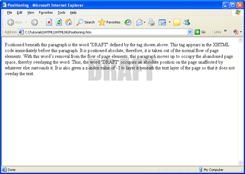
Figure 6-35.
Absolute positioning of content beneath the text layer of a page.
The text layer of a page always has a z-index value of 0 (zero). Therefore, the <div> tag is given a z-index value of -1 value in order to layer the word beneath the text layer so that it does not block out the text.
When a page element is positioned absolute and is given left and top property settings, it is taken out of the normal flow of page elements. In the above example, the <div> tag is removed from its normal physical location preceding the paragraph. The paragraph, then, moves up to occupy the abandoned position of the <div> tag. This means that it does not really matter where an element that is positioned absolute is coded on the page. Irrespective of where it is physically coded it is still positioned in relation to the top-left corner of the page. The only case where its coded position matters is when the element is positioned only by its left (but not its top) property. If it is not repositioned vertically, it stays in its coded position.
In some cases, the container for an absolute positioned element may be something other than the Web page itself or <body> tag. In the example below, a <div> serves as a container for a smaller red <div> that is positioned absolute.
<p>Paragraph above container...</p><div id="container" style="position:relative;height:200px;width:300px;border:solid 3px black;"><div id="box" style="position:absolute;height:80px;background-color:red;width:80px"></div></div><p>Paragraph below container...</p>
Paragraph above container...
Paragraph below container...
The container <div> is positioned relative and therefore maintains the normal page flow between two
elements. Since the box <div> is coded inside of the container, it will be positioned absolute relative to the parent container <div>. As additional elements are added above the container, it will continue to move down the page and maintain normal page flow; however, the box will always remain positioned absolute with the container element.
Fixed Positioning - TOP
Fixed positioning is very similar to absolute positioning, with two major differences:
- Elements are always positioned absolutely relative to the browser window, no matter what type of positioning there parent element may have applied. In contrast, absolute positioned elements are positioned relative to their parent element.
- Elements that have a fixed positioning remain fixed in place as the document is scrolled by the user
Fixed positioning is useful when creating pages that include a consistent navigation system. The navigation menu can be styled to remain in place as the page scrolls, providing the user with easy to access navigational options. Fixed positioning provides a means by which web developers can use CSS to emulate a frames page.
Determining Positional Locations of Page Elements - TOP
Since it can be difficult to determine left and top page positions relative to a lengthy, scrolling Web page, elements that are positioned in relation to one another are often placed inside another container element. This container element is positioned relative to maintain its position within the flow of page elements, and the contained elements are positioned absolute inside the container. Thus, absolute position measurements are made relative to the container rather than to the page. The container becomes the easier-to-manage coordinate system within which contained elements are precisely positioned.
A good general solution to positioning page elements in relation to one another is
-
Define and size a <div> tag to encompass the positioned elements. Position the division relative, thus locating it within the flow of page content. As content is added to or removed from the page, this division still maintains its relative position between other page elements. It moves up or down the page as page content changes.
-
Place elements to be positioned inside the division, and position them absolute<. Thus, the left and top distances for the positioned elements are always measured from the top-left corner of the division. This "local" coordinate system stays the same even if the division changes positions within the flow of page elements.
The division shown in Figure 6-36 is positioned relative to maintain its position among other XHTML elements on a page. It is displayed with a dotted border to make it visible. The enclosed squares are positioned absolute, with left and top positions measured from the top-left corner of this division.
<style>.DIV {position:relative;width:300px; height:160px; border:dotted 1}.RED {position:absolute;width:100px; height:100px; left:0px; top:0px;background-color:red; border:solid 1px white; color:white;z-index:1; text-align:right}.GREEN {position:absolute;width:100px; height:100px; left:50px; top:25px;background-color:green; border:solid 1px white; color:white;z-index:2; text-align:right}.BLUE {position:absolute;width:100px; height:100px; left:100px; top:50px;background-color:blue; border:solid 1px white; color:white;z-index:3; text-align:right}</style><div class="DIV"><span class="RED">Red </span><span class="GREEN">Green </span><span class="BLUE">Blue </span></div>Listing 6-29. Code to absolutely position elements inside a relatively positioned container.
Red Green BlueFigure 6-36. Absolute positioning inside a container positioned relative.
The advantage of using this strategy is that the container division can be moved to any location on the page and its contained elements still maintain their absolute positions within the division. It is not necessary to recalculate their positions since they are always relative to the top-left corner of the container division.
The following code uses this same strategy to produce a drop-shadow effect. Browser output is shown in Figure 6-37.
<style type="text/css">div#CONTAIN {position:relative;height:45px; width:180px; border:dotted 1px}div#BLACK {position:absolute;left:0px; top:0px; z-index:2; font-family:impact; font-size:24pt; color:black}div#SILVER {position:absolute;left:+5px; top:+5px; z-index:1; font-family:impact; font-size:24pt; color:silver}</style><div id="CONTAIN"><div id="SILVER">Drop Shadow</div><div id="BLACK">Drop Shadow</div></div>Listing 6-30. Code to create a drop-shadow effect.
Drop ShadowDrop ShadowListing 6-37. Absolute positioning of elements inside a container positioned relative.
An encompassing division (positioned relative within the flow of page content) contains the two layered elements to be positioned. The container division is given a dashed border to show its size and position. The words and shadow positions can be easily determined by their distances from the top-left corner of this division. The words are positioned at the very top-left corner of the division (left:0px; top:0px); the shadow is offset 5 pixels from the words (left:+5px; top:+5px). The words are given a z-index value larger than the shadow to layer them on top.
When enclosing positioned content inside a division you normally need to set the width and height properties of the division. A positioned division has a default width that spans the width of its container -- the width of the Web page if its container element is the <body> tag. You may wish to set the division width only large enough to enclose its contained elements as is done for the above drop shadow effect. A positioned division also has a default height of 0 pixels irrespective of its content. Therefore, you will need to set its height large enough to reserve vertical page space for displaying its enclosed content.
When elements are positioned, they take a shrink-to-fit behavior. In other words, the <div> element only expand enough to accommodate the content contained within. In addition to the CSS height and width properties, the top, bottom, left, and right offset properties can affect dimensions of the element. If both top and bottom are specified on an absolutely positioned element, height is implied. Likewise, if both left and right offset properties are applied, width is implied.
CSS Page Layout - TOP
In addition to formatting text, page colors, and element positioning, CSS can also be used to configure the layout of a Web page. CSS layout is becoming more popular despite early problems with lack of browser support and continued use of traditional layout methods such as Frames and Tables. A CSS layout has many advantages over traditional page layout techniques. When CSS is used to configure the page layout in addition to formatting text and colors, the following advantages of using CSS are enhanced:
- Style is Separate from Structure
- Smaller HTML files
- Easier Site Maintenance
- Enhanced Accessibility
- Increased Page Layout Control
- Support of the Semantic Web
A crucial building block of CSS positioning is the CSS Box Model. The CSS Box Model describes how the browser measures properties such as width, padding, borders, and margins. Under the CSS box model, each page element is considered to a rectangular box. This box consists of a content area surrounded by padding, a border, and margins. The content area consists of a combination of text, graphics, or other Web page elements. The visible width of the element on the page is the total of the content width, the padding width, and the border width. The padding area is between the content and the border. The default padding is zero. The border area is between the padding and the margin. The default border has a value of zero and does not display. The margin determines the empty space between the element and any adjacent elements. Figure 6-38 illustrates a typical CSS box model.
Figure 6-38.
Margins, padding, and borders surrounding page elements.
Creating a Simple Layout Using CSS - TOP
Figure 6-39 shows a simply page using CSS to control the page layout. Notice that the page consists of four containers or boxes: wrapper, heading, content, and footer. The wrapper or container is used to contain the page. All page elements are coded within the wrapper. The heading is used to code a heading for the page. Here a level 1 heading is used to format the name of the Web page. The heading container might also contain a company logo. The content box contains the main contents of the page. This can include any XHTML element (<p>, <img/>, <div>,<h1>). Finally, the footer is used to contain footer information. Here copyright information is included.
World Wide Web Products
"Sed ut perspiciatis unde omnis iste natus error sit voluptatem accusantium doloremque laudantium, totam rem aperiam, eaque ipsa quae ab illo inventore veritatis et quasi architecto beatae vitae dicta sunt explicabo. Nemo enim ipsam voluptatem quia voluptas sit aspernatur aut odit aut fugit, sed quia consequuntur magni dolores eos qui ratione voluptatem sequi nesciunt. Neque porro quisquam est, qui dolorem ipsum quia dolor sit amet, consectetur, adipisci velit, sed quia non numquam eius modi tempora incidunt ut labore et dolore magnam aliquam quaerat voluptatem. Ut enim ad minima veniam, quis nostrum exercitationem ullam corporis suscipit laboriosam, nisi ut aliquid ex ea commodi consequatur? Quis autem vel eum iure reprehenderit qui in ea voluptate velit esse quam nihil molestiae consequatur, vel illum qui dolorem eum fugiat quo voluptas nulla pariatur?"
"Sed ut perspiciatis unde omnis iste natus error sit voluptatem accusantium doloremque laudantium, totam rem aperiam, eaque ipsa quae ab illo inventore veritatis et quasi architecto beatae vitae dicta sunt explicabo. Nemo enim ipsam voluptatem quia voluptas sit aspernatur aut odit aut fugit, sed quia consequuntur magni dolores eos qui ratione voluptatem sequi nesciunt. Neque porro quisquam est, qui dolorem ipsum quia dolor sit amet, consectetur, adipisci velit, sed quia non numquam eius modi tempora incidunt ut labore et dolore magnam aliquam quaerat voluptatem. Ut enim ad minima veniam, quis nostrum exercitationem ullam corporis suscipit laboriosam, nisi ut aliquid ex ea commodi consequatur? Quis autem vel eum iure reprehenderit qui in ea voluptate velit esse quam nihil molestiae consequatur, vel illum qui dolorem eum fugiat quo voluptas nulla pariatur?"
Figure 6-39. Simple CSS page Layout.
The code for the simple layout is show below:
<!DOCTYPE html><html lang="en"><head><title>Positioning</title></head><body><div id="wrapper" style="border:solid 2px black;width:auto"><div id="heading" style="border:solid 3px black;width:800px;padding:10px;margin:10px"><h1> World Wide Web Products</h1></div><div id="content" style="border:solid 3px black;width:800px;padding:10px;margin:10px"><p>"Sed ut perspiciatis unde omnis iste natus error sit voluptatem accusantium doloremque laudantium, totam rem aperiam, eaque ipsa quae ab illo inventore veritatis et quasi architecto beatae vitae dicta sunt explicabo. Nemo enim ipsam voluptatem quia voluptas sit aspernatur aut odit aut fugit, sed quia consequuntur magni dolores eos qui ratione voluptatem sequi nesciunt.Neque porro quisquam est, qui dolorem ipsum quia dolor sit amet, consectetur, adipisci velit, sed quia non numquam eius modi tempora incidunt ut labore et dolore magnam aliquam quaerat voluptatem. Ut enim ad minima veniam, quis nostrum exercitationem ullam corporis suscipit laboriosam, nisi ut aliquid ex ea commodi consequatur? Quis autem vel eum iure reprehenderit qui in ea voluptate velit esse quam nihil molestiae consequatur, vel illum qui dolorem eum fugiat quo voluptas nulla pariatur?"</p><p>"Sed ut perspiciatis unde omnis iste natus error sit voluptatem accusantium doloremque laudantium, totam rem aperiam, eaque ipsa quae ab illo inventore veritatis et quasi architecto beatae vitae dicta sunt explicabo. Nemo enim ipsam voluptatem quia voluptas sit aspernatur aut odit aut fugit, sed quia consequuntur magni dolores eos qui ratione voluptatem sequi nesciunt.Neque porro quisquam est, qui dolorem ipsum quia dolor sit amet, consectetur, adipisci velit, sed quia non numquam eius modi tempora incidunt ut labore et dolore magnam aliquam quaerat voluptatem. Ut enim ad minima veniam, quis nostrum exercitationem ullam corporis suscipit laboriosam, nisi ut aliquid ex ea commodi consequatur? Quis autem vel eum iure reprehenderit qui in ea voluptate velit esse quam nihil molestiae consequatur, vel illum qui dolorem eum fugiat quo voluptas nulla pariatur?"</p></div><div id="footer" style="border:solid 3px black;width:800px; padding:10px;margin:10px"><p>© 2010 WWW Products</p></div></div></body></html>
The CSS for the simple layout is described below:
- Wrapper Container - #wrapper {border:solid 2px black;width:auto}
- The wrapper or container division is configured with a solid, 2px, and black border. It can be helpful to initially display borders around the divisions to help with layout. The border can be removed on the final display. The width of the wrapper is set to auto. By default, width and height properties have an auto value. The meaning of the auto keyword changes depending on the type of element that it is applied to. When used with the <div> element, the element spans all the horizontal space available to it and expands vertically to accomodate any content inside of it, including text, images, and other divisions. In this example, the width of the wrapper horizontally spans the width of the page.
- Heading Container - #heading {border:solid 3px black; width:800px;padding:10px;margin:10px}
- The heading <div> is the first container coded in the wrapper. It is given a 3px, solid, and black border. The heading is assigned a width of 800px. 10 pixels of padding is applied to the container and it is assigned a 10px margin.
- Content Container - #content {border:solid 3px black; width:800px;padding:10px;margin:10px}
- The content container appears below the heading container. Like the heading container, it is given a width of 800px, padding of 10px, and a margin of 10px.
- Footer Container - #footer {border:solid 3px black; width:800px; padding:10px;margin:10px}
- The footer container appears below the content container. Like the heading and content containers, it is given a width of 800px, padding of 10px, and a margin of 10px.
Since all containers are positioned static, they follow the normal page flow. In other words, they appear in the order in which they are coded - heading, content, and footer.
Creating a Two-Column Layout Using CSS - TOP
Figure 6-40 shows a two-column layout using CSS to control the page layout. Notice that the page consists of three containers or boxes: wrapper, menu, and content. The wrapper or container is used to contain the page. All page elements are coded within the wrapper. The menu is used to code a menu for the page. Here, a level 2 heading is used to format the menu heading. A list structure is used to create the three menu items. The menu container is set to float left. The content box contains the main contents of the page. This can include any XHTML element (<p>, <img/>, <div>, <h1>). The content container wraps around the right side of the floating menu container to create a two-column effect.
Content
"Sed ut perspiciatis unde omnis iste natus error sit voluptatem accusantium doloremque laudantium, totam rem aperiam, eaque ipsa quae ab illo inventore veritatis et quasi architecto beatae vitae dicta sunt explicabo. Nemo enim ipsam voluptatem quia voluptas sit aspernatur aut odit aut fugit, sed quia consequuntur magni dolores eos qui ratione voluptatem sequi nesciunt. Neque porro quisquam est, qui dolorem ipsum quia dolor sit amet, consectetur, adipisci velit, sed quia non numquam eius modi tempora incidunt ut labore et dolore magnam aliquam quaerat voluptatem. Ut enim ad minima veniam, quis nostrum exercitationem ullam corporis suscipit laboriosam, nisi ut aliquid ex ea commodi consequatur? Quis autem vel eum iure reprehenderit qui in ea voluptate velit esse quam nihil molestiae consequatur, vel illum qui dolorem eum fugiat quo voluptas nulla pariatur?"
"Sed ut perspiciatis unde omnis iste natus error sit voluptatem accusantium doloremque laudantium, totam rem aperiam, eaque ipsa quae ab illo inventore veritatis et quasi architecto beatae vitae dicta sunt explicabo. Nemo enim ipsam voluptatem quia voluptas sit aspernatur aut odit aut fugit, sed quia consequuntur magni dolores eos qui ratione voluptatem sequi nesciunt. Neque porro quisquam est, qui dolorem ipsum quia dolor sit amet, consectetur, adipisci velit, sed quia non numquam eius modi tempora incidunt ut labore et dolore magnam aliquam quaerat voluptatem. Ut enim ad minima veniam, quis nostrum exercitationem ullam corporis suscipit laboriosam, nisi ut aliquid ex ea commodi consequatur? Quis autem vel eum iure reprehenderit qui in ea voluptate velit esse quam nihil molestiae consequatur, vel illum qui dolorem eum fugiat quo voluptas nulla pariatur?"
Figure 6-40. Two-Column CSS page Layout.
The code for the two-column layout is show below:
<div id="wrapper" style="border:solid 2px black;width:auto"><div id="menu" style="border:solid 3px black;width:150px;height:370px;padding:10px;margin:10px;float:left"><h2>Menu</h2><ul><li>Menu Item 1</li><li>Menu Item 2</li><li>Menu Item 3</li></ul></div><div id="content" style="border:solid 3px black;padding:10px;margin:10px;width:650px;margin-left:190px"><h2>Content</h2><p>"Sed ut perspiciatis unde omnis iste natus error sit voluptatem accusantium doloremque laudantium, totam rem aperiam, eaque ipsa quae ab illo inventore veritatis et quasi architecto beatae vitae dicta sunt explicabo. Nemo enim ipsam voluptatem quia voluptas sit aspernatur aut odit aut fugit, sed quia consequuntur magni dolores eos qui ratione voluptatem sequi nesciunt. Neque porro quisquam est, qui dolorem ipsum quia dolor sit amet, consectetur, adipisci velit, sed quia non numquam eius modi tempora incidunt ut labore et dolore magnam aliquam quaerat voluptatem. Ut enim ad minima veniam, quis nostrum exercitationem ullam corporis suscipit laboriosam, nisi ut aliquid ex ea commodi consequatur? Quis autem vel eum iure reprehenderit qui in ea voluptate velit esse quam nihil molestiae consequatur, vel illum qui dolorem eum fugiat quo voluptas nulla pariatur?"</p><p>"Sed ut perspiciatis unde omnis iste natus error sit voluptatem accusantium doloremque laudantium, totam rem aperiam, eaque ipsa quae ab illo inventore veritatis et quasi architecto beatae vitae dicta sunt explicabo. Nemo enim ipsam voluptatem quia voluptas sit aspernatur aut odit aut fugit, sed quia consequuntur magni dolores eos qui ratione voluptatem sequi nesciunt. Neque porro quisquam est, qui dolorem ipsum quia dolor sit amet, consectetur, adipisci velit, sed quia non numquam eius modi tempora incidunt ut labore et dolore magnam aliquam quaerat voluptatem. Ut enim ad minima veniam, quis nostrum exercitationem ullam corporis suscipit laboriosam, nisi ut aliquid ex ea commodi consequatur? Quis autem vel eum iure reprehenderit qui in ea voluptate velit esse quam nihil molestiae consequatur, vel illum qui dolorem eum fugiat quo voluptas nulla pariatur?"</p></div><div id="footer" style="border:solid 3px black;padding:10px;margin:10px;width:auto;clear:left"><p>© 2010 WWW Products</p></div></div>
The CSS for the two-column layout is described below:
- Wrapper Container - #wrapper {border:solid 2px black;width:auto}
- The wrapper or container division is configured with a solid, 2px, and black border. It can be helpful to initially display borders around the divisions to help with layout. The border can be removed on the final display. The width of the wrapper is set to auto. By default, width and height properties have an auto value. The meaning of the auto keyword changes depending on the type of element that it is applied to. When used with the <div> element, the element spans all the horizontal space available to it and expands vertically to accommodate any content inside of it, including text, images, and other divisions. In this example, the width of the wrapper horizontally spans the width of the page.
- Menu Container - #menu {border:solid 3px black;width:150px;height:370px;padding:10px;margin:10px;float:left}
- Like the wrapper container, the menu is initially given a border set to solid, 3px, and black in color. This border can also be removed on the final display. The key to the two-column layout design is the float property. The menu container is set to float to the left. The width of the container is set to a value of 150 pixels. It is given 10 pixels of padding (white space between the menu border and any content coded within the container), and a 10 pixel margin surrounding the menu container. The height of the menu is set to 370 pixels so that it is the same height as the content container.
- Content Container - #content {border:solid 3px black;padding:10px;margin:10px;width:650px;margin-left:190px}
- The content container wraps around the right side of the floating menu. It has a solid, 3px, and black border. The width of the content <div> is set to 650px. Since the menu container is 150 px wide with 10px (left and right margins) and 10px pixels of padding (left and right padding), the content container is given a left margin of 190px (150px + 20px + 20px). This margin value should be greater than or equal to the width (including any margin or padding values) to provide the look of a two-column layout.
- Footer Container - #footer {border:solid 3px black;padding:10px;margin:10px;width:auto;clear:left}
- The footer container appears below the menu and content containers. It has a solid, 3px, and black border. The width of the footer <div> is set to auto so that it spans the width of the wrapper. The clear property is also applied to cancel the effects of the floating menu container. The clear property is set to left so that the footer aligns with the left margin and does not attempt to wrap around the menu. When the float property is applied to an element, all subsequent elements will attempt to wrap around the floating element. The clear property cancels out this effect.
CSS Layout Design Issues - TOP
Using CSS for page layout can be challenging. It requires lots of practice and patience. One of the major problems with CSS layout is that even modern browsers implement CSS in different ways. A CSS design may look perfect in Firefox, but the display could be drastically different in Internet Explorer. Testing CSS layout using multiple browsers is crucial. Expect that pages will display slightly different in various browsers. Your goal should be to design a page that looks best on the most commonly used browsers (currently Internet Explorer and Firefox) and displays acceptably well on other less common browsers.
It is also helpful to be able to debug CSS documents. Some common debugging techniques include:
- Manually check your CSS for Syntax Errors
- Use the CSS validation Tool at http://jigsaw.w3.org/css-validator/ to check CSS syntax
- Configure temporary background colors and borders for page elements. This will help you easily identify page elements and locate possible problems associated with them
- Use CSS comments to block sections of CSS until the coding problem is located