This chapter introduces the fundamentals of HTML document styling, explaining how to control the appearance and layout of web page elements. You will learn how styling can be applied through traditional HTML attributes and, more importantly, through Cascading Style Sheets (CSS), the modern standard for formatting web content. Topics include adjusting visual properties such as colors, sizes, alignment, spacing, and positioning to create more attractive and professional web pages.
The chapter also explores the three primary methods of applying CSS: inline styles, embedded style sheets, and linked style sheets. You will learn when each method is appropriate, how styles cascade and inherit throughout a website, and how CSS can be organized for efficiency and consistency across multiple pages. By the end of the chapter, you will understand the basics of applying, managing, and validating styles to enhance both the design and maintainability of your web projects.
3.1 - Applying Styles
Applying Styles
A large part of HTML5 coding involves the application of styling characteristics to page elements. Styling includes the positioning of elements on the page along with such visual appearances as font faces, sizes, colors, and other display characteristics. There are two basic ways to control the layout and appearance of page elements: through tag attributes and through style sheets. These methods are described briefly here and are elaborated and illustrated throughout the tutorial.
Formatting styles can be applied through attributes coded within HTML tags. Particular tags have particular attributes that are specific to them and that control the appearance of whatever page content they contain. As a quick example, a horizontal rule is displayed across the page wherever the <hr> tag is coded. This tag produces the following line that is often used to separate paragraph level content on page.
Figure 3-1.
Default horizontal rule.
The above line is the default display of the tag. It can take on a different appearance by coding attributes inside the tag. The size attribute controls the depth of the line; the width attribute gives its length; the color attribute sets its color, and the align attribute specifies its horizontal position on the line (to the left of the page, to the right of the page, or centered on the page).
Tag attributes are coded in the general format attribute="value". The attribute is named and a quoted value is supplied for its setting. Below is an <hr> tag coded with four attributes to control its displayed appearance as shown in Figure 3-2.
Figure 3-2.
Red horizontal rule 50% of the width of the Web page.
The line is 10 pixels in height (size="10"), 50% of the width of the browser window (width="50%"), red in color (color="red"), and centered horizontally on the page (align="center"). Thus, attribute values give styling characteristics to display the rule differently from its normal default style. As you proceed through this tutorial, particular attributes associated with particular tags are presented as styling options for those tags.
Under HTML5 standards, most of the styling attributes of tags have been deprecated. This means that the attributes are still recognized in modern browsers, but the recommendation is to abandon their use in favor of other styling methods. The movement is towards use of Cascading Style Sheets, rather than attributes, to apply styling to HTML5 elements.
The preferred way to apply styling to page elements is with Cascading Style Sheets (CSS). A style sheet is a set of style properties and accompanying style values that describe the appearance of HTML5 elements to which they are applied. There are three methods of creating style sheets: an in-line style sheet appears inside the tag to which its style declarations apply; an embedded style sheet is a separate style section of a Web page which applies its styles to all designated tags on a page; and a linked style sheet is an external document containing style settings that apply to all pages that link to it.
in-line style sheet is coded inside a tag to apply styling to that particular tag. It is coded in the general format shown in Listing 3-1.
<tag style="property: value [; Property:value] ..."> </tag>
Listing 3-1. General format for an in-line style sheet.
One or more property:value pairs give style settings within a style attribute coded in the tag. Multiple style properties settings are separated from each other with semicolons, and spaces can be included between the settings to help with readability.
To some extent, the properties and values that can be coded for a tag depend on the particular tag being styled. For instance, style settings for a horizontal rule can include height, width, color, and text-align properties, identical in effect to the deprecated size, width, color, and align attributes they replace. These properties are coded as an in-line style sheet as shown in Figure 3-3. A style attribute appears inside the <hr> tag and specifies a set of properties and values to apply to the tag when it is displayed in the browser.
Listing 3-2. Horizontal rule created with an in-line style sheet.
Figure 3-3.
Horizontal rule created with an in-line style sheet.
When applied as in-line style sheets, the properties and values pertain only to the tag in which they are coded. This means that if there are several <hr> tags on a page, each would need to include the same in-line style sheet to share the same style. This may not present a problem with only a few tags; however, with many tags it can be tedious and error-prone to code the same style sheet in all of the individual tags. A way is needed to declare style settings one time and to share these settings among multiple tags.
To avoid duplicate coding of in-line style sheets, an embedded style sheet can be used. An embedded style sheet is defined within a <style> tag, normally coded in the <head> section of the page. Within this <style> section is a list of tag names, called selectors, to which style declarations (properties and values) are assigned. Once these declarations are made, they are automatically applied to the identified tags wherever they are located on the page.
Older HTML languages required the additional <style> tag attribute type="text/css" to be included in order to specify the type of content surrounded by <style> tags; however, in HTML5 the type automatically defaults to "text/css" when omitted, making it unnecessary to include. The general format for the <style> section of a document is shown in Listing 3-3.
Listing 3-3. General format for embedded style sheet.
A selector is a tag name (without the enclosing < and > symbols). Style properties and values for the tag are enclosed within a list of style declarations, separated by semicolons, and all enclosed within a pair of braces { }. For example, the following code specifies style declarations for the <hr>tag by supplying the same style settings as in the previous in-line style sheet.
Listing 3-4. Application of an embedded style sheet.
The hr selector is associated with four property:value declarations to style a horizontal rule. Once these styles are defined within an embedded style sheet, they are applied automatically wherever the browser encounters an <hr> tag in the document. It is not necessary to code separate in-line style sheets within each and every <hr> tag. The tag itself carries the styling described in the embedded style sheet.
Although shown above with a single selector for the <hr> tag, an embedded style sheet can contain any number of entries depending on how many different tags are to be styled. The example is also coded on a single line. Many Web page authors prefer to code property:value settings on separate lines for ease of reading and editing as shown in Listing 3-5.
Listing 3-5. Alternate coding for an embedded style sheet.
The typed format of style sheet entries does not affect their styling. Like HTML code, style sheet code is in free format: it can be arranged in any fashion as long as the codes and punctuation are correct.
Whether to employ an embedded style sheet or multiple in-line style sheets is a matter of coding efficiencies and personal choice. Normally, if a style is applied to multiple occurrences of a tag it involves less coding and fewer errors to code an embedded style sheet by declaring the style one time for sharing by all designated tags. One the other hand, if a style is applied only once to a single tag, then there is convenience in coding an in-line style sheet for that one particular tag. Later, strategies are presented for dealing with various styling situations.
If your Web site contains multiple pages,then a third style sheet alternative is probably the best solution. It permits you to conveniently apply the same styles to all pages without having to duplicate in-line or embedded style sheets on each page.
A linked style sheet is a separate document containing property:value settings in the same format as an embedded style sheet. The only difference is that the linked document does not include <style> tags surrounding the entries. For example, a linked style sheet document containing specifications for the <hr> tag described above includes the entries shown in Listing 3-6.
This separate document is created with a text editor and saved as a standard text file, usually with the file extension .css to identify it as a style sheet document. It is a common practice to save the document under the name Stylesheet.css in the same directory as the Web pages to which it applies.
A linked style sheet document contains style settings that are applicable to all pages of the Web site. Therefore, all pages that use the style sheet must "link" to it to make the styles available to those pages. This linkage occurs with a <link> tag coded in the <head> section of the page. The general format for the <link> tag is shown in Listing 3-7.
<linkhref="url"rel="stylesheet">
Listing 3-7. General format for <link> tag.
The href (hypertext reference) attribute gives the location of the linked style sheet. If the style sheet appears in the same directory as the Web page to which it applies, then this entry is simply the name of that document. The rel attribute specifies the relationship of the external document to the current page (always "stylesheet"). Just as with the <style> tag, the attribute type="text/css" historically was necessary to include in order to tell the browser what type of resources was being linked. Under HTML5, when the type tag is omitted, it automatically defaults to "text/css", making its inclusion unnecessary.
If you have a style sheet document named Stylesheet.css that is located in the same folder as your Web page. You link the Web page to this document using the following HTML code.
Listing 3-8. Linking a Web page to a linked style sheet.
Now the Web page has available to it all of the style settings included in the Stylesheet.css document. This linked style sheet can serve to replace embedded or in-line style sheets that otherwise would appear on individual Web pages. As in the case with embedded style sheets, any tags identified with selectors in a linked style sheet carry with them the declared styles.
It is usually a good idea to place comments in your CSS document to describe its various sections. Comments are general descriptions or explanations of CSS code. These serve as useful reminders of the purposes or contents of sections of code when you or someone else returns at a later time to edit the document.
CSS comments are coded between a /* and */. Comments can span multiple lines. The example below demonstrates the use of CSS comments.
/* Set Page Font Family */

body {font-family:arial}

/* You can also comment an entire block during testing

.comment {font-weight:bold}

*/
Listing 3-9. Examples of comments that span multiple lines.
Besides their use for including comments in a CSS document, comment tags can be used to temporarily suspend browser display of a section of code. This purpose is often useful in "debugging" your page, that is, in trying to discover errors by selectively removing sections of code from display until the problem is isolated.
It would not be uncommon to employ all three types of style sheets for a single Web page. A linked style sheet would contain styles that are common to all Web pages; an embedded style sheet would contains styles that are pertinent to the particular page; and in-line style sheets would apply to individual tags for which common styling is not needed. The browser handles these multiple style sheets in the following fashion.
First, any linked style sheets are applied to the identified tag selectors on the page.
Second, any embedded style sheets are applied. If the same tag selectors appear in both the linked and embedded style sheets then embedded styles override or augment linked styles.
Third, any in-line style sheets are applied. If these settings pertain to the same tags that appear in either linked or embedded style sheets, then in-line styles override or augment both linked and embedded styles.
The general principle in force is that any lower-level style setting takes precedence over an equivalent higher-level style setting. In-line style sheets take precedence over embedded style sheets which, in turn, take precedence over linked style sheets.
Assume, for example, that a linked style sheet contains the following style declarations for horizontal rules.
Listing 3-10. Linked style sheet for horizontal rules.
All pages that link to this style sheet display horizontal rules in this style. Now assume that one particular page needs differently styled rules, say, ones that are blue rather than red. An embedded style sheet is coded on this single page in order to override the color declaration in the linked style sheet:
<style>
    hr {color:blue;}
</style>
Listing 3-11. Embedded style sheet for horizontal rules.
All horizontal rules on this page are blue; however, they retain the height, width, and text-align properties from the linked style sheet. Tags on this page inherit the properties of the linked style sheet unless modified by the embedded style sheet.
Assume further that one particular horizontal rule on this page needs to be green and extend to the width of the page. An in-line style sheet is added to this particular rule.
<hr style="color:green; width:100%;">
Listing 3-12. In-line style sheet for a horizontal rule.
Green styling overrides the blue color that is inherited from the embedded style sheet, and a width of 100% overrides the 50% width inherited from the linked style sheet. This particular rule, however, retains its 1 pixel height and centered alignment inherited from the linked style sheet.
Style inheritance is what makes style sheets "cascading." Linked styles are inherited by, or cascade across, all Web pages that link to them; embedded styles are inherited by, or cascade across, an entire Web page containing a <style> section; and in-line styles are inherited by, or cascade across, individual tags containing in-line style sheets.
Throughout these tutorials, style properties and values are introduced and illustrated as in-line style sheets with discussion on how they can be elevated to embedded on linked style sheets for wider application. By the end, you should be at ease with style sheets and with the many ways they offer to design Web pages to meet your most exacting design requirements.
The W3C maintains a free CSS Validation Service available at http://jigsaw.w3.org/css-validator that can be used to validate CSS code and check it for syntax errors. The CSS validation tool can help identify code that needs to be corrected quickly and indicate which style rules a browser likely to consider valid.
Figure 3-4.
W3C CSS Validation Service.
There are three options for validating CSS.
You can enter the URL for the external or linked .css file.
When text is displayed in the browser window it spans from border to border with about a quarter of an inch margin surrounding the text on the page. You may have noticed these margins on Web pages created earlier. They are shown in the simple single-paragraph Web page in Figure 3-5.
Figure 3-5.
Web page with default margins.
In some cases, these margin settings work perfectly well. If there is a large amount of text on the page, these narrow margins make the page appear crowded look, and the appearance increases the difficulty of reading the page. Plodding through line after line of text spanning from border to border can become tiresome. A Web page is more inviting, is more readable, and is easier on the eyes if more white space appears around the text. In other cases, however, you may wish to reduce or remove default margin settings so that certain page elements appear even closer to the window borders.
Recall that the <body> tag encloses all page content that appears in the browser window. This tag can also be used to control margins around the borders of the page. The way to do this is to apply a style sheet to the <body> tag to adjust page margins.
There are five style properties that can be used to set margins around page elements. These properties specify the amount of space to leave between the outside edges of the element and any surrounding content. When applied to the <body> tag, they give the amount of white space that needs to be left around any content displayed on the page.
npx (pixels) - A pixel represents a single dot on a monitor. The number of dots per inch depends on the screen resolution. n% (percent) - A percent specifies a value relative to the current value. nem (ems) - One em is equal to the font-size for the current font. npt (points) - A point is 1/72 of an inch. auto
Figure 3-6. Margin properties and values.
The margin property sets the same margin width around all sides of the element; the margin-top, margin-right, margin-bottom, and margin-left properties set margins individually for each of the four sides. The auto setting causes margins to revert to their default widths when overriding previous margin settings.
The margin properties, like various other style properties, require a measurement value. In most cases, you are required to specify whether the measurement is in pixels (px), a percentage (%) of the width of the browser window, an em (em), or point (pt). If you do not specify the measurement type, then pixels are assumed.
Applying Margins with an In-Line Style Sheet - TOP
You can set margins surrounding the content on a Web page by applying a style sheet to the <body> tag. For example, the following in-line style sheet sets a 25-pixel margin around the entire page by using the margin property, and by specifying 25 pixels of white space between the contents on the page and the borders of the browser window.
<body style="margin:25px;"><p> This Web page displays a paragraph of text within margin settings of
25 pixels surrounding the page. These margins are produced by an in-line
style sheet applied to the body of the document. Lines of text extend
between and are word-wrapped within these left, right, top, and bottom
margin settings.</p></body>
Listing 3-13. Setting the margins surrounding a Web page with an in-line style sheet.
This styling produces the page display shown in Figure 3-7. The text paragraph appears less crowded than in Figure 3-5 which makes it a more inviting read. Shortening the lines makes the text more readable as well.
Figure 3-7.
Web page with 25-pixel margins surrounding the page.
Applying Margins with an Embedded Style Sheet - TOP
In the above example, the <body> tag includes an in-line style sheet to set margins for this particular page. Instead, you can code an embedded style sheet to produce the same results. The following <style> entry supplies a body selector along with a margin style property and value to apply to this tag.
<head><title> Page Margins</title><style>
body {margin:25px;}
</style></head><body><p> This Web page displays a paragraph of text within margin settings of
25 pixels surrounding the page. These margins are produced by an embedded
style sheet applied to the body of the document. Lines of text extend
between and are word-wrapped within these left, right, top, and bottom
margin settings.</p></body>
Listing 3-14. Setting the margins surrounding a Web page with an embedded style sheet.
The <body> tag, through the body selector, takes on the 25-pixel margin setting without having to code a style sheet inside the tag itself. Furthermore, by using an embedded style sheet, style settings are isolated within a separate section of the page which allows styles to be easily located and changed if necessary. In fact, your first instinct, should be to create an embedded style sheet adjusted to in-line or linked style sheets as situations dictate.
If you have a Web site with multiple pages and all pages need to share the same body margins, then a linked style sheet should be used. Place body styling in this separate document and link to it from all pages to which the style should apply.
The following code shows a Stylesheet.css document in which margin styling for the <body> tag is specified. This document appears in the same Web directory as the pages which share this style.
    Stylesheet.css

        body {margin:25px;}
Listing 3-15. Linked style sheet document.
Once this style sheet document has been created any Web page can apply its margin settings by linking to it. Code to adopt this linked style sheet is shown below.
In the above examples, the margin property is applied to set the same margin widths surrounding all four side of the page. Instead, you can selectively apply different widths to each of the sides by using individual margin properties. In the following embedded style sheet these different margin settings are applied to a page.
    <style>
      body {margin-top:50px; margin-left:30px; margin-right:30px;
            margin-bottom:50px;}
    </style>
Listing 3-17. Setting individual margins surrounding a Web page with an embedded style sheet.
Note that the properties can appear in any order without affecting their application. Be sure that property:value pairs are connected with a colon (:) and that declarations are separated with semicolons (;).
The single margin property also provides a quick way to specify individual margins. The previous example of:
body {margin-top:50px; margin-left:30px; margin-right:30px; margin-bottom:50px;}
Could have been written using just the margin property in the following way:
body { margin: 50px 30px 50px 30px; }
With this shortcut method the order of values is important. Each length corresponds to the top, right, bottom, and left margins, in that order. Providing the margin with just two values also provides a neat shortcut. The previous code can further be reduced simply to:
body { margin: 50px 30px; }
Here, the top and bottom margins will have a length of 50px, and the left and right margins will have a length of 30px. Again, the order matters for this shortcut to correctly work.
It was mentioned previously that multiple <br> tags can be used to increase the amount of vertical spacing on a page. Each <br> tag beyond the one used to end a line of text produces an additional blank line down the page.
This same effect can be achieved with margin-top and margin-bottom style settings. By specifying these margin widths at the top and bottom of a text block, the given number of pixels of blank space are inserted before and after the text, and produce an effect similar to inserting blank lines. For instance, the following code inserts additional spacing before and after an indented paragraph by increasing its top and bottom margins with an in-line style sheet. The effect is the same as shown previously for a blockquoted paragraph offset with additional <br> tags. Browser output is shown in Figure 3-8.
<p>Here is a tale about Mary and a pesky little lamb which followed her
anywhere and everywhere she went.</p><p style="margin-left:40px; margin-right:40px;
margin-top:50px; margin-bottom:50px;">
Mary had a little lamb,<br>
Its fleece was white as snow;<br>
And everywhere that Mary went,<br>
The lamb was sure to go.<br></p><p>Mary had an awkward social life. It's awfully difficult to date with sheep
trailing around after you all the time.</p>
Listing 3-18. Setting vertical margins with an in-line style sheet.
Figure 3-8.
Using margin settings to increase vertical spacing.
While it is possible to use either multiple <br> tags or extended margin settings to produce vertical spacing, HTML5 guidelines specify that the tag should only be used to provide line breaks among content, not simply to generate extra blank vertical space. Moreover, greater pixel precision is gained by applying margin-top and margin-bottom styles.
As you encounter additional tags throughout these tutorials, keep in mind that they can be assigned margin properties to adjust the amount of space between their contents and surrounding elements on the page. Margin settings are one of the main techniques used to reduce the crowding of content on a Web page. There will be a recurring need to apply margin properties to all manner of HTML tags.
Margin styles are applicable to many HTML tags, not just to the <body> tag. In fact, any container tag can take on margin settings. The <p> tag is case in point. By declaring margin, margin-top, margin-right, margin-bottom, and/or margin-left style properties for this tag, a paragraph can have its margins adjusted on all sides of the text block or on each side individually.
The following code displays three paragraphs, the middle one of which uses an in-line style sheet to set its left and right margins to 40 pixels.
<p>Here are three paragraphs. This first paragraph is formatted with a
standard paragraph tag with default style settings.</p><p style="margin-left:40px; margin-right:40px;">This second paragraph is
formatted with the style setting "margin-left:40px; margin-right:40px;" to
adjust its left and right margins to offset the paragraph from surrounding
paragraphs. This styling produces a paragraph similar in style to a
blockquote tag.</p><p>This third paragraph is coded like the first one. It is enclosed within
a standard paragraph tag containing default styles.</p>
Listing 3-19. Setting paragraph margins with an in-line style sheet.
Browser output of this coding is shown in Figure 3-9.
Figure 3-9.
Setting paragraph margins.
An in-line style sheet is used in this example since margin settings are applicable only to the single paragraph. There is no need to define an embedded style sheet or to create a linked style sheet document since this styling is not shared across all paragraphs.
Although not recognized under HTML 5 there are margin attributes, rather than margin properties, that can be used to set margin spacing for a page. These deprecated <body> attributes are listed below.
Margin settings are given by a value (n) representing the number of pixels of blank space to leave between the page content and the borders of the browser window. Settings apply individually to each of the borders (leftmargin, rightmargin, topmargin, bottonmargin), to both sides (marginwidth), or to both the top and bottom (marginheight) margins of the page. For example,
Although these deprecated <body> attributes still work in modern browsers and you are likely to encounter them on existing Web pages, you should not use them when creating your own pages. Rely instead on margin style properties using linked, embedded, or in-line style sheets.
Elements on a Web page are normally blocked at the left margin of the page or at the left margins established by their margin or margin-left style properties. It is often the case, that you may wish to change this default alignment, and align a page element at the right margin, center it horizontally on the page, or "float" the element to the left or right to permit text flow around the sides of the element.
The text-align style property permits left, center, right, or justified alignment of text within elements. Its property settings are shown in Figure 3-10.
Property
:
Values
text-align
left center right justify
Figure 3-10. Text alignment property and values.
The text-align style property is replacement for the deprecated align attribute previously used for <p>, <hn>, and <hr> tags. From this point forward, all horizontal alignment of text should be done with the text-align property.
A <p> tag surrounds a block of text which has its individual lines blocked at the left margin of the page or at the left margin established by the paragraph's margin or margin-left style setting. A text-align style can be applied to the paragraph to change this default left-alignment display.
The following code creates four paragraphs that each have an in-line style sheet to apply different text alignments. Browser display of these paragraphs is shown in Listing 3-20.
<p style="text-align:left;">
This paragraph is formatted using the style="text-align:left;" style
setting. Each line of text is blocked at the left margin of the page and
wraps at the right margin of the page. This is the default alignment
style for a paragraph.</p><p style="text-align:center;">
This paragraph is formatted using the style="text-align:center;" style
setting. Each line of wrapped text appears centered between the left and
right page margins.</p><p style="text-align:right;">
This paragraph is formatted using the style="text-align:right;" style
setting. Each wrapped line of text is aligned at the right margin of the
page.</p><p style="text-align:justify;">
This paragraph is formatted using the style="text-align:justify;" style
setting. All wrapped lines of text except the last line are expanded to reach
both left and right margins. Since the final line is not long enough to
wrap, it is not justified between the margins of the page.</p>
Listing 3-20. Setting paragraph alignments with in-line style sheets.
Figure 3-11. Various paragraph alignments displayed in browser window.
In this example, all four paragraphs have a different styling. Thus, <p> tags are styled with in-line style sheets rather than with an embedded or linked style sheet which would produce common styling for all paragraphs. Keep in mind, that text alignment which should be shared by all paragraphs on a page should appear one time only in an embedded or linked style sheet. If it is decided that all paragraphs on a page will have justified lines, then an embedded style declaration for the p selector is appropriate.
    <style>
      p {text-align:justify;}
    </style>
Listing 3-21. Setting alignment for all paragraphs with an embedded style sheet.
If it is further decided that all paragraphs on all pages of a Web site will have justified paragraphs, then this embedded style sheet can be promoted to a linked style sheet for sharing among all pages.
Text alignment styles can be applied to <hn> tags to place headings at the left, in the center, or to the right of a page. In the following example, the text-align property is applied to an <h2> heading with an in-line style sheet to center it horizontally on the page. This style property replaces the older align="center" attribute previously used to align headings.
It is normally the case that various headings used on a Web page will have common styles in order to enforce a common look for the page. Therefore, it is common practice to include heading alignment in an embedded style sheet for sharing among all like headings. The following code gives alignment styling for three heading sizes that appear on a page. Furthermore, top margins are increased to leave additional vertical blank space between the headings and preceding text.
Listing 3-23. Setting alignment styles for all headings on a page.
Although text alignment is not required for the above <h2> and <h3> tags (since left is the default alignment), these settings are included in the style sheet to make them explicit and to documentation the settings. Also, since all heading alignments appear in this embedded style sheet, any changes to heading alignments can be made at this single location for propagation across all headings on the page.
Image alignment takes place by first converting the image from an inline element to a block-level element using the CSS display property, and setting its value to block. Next, the CSS properties margin-left and margin-right styles are applied with a value set to auto. For example, coding to center an image on the page is given in the following in-line style sheet.
Image resources have an inherent width value. When margin-left and margin-right are both set to auto, the browser calculates the amount of space available, minus the width of the image, and divides it evenly between the left and right margins. For other block-level elements which have no inherent width length, you must specify a width in order to horizontally center the element.
Alternative to positioning a picture on a line by itself is to place it at the left or right margin and permit word wrap around it. The picture is said to "float" to the left or right of its accompanying text. Floating an image makes use of the float style property.
Property
:
Values
float
left right none
Figure 3-14. Float property and values.
The picture in Figure 3-15 appears at the right margin of the page (floated right). The accompanying text paragraphs wrap around the image. All styling is contained in an embedded style sheet.
Figure 3-15. A floated image.
<head><title>Floated Image</title><style>
body {margin:20px;}
p {text-align:justify;}
h2 {text-align:center;}
img {float:right; margin-left:25px;}
</style></head><body><h2>Floating Images</h2><p><img src="Stonehenge.jpg" alt="Picture of Stonehenge">
An alternative to positioning a picture on a line by itself is to place the
image at the left or right margin to permit word wrap around it. The
accompanying picture is floated to the right of the text on this page.</p><p>Remember that it is important to code the <img> tag immediately
before any text or other page elements that are to be wrapped around the
image. The image is floated at the exact location on the page at which the
<img> tag is coded. The current tag is placed at the beginning of
the first paragraph; therefore, it is floated to the right of that
paragraph.</p></body>
Listing 3-25. Code to float an image to the right of a page.
Notice that the float property is associated with the img selector in the above style sheet. It is a property of the <img> tag -- the tag to be floated -- unlike the case where an image is placed on a line by itself and is aligned by the text-align property of its enclosing <p> tag.
Images that are floated to the left or right of the page must be coded immediately before any text that wraps around the image. In the above example, the <img> tag appears at the beginning of the paragraph that wraps around the image. No line breaks appear between the image and its surrounding content. The <img> tag is assigned the float:right style property to place it at the right margin of its enclosing paragraph. It also has a margin-left: 25px style setting in order to leave white space between the picture and its surrounding text on the left.
Images can be floated to the left or right of the page; they cannot be placed in the middle of the page with word wrap around both sides. When floating images, it is usually a good idea to include additional white space between the image and its surrounding text by extending its margins. Like most style properties, the float property can be applied to many other tags. In later tutorials you will learn how to float text containers to the left or right of a page.
In the above example, all tags are styled with an embedded style sheet. Although not shown here, any other <p>, <h2>, and <img> tags appearing on this page would take on these same styling characteristics.
When images are floated to the left or right of the page, subsequent text wraps around the image. This is illustrated in Figure 3-16 where an image floats to the left so that a caption for the image wraps to its right. At the same time, a follow-on paragraph also wraps around the image.
Here is a captioned image that is floated to the left so that its caption appears on its right.
Figure 1. The Passion of the Western Mind.
This following paragraph also wraps to the right of the picture, since it is coded in the line below the caption.
Figure 3-16. A floated image with text paragraphs wrapped around it.
<p>Here is a captioned image that is floated to the left so that its caption
appears on its right. </p><div><img src="book.gif" alt="Book picture" style="float: Left(); margin-right:10px; margin-bottom:10px"><b>Figure 1. </b><br><i>The Passion of the Western Mind </i>.
</div><p>This following paragraph also wraps to the right of the picture since it
is coded next in line below the caption. </p>
Listing 3-25. Code to float an image with text paragraphs wrapped around it.
Although any subsequently coded text wraps around a floated image, you might not want this to happen. For instance, in the following display the picture caption wraps to the right of the image; however, the follow-on paragraph, rather than being wrapped around the image, appears below the image.
Here is a captioned image that is floated to the left so that its caption appears on its right.
Figure 1. The Passion of the Western Mind.
This following paragraph appears below the picture rather than wrapped in-line below the caption.
Figure 3-17. A floated image with a follow-on paragraph appearing below the image.
Code to produce this display is shown below.
<p>Here is a captioned image that is floated to the left so that its caption
appears on its right. </p><div><img src="book.gif" alt="Book picture" style="float: Left(); margin-right:10px; margin-bottom:10px"><b>Figure 1. </b><br><i>The Passion of the Western Mind </i>.
</div><p style="clear:left">This following paragraph appears below the picture
rather than wrapped in-line below the caption. </p>
Listing 3-26. Code to display text at a clear left margin.
You can ensure that a page element always appears at the left or right margin of the page by assigning it the clear style property. The value of this property can be left, right, both, or none (default).
Property
:
Values
clear
left right both none (default)
Figure 3-18. Clear style property and values.
In the previous example, the follow-on paragraph is given the in-line style setting clear:left;. This means that the paragraph is displayed on the next available line that has a "clear" left margin. Therefore, the paragraph begins on the line immediately below the picture, on the first line whose left margin is not occupied by another element.
Any time a page element is floated to the left or right of the page, you may need to ensure that a subsequent text or graphic element appears below the floated element rather than being displayed as part of the wrapped content. The value of the clear property assigned to this non-wrapped element depends on the margin location (left or right) of the floated element. The setting clear:both ensures that neither margin is occupied by a page element before displaying the so-styled element.
Previous examples of left-aligned paragraphs show them in "blocked style" wherein all lines of text are blocked at the left margin. It is common practice to indent the first line of a paragraph as a visual clue that this is the beginning of a new paragraph. First-line indention is not really necessary when paragraphs are separated by blank lines as is the case with Web pages. Still, you may wish to apply this formatting to soften the look of your pages.
The text-indent style property is used to indent the first line of a paragraph. The amount of indention is given in number of pixels or as a percentage of the width of the page.
Property
:
Values
text-indent
npx n%
Figure 3-19. Text indention property and values.
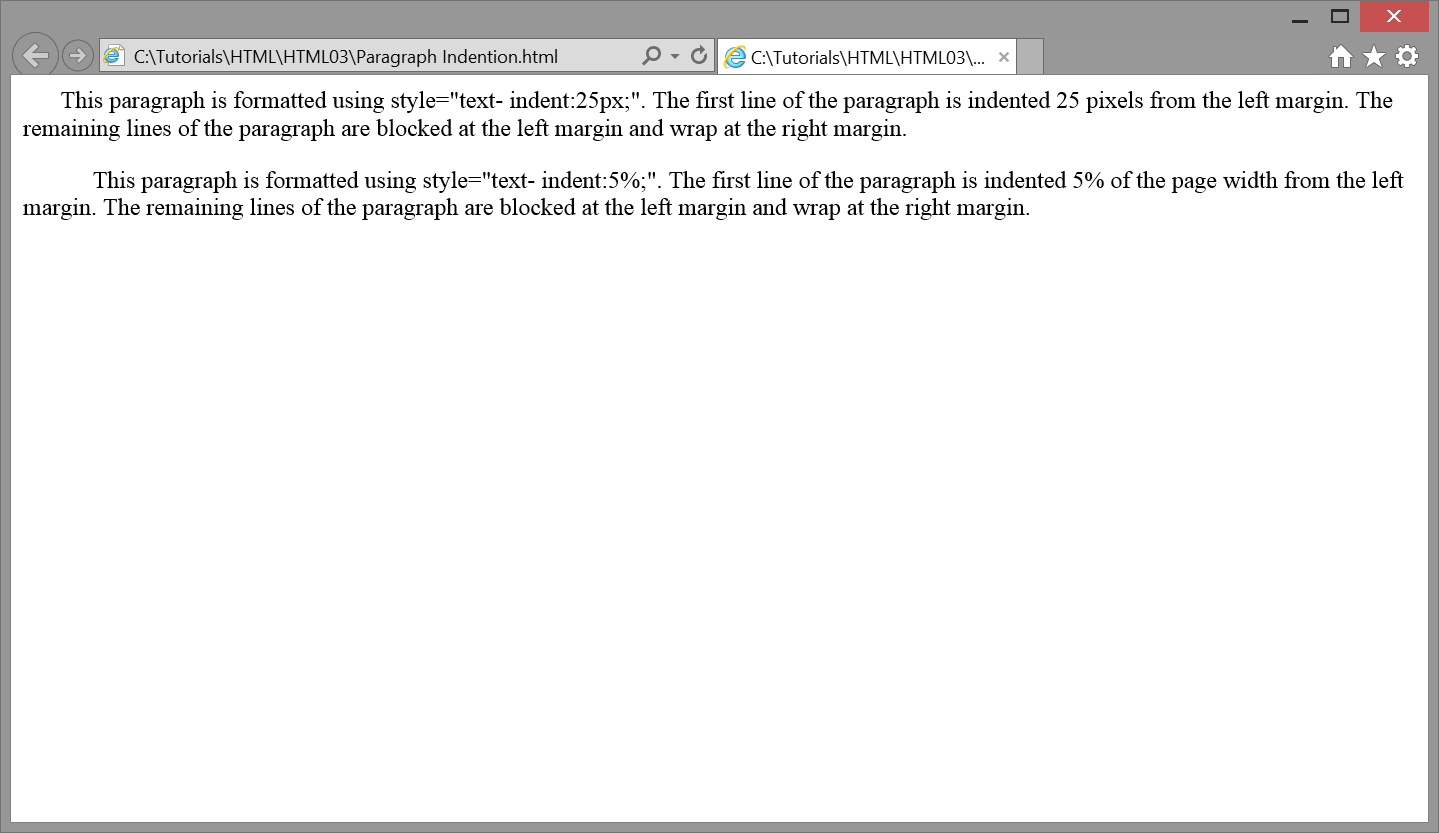
The following code indents the first line of two paragraphs: the first by 25 pixels and the second by 5% of the width of the page. Browser output is shown in Figure 3-20.
<p style="text-indent:25px;">This paragraph is formatted using style="text-
indent:25px;". The first line of the paragraph is indented 25 pixels from the
left margin. The remaining lines of the paragraph are blocked at the left
margin and wrap at the right margin.</p><p style="text-indent:5%;">This paragraph is formatted using style="text-
indent:5%;". The first line of the paragraph is indented 5% of the page width
from the left margin. The remaining lines of the paragraph are blocked at
the left margin and wrap at the right margin.</p>
Listing 3-27. Setting first-line indentations for paragraphs.
Figure 3-20. Text indentations applied to paragraphs.
In this example, both pixel and percentage values produce approximately the same amount of first-line indention. When using a percentage measure for paragraph indention, remember that this value is based on the width of the page. Different amounts of indention will occur depending on the width of the browser window. In order to maintain a fixed amount of indention regardless of window size, use a pixel or em value rather than a percentage.
There are two general width and height style properties that can be used to size any page element. The width property gives the width of an element in pixels or as a percentage of the page width. The height property sets the element's height in pixels or as a percentage of page height.
Property
:
Values
width
npx n%
height
Figure 3-21. Width and height properties and values.
In subsequent tutorials, these properties are applied to a wide assortment of page elements. For this initial introduction, widths and heights are applied to horizontal rules and graphic images to illustrate their use.
As described previously, paragraph level content can be visually and thematically separated by displaying a horizontal rule between them. This is done with the <hr> tag to draw a line across the page.
The default rule is 2 pixels in height and spans the width of the browser window. You can change these dimensions by coding width and height styles for the <hr> tag. This sizing is shown by the following in-line style sheet and browser display.
When specifying widths of page elements, it is often preferable to code them as percentages. In this way, the widths always appear in correct proportion to other elements on the Web page regardless of whether the user adjusts the size of the browser window. If a horizontal rule is sized to less than the width of the browser window, then it also can be aligned with text-align:left, text-align:center, or text-align:right to position it horizontally on the line. In the previous example, the rule is 75% of the width of the page and is centered.
Normally all horizontal rules on a page will be of the same style. Therefore, it makes sense to code this styling in an embedded or linked style sheet so that it can be coded one time for application to all rules on the page or all rules on the site. The following code is an example of how horizontal rules can be standardized for a page with an embedded style sheet.
Listing 3-28. Code to style all horizontal rules on a page.
With this styling, all <hr> tags on the page produce rules that are 1 pixel in height, 50% of the width of the browser window (irrespective of the window size), and centered horizontally on the page.
It is often the case that graphic images are not the exact widths or heights needed to fit comfortably on your Web page. This is a recurring problem if you do not possess, or do not know how to use, imaging software to resize the image prior to placing it on the page. However, by applying width and height style properties to these images they can be resized on-the-fly when displayed in the browser.
The actual size of the image shown in Figure 3-23 is 162 x 108 pixels. When displayed on the page, its width is set to 100 pixels with an in-line style sheet.
<img src="Stonehenge.jpg" alt="Picture of Stonehenge" style="width:100px;">
Listing 3-29. Code for dynamically resizing an image.
Figure 3-23. A dynamically resized image.
When resizing images, set either the width or height property, usually not both. The browser automatically adjusts the other dimension to maintain proper proportion. Of course, you can set both properties independently if you know their correct resized dimensions or if you wish to create special visual effects with disproportionate widths and heights.
Even though an image can be automatically resized when displayed in the browser, it still retains its original file size. An extremely large image still can take up considerable disk space and can cause delays in downloading prior to its display. Ideally, you should edit a large image to reduce its actual size to the dimensions of its page display rather than using width and height styling to reduce only its display size.
An image should not normally be displayed at larger dimensions than its original size. When increasing the size of an image you risk losing resolution and producing a fuzzy "pixelated" image.
Recall from a previous tutorial that the <img> tag has deprecated width and height attributes for resizing images. These attributes should be replaced by their comparable width and height style properties for concordance with HTML5 standards. Although their names are the same, the way in which attributes and styles are applied is different.
The width and height style settings can be applied to almost any HTML5 element by default, not just to <hr> and <img> tags as in the previous examples. In subsequent tutorials, there will be recurring occasion to resize other page elements to fit them with exact dimensions on the page.
Colors can be applied to various page elements with the color and background-color properties. Color values can be given by a color name, a hexadecimal value representing the combination of red, green, and blue hues to be applied, or by an rgb(red,green,blue) functional form where each hue is given as a decimal or percentage value. For example, color specifications can take the following forms:
Listing 3-30. Code to style all horizontal rules on a page.
These color assignments are discussed more fully in a later tutorial. For now, you can use common system color names to bring color styling to your pages. There are 16 basic color names recognized as standard Windows colors and shown in Figure 3-24. These colors can be applied to page elements with the style settings color:name or background-color:name coded in the style sheet associated with the element.
Text colors are applied by assigning a color value in the style sheet associated with the container tag enclosing the text. For instance, a heading can be displayed in blue by assigning this color name in an in-line style sheet for the <hn> tag.
<h1style="color:blue;">A Blue Heading</h1>
Listing 3-31. Code to style a colored heading.
If an entire paragraph is to have a particular text color, then that color name can be applied with a style sheet associated with its <p> tag.
<pstyle="color:red;">...red paragraph text...</p>
Listing 3-32. Code to style a colored paragraph.
In certain cases, you may wish to display all text on a page in a particular color. This is easily done by assigning the color property to the <body> tag. The following code displays all text on a page in green by using an embedded style sheet associated with the body selector.
<style>
    body {color:green;}
</style>
Listing 3-33. Embedded style sheet to color all text on a page.
Any text container can also be given a background color by applying the background-color property. Just make sure that the color chosen is complementary to the text color and does not make it difficult to read the text. In the following style sheet, yellow is used as the page background color behind its green text.
<style>
  body {color:green; background-color:yellow;}
</style>
Listing 3-34. Embedded style sheet to assign a background color to a page.
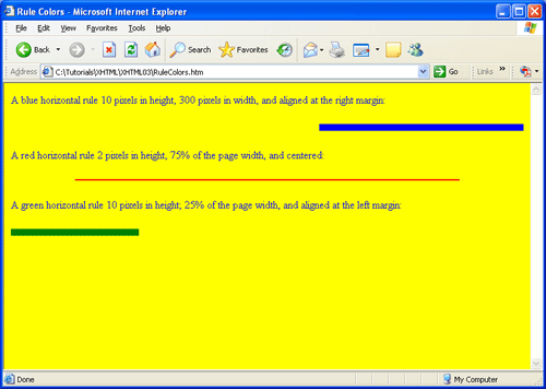
The same background-color styling can be applied to horizontal rules to change their filled in color. In the following example, rules are displayed with various style properties to produce different colors, sizes, and page positioning. At the same time, the foreground (text) color of the page is blue and the background color is yellow. Browser output is shown in Figure 3-26.
<body style="color:blue; background-color:yellow;"><p>
A blue horizontal rule 10 pixels in height, 300 pixels in width, and
aligned at the right margin:
</p><hr style="background-color:blue; height:10px; width:300px; text-align:right;"><p>
A red horizontal rule 2 pixels in height, 75% of the page width, and
centered:
</p><hr style="background-color:red; height:2px; width:75%; text-align:center;"><p>
A green horizontal rule 10 pixels in height; 25% of the page width, and
aligned at the left margin:
</p><hr style="background-color:green; height:10px; width:25%; text-align:left;"></body>
Listing 3-35. Code to style horizontal rules.
Figure 3-25.
Styled horzontal rules
In this example, all rule styling is applied with in-line style sheets. The individual rules have different settings for which an embedded style sheet with a single hr selector is not appropriate. Body styling also uses an in-line style sheet. Although, in this case, an embedded style sheet with a body selector could have been used to apply foreground and background colors.
The color and background-color properties can be applied to all HTML5 elements. Many different color combination can be used to produce a full spectrum of colors. Extended discussion of color values and styling is saved for a later tutorial. Use of the basic color names can get you started in introducing color variety to your pages.
Up to this point, styles have been applied to individual page elements by associating style sheets with their tags. This technique works fine in most cases; however, there are styling situations not covered by this method.
For example, within a paragraph you might wish to apply a style to a particular letter, word, phrase, or other text string located inside the paragraph. Applying a style sheet to the <p> tag does not give you the ability to select which "substring" of the paragraph to style. All characters in the paragraph receive the same styling.
Another example is a consecutive group of paragraphs to which you want to apply the same style. As you may have expected, you can duplicate and apply the same in-line style sheet individually to the separate <p> tags to give them the same appearance. Nonetheless, the ability to apply the same style to the paragraphs as a group without having to style them individually would be more convenient.
For these and other styling situations involving strings of text less than a paragraph in length and blocks of text longer than a paragraph, HTML5 provides "marker" tags to identify and isolate particular sections or subsections of a page to which styling can be applied.
A <span> tag is an in-line tag placed around text for the purpose of identifying a string of characters to which this tag's style sheet is applied. The tag can enclose a single letter, a word, a phrase, a sentence, or any other substring of text for the purpose of identifying it for the application of styling. As an in-line tag, the <span> tag surrounds a string of text enclosed inside a block-level container.
In the following paragraph, the words "RED" and "BLUE" are isolated with <span> tags as words to which these tags apply their color properties. When this paragraph is displayed in the browser, the two words are rendered in their associated colors.
<p>This paragraph contains the word <span style="color:red;">RED</span>
that is surrounded by a <span> tag to apply this color property to the word. In
this sentence the word <span style="color:blue;">BLUE</span> is given that
color.</p>
Listing 3-36. Code to style words within a paragraph.
A <span> tag is nothing more than a marker to isolate text to which its style sheet can be applied. It has no built-in formatting characteristics of its own or semantic meaning. It does not force a line break nor does it produce a blank space. Therefore, it can be used in-line within the normal flow of text simply to style its enclosed content. Naturally, the style that is applied must be appropriate to the enclosed text string. For instance, it would not be appropriate to apply the text-indent property to indent the "first line" of a single word enclosed by a <span> tag.
A <div> (division) tag is a similar type of marker to the <span> tag. Its purpose is to enclose and designate a collection of page elements for application of styling to the enclosed set without providing any semantic meaning. The <div> tag is a block-level tag because it encloses other tags, and more importantly, it forces a line break on the page by creating a line break before and after its enclosed content.
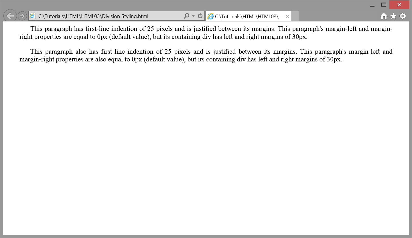
Use of the <div> tag is illustrated by the following two paragraphs. Both paragraphs are styled the same. However, instead of coding these styles with in-line style sheets in both <p> tags, the paragraphs are surrounded by a <div> tag which applies these styles. The paragraphs inherit the text-indent and text-align styles of the enclosing <div> tag. Browser output of this formatting is shown in Figure 3-26.
<div style="text-indent: 25px; margin-left:30px; margin-right:30px; Text-align: justify;"><p>
This paragraph has first-line indention of 25 pixels and is justified
between its margins. This paragraph's margin-left and margin-right
properties are equal to 0px (default value), but its containing div has left
and right margins of 30px.
</p><p>
This paragraph also has first-line indention of 25 pixels and is justified
between its margins. This paragraph's margin-left and margin-right
properties are also equal to 0px (default value), but its containing
div has left and right margins of 30px.
</p></div>
Listing 3-37. Code to style two paragraphs through an enclosing <div> tag.
Figure 3-26. Paragraphs styled with enclosing <div> tag.
The <div> tag does not have any visible formatting characteristics of its own other than the fact that it creates a line break before and after its enclosed content. These line breaks are not evident in the above example since <p> tags themselves produce their own line breaks. Such line breaks are collapsed together with those produced by the <div> tag.
Since the <div> tag, like the <span> tag, provides great flexibility in enclosing and styling page content, there are numerous occasions throughout these tutorials where spans and divisions are used to apply formatting to a wide assortment of page elements.
Use of embedded style sheets has been suggested as the normal way to apply page-wide styles to tags. Where particular tags need to take on special styles different from these page-wide styles, in-line style sheets are used to modify the styling.
Where practical, embedded style sheets should always be the preferred styling method, even for application of special one-time-only styling. Embedded style sheets localize style settings within the single <style> section of the page, thereby making them more accessible than if scattered across multiple in-line style sheets. Also, embedded style sheets can be easily promoted to linked style sheets for site-wide application. Discussed below are ways to apply special styling to page elements by using embedded style declarations rather than in-line style sheets.
By way of review, most embedded styling can be done with individual tag selectors and their associated style declarations. These simple selectors declare default tag styling for an entire page. The general format for a simple selector is shown in Listing 3-38.
selector {property:value [; property:value] ... }
Listing 3-38. General embedded style sheet format for a simple selector.
Any number of selectors can be combined with any number of style properties within an embedded style sheet. For example, the following simple selectors set page-wide formatting for page margins, headings, and paragraphs. Anywhere one of these tags is encountered on the page, the browser applies the associated style.
    <style>
        body       {margin:20px; color:black;}
        h1         {color:blue; text-align:center;}
        h2         {color:blue; text-align:left;}
        p          {text-align:justify; text-indent:25px;}
    </style>
Listing 3-39. An embedded style sheet applying simple selectors.
There will likely to be occasions where these page-wide styles need to be modified for particular tags. For example, one or more of the paragraphs in the document may require different alignment or indention, or a particular heading may use a different style to emphasize it differently from other headings. Although you can use in-line style sheets to override these embedded style declarations, there are ways to designate exceptional styling within the embedded style sheet itself.
One way to apply special styles to individual page elements is to provide the element with a unique identifier. After which, special styling can be applied only to the element with that identifier that is within the embedded style sheet.
For instance, assume that common paragraph indention and alignment are adopted for an entire Web page with the embedded style sheet declaration shown above. That is, all paragraphs have 25-pixel indentions and are text justified with first-line indents of 25 pixels. Now assume that one particular paragraph on the page requires different styling. This single paragraph needs to be offset from surrounding paragraphs with 25-pixel left and right margins and it should not have first-line indention.
The first step in styling this particular paragraph is to assign it an id value. An id is a unique identifier for the tag. It can be any name you choose using combinations of alphabetic and numeric characters. In the following code, id="Special" is assigned to the paragraph requiring special formatting.
    <p id="Special">This paragraph requires special styling different from regular
    paragraphs on the page. It should be offset 25 pixels from both margins and not
    have first-line indention.</p>
Listing 3-40. Identifying a paragraph for application of special styling.
With an id assigned to this <p> tag it can be designated for special styling by using an ID selector in the embedded style sheet. The general format for an ID selector is shown in Listing 3-41.
#id{property:value [; property:value]...}
Listing 3-41. General style sheet format for ID selector.
Styling is applied to the element on the page that contains an id="value" property, where "value" matches the #id name. Thus, an ID selector can be added to the above style sheet to format the special paragraph differently from regular paragraphs:
    <style>
      body       {margin:20px; color:black;}
      h1         {color:blue; text-align:center;}
      h2         {color:blue; text-align:left;}
      p          {text-align:justify; text-indent:25px;}
      #Special  {text-indent:0px; margin-left:25px; margin-right:25px;}
    </style>
Listing 3-42. Applying styling to an ID selector.
The syntax #Special refers to the tag with the id value (#) of "Special". The standard 25-pixel first-line indention given by the p simple selector is reset to 0 pixels for this particular paragraph. Also, the paragraph is given left and right margin settings different from normal paragraphs. Nevertheless, its text remains justified as inherited from standard paragraph styling given through the p selector. In other words, all paragraphs inherit the styling given by the p simple selector unless these styles are modified or supplemented by an #id selector.
ID Selectors can be used for identifying and styling any HTML tag. Just assign a unique id="value" attribute to the tag and add the ID Selector #value to the stylesheet. ID Selectors should be unique and assigned to only one tag in the HTML document. In this way, the id property in tags serve to uniquely identify them for specific reference in stylesheets.
You should not style <span> or <div> tags with simple selectors in an embedded style sheet. These tags often appear multiple times on a page to isolate and style different portions of text and different collections of page elements, all of which usually require a different styling. Thus, you cannot associate one particular style with these tags without reducing their flexibility in styling other spanned text or divisions that require a different styling. In other words, do not code the following simple selectors in embedded style sheets.
<style>
  div     {property:value}
  span    {property:value}
</style>
Listing 3-43. Avoid using simple selectors for <div> and <span> tags.
However, by using ID selectors you can apply different styles to different <span> and <div> tags without committing them to one particular style.
In the following example, two paragraphs are given the same style by enclosing them inside a <div> to which special styling is applied. The style effects only this single division through its unique ID selector. Styling of other divisions is not affected since they do not have this id value. At the same time, two <span> tags take on their unique stylings through their unique id values, and leave any other stylings of spanned text unaffected.
<style>#Justify {text-align:justify;}
#Red {color:red;}
#Blue {color:blue;}
</style><div id="Justify"><p>This paragraph is styled by inheriting the styling of its container
division which is formatted with the <span id="Red">"Justify"</span>style.</p><p>This paragraph is also styled by inheriting the styling of its container
division. In addition, <span id="Blue">BLUE</span> styling is applied to
one of its words.</p> </div>
Listing 3-44. Using ID selectors for styling individual <div>and <span> tags.
By defining a class selector a general-purpose style can be declared for broad application to any tags needing to share the style. A class selector is defined in an embedded style sheet as shown by its general format in Listing 3-45.
.class {property:value [ ;property:value] ...}
Listing 3-45. General style sheet format for class selector.
Rather than naming a tag or using an id as the selector, a class name is supplied, preceded by a period. This .class selector can be a name of your choosing, but cannot include spaces or special characters. Any combination of style properties and values can be associated with this style class.
The following embedded style sheet includes a style class named .Offset. Once this class has been defined, it is assigned to any tag with the class="class" attribute. Below, the style class is applied to a paragraph by assigning it to the <p> tag. This paragraph takes on the styling of the .Offset class, in this case overriding normal styling given by the p simple selector.
<style>
p {margin:20px;}
.Offset {margin-left:30px; margin-right:30px;}
</style><p class="Offset">This paragraph requires special styling different from normal
paragraphs on the page. It has left and right margins of 30 pixels.</p>
Listing 3-46. Declaring and applying a style class.
(Note that the class assigned in the tag does not include the period that is necessary when declaring the .class selector in the style sheet.)
A style class is a general-purpose style that can be applied to any type of tag simply by assigning the class to the tag. Furthermore, unlike the ID selector, the class selector can be assigned to any number of tags. Thus, any paragraphs, divisions, or other block-level tag types can reflect the above styling by assigning them to the .Offset class. Of course, the tag to which the class is applied must be receptive to the particular properties and values declared for the class.
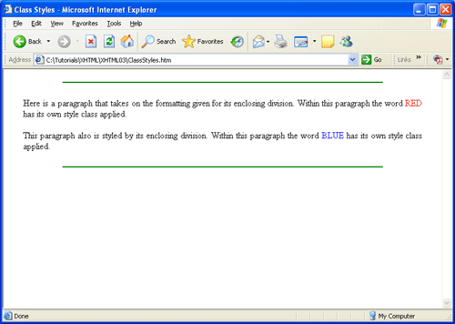
Style classes are particularly relevant to <span> and <div> tags for styling text strings and blocks of code without committing these tags to one particular style. The tags become carriers for many different styles simply by assigning different style classes to them. The following code is an example of applying various style classes through various tags to produce the page display shown in Figure 3-27.
<head><title>Class Styles</title><style>
.Offset {margin-left:25px; margin-right:25px; text-align:justify;}
.Red {color:red;}
.Blue {color:blue;}
.Rule {height:2px; width:75%; text-align:center; color:green;}
</style></head><body><hrclass="Rule"><div class="Offset"><p>Here is a paragraph that takes on the formatting given for its enclosing
division. Within this paragraph the word <span class="Red">RED</span> has its
own style class applied.</p><p>This paragraph also is styled by its enclosing division. Within this
paragraph the word <span class="Blue">BLUE</span> has its own style class
applied.</p></div><hr class="Rule" ></body>
Listing 3-47. Declaring and applying various style classes.
Figure 3-27. Application of class styles.
Both of the above paragraphs are styled by enclosing them inside a division to which the .Offset style class is assigned. Thus, the paragraphs inherit division styling. In this case, both paragraphs are offset from the page margins and the text is justified. This technique has the same effect as declaring an ID selector for division styling (div#Offset) and applying the style through this ID selector (<div id="Offset">). However, the .Offset class is more flexible since it can be associated with other multiple tags. Any tags on the page can take on the .Offset style by assigning them to this class.
Within each paragraph are individual words that take on color styling. These words are enclosed inside <span> tags through which colors are applied by assigning the tags to either the .Blue or .Orange style class. Incidentally, if any other sections of the page — a paragraph, a heading, whatever — need to be displayed in one of these colors, then their enclosing tags can be assigned these same style classes. Any normal stylings of these tags are supplemented with assigned colors.
Both horizontal rules are 75% of the width of the page, 2 pixels in height, green, and centered. The choice is made to define a style class to represent this styling and to assign all <hr> tags to this class. Of course, these styles could be defined for the simple hr selector without using a class; however, the choice is made to create classes for all stylings and to assign tags to these classes according to what is required. It would not be unusual to find an embedded style sheet composed exclusively of style classes that are selectively applied to all varieties of tags requiring those styles.
CSS Media Types allow you to specify how documents will be presented in different media such as the browser screen, on paper, hand held devices, and other types of common media. The ability to control page layout in different types of media can be helpful because a document usually needs a larger font-size on a screen than on paper; and sans-serif fonts are easier to read on the screen, while serif fonts are easier to read on paper. Among other things, CSS Media Types also allow you to customize your page for various types of accessibility devices. Guidelines for creating accessible sites will be discussed later in another tutorial.
The table below lists the different CSS Media Types and describes how they are used.
Media Type
Description
all
Used for all media type devices.
braille
Used for braille tactile feedback devices.
embossed
Used for printing on braille printers.
handheld
Used for small handheld devices.
print
Used for printers.
projection
Used for projected presentations, like slides.
screen
Used for computer screen
speech
Used for speech and sound synthesizers.
tty
Used for terminals or devices with limited display capabilities.
tv
Used for televisions.
Figure 3-28. Table of CSS Media Types.
The @media media type { } rule allows different style rules for different media in the same style sheet.
<head><title>Class Styles</title><style>
@media screen {
p {font-size:11pt;font-family:Arial;}
}
@media print {
p {font-size:10pt;font-family:Times New Roman;}
}
</style></head><body><p>This example tells the browser to display a
11 point Arial font on the screen, but if the page is
printed, it will be in a 10 point Times New Roman font.
</p></body>
Listing 3-48. Declaring and applying styles for different media types.
When the page is viewed in the browser, the text is rendered in 11 point Arial. When the page is printed, the font size is 10 points and in Times New Roman.
By now, you are probably confused. You have a choice of using linked style sheets, embedded style sheets, in-line style sheets, or some combination of the three. When using linked or embedded style sheets you have a choice of using simple tag selectors, ID selectors, or style classes. Later in this tutorial, additional styling options are presented. What's a person to do about all these options?
Given the various approaches to styling, a reasonable strategy to follow is outlined below. You may developed your own preferred approach as you become more familiar with style sheets, but the following outline is a good beginning to sort out the options.
Use an embedded style sheet as the primary styling method. This permits isolation of styles within a single section of the page thereby making it easier to locate and change styles. It also promotes embedded styles to a linked style sheet for site-wide application.
Within the embedded style sheet, use simple tag selectors to apply common, page-wide styling to all tags of the same type.
Define style classes to apply styling through general-purpose tags such as <span> and <div> tags. Also, use style classes when two or more tags require formatting different from or supplementary to that given by their simple tag selectors.
For single tags requiring unique styling, assign an id value to the tag and apply its styling through an ID selector in the embedded style sheet.
Use an in-line style sheet where one-time styling is required and there is overriding convenience in having the style sheet coded inside the tag. Too many in-line style sheets are difficult to track down for changes; plus, identical in-line styles have to be changed in multiple locations, leading to possible oversight and errors.
Although preference is given to using embedded style sheets -- and by extension, linked style sheets the -- these tutorials often use in-line style sheets as instructional devices to introduce and describe style properties. The assumption is, however, that in-line styles will be elevated to embedded or linked styles when pages are "put into production."
This tutorial has given you a first introduction to style sheets. There are many more style properties to come and many other variations on those introduced here. The importance of style sheets cannot be over-emphasized. With deprecation of most tag formatting attributes, style sheets have become the primary technique for arranging and displaying page content. The use of in-line, embedded, and linked style sheets has become the essence of HTML5 coding.
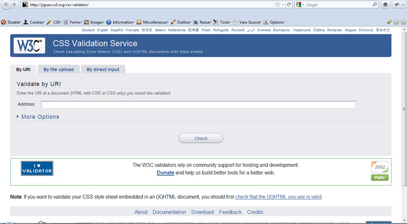
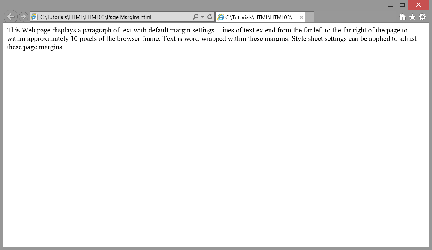
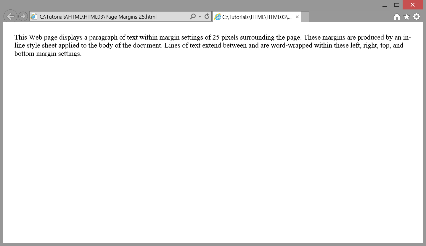
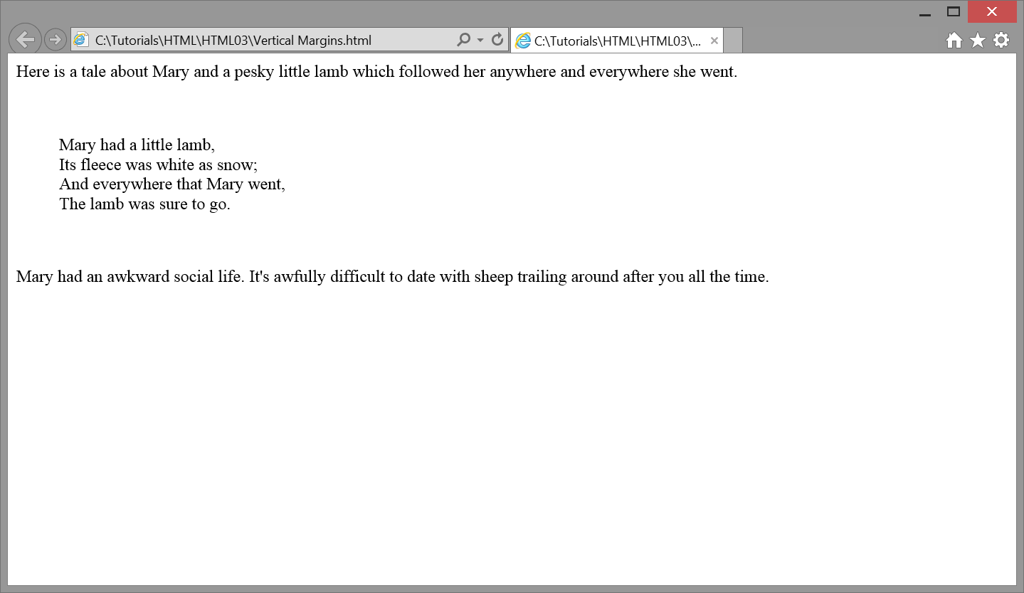
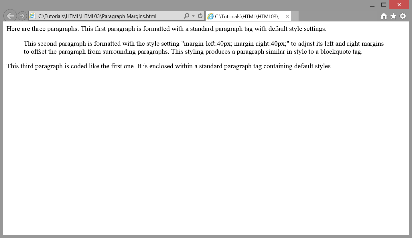


 Figure 1.
 Figure 1.