Chapter 8 - Using Tables
Chapter 8 introduces HTML tables and their role in organizing and presenting information in a structured format. You will learn how to create tables using rows and columns, add headings and captions, and organize data in a way that is clear and easy for users to understand. Tables are commonly used to display schedules, pricing information, inventory data, and other content that benefits from a grid-based layout.
The chapter also explores techniques for enhancing the appearance and usability of tables through proper formatting and structure. By learning how to design well-organized tables, you will be able to present complex information more effectively while improving readability and accessibility. These skills provide an important foundation for displaying data on professional and user-friendly web pages.
8.1 - Creating Tables
Creating Tables
Tabular arrangements of data into rows and columns can help the viewer sort through masses of data to understand their underlying structure and content. Therefore, tables are useful devices for presentation of information in a meaningful form. At the same time, tables have historically been used to structure the layout of a Web page; however, this approach is becoming deprecated in favor of CSS-based layouts. In short, tables are important presentation devices and should be used to present tabular data. They should not be used to define the layout of a Web page.
The <pre> Tag - TOP
Previously you were introduced to the <pre> tag as one method for arranging data into rows and columns for tabular presentation. A block of text surrounded by the <pre> tag is displayed in a monospace font in precisely the way it is typed in the text editor. The tag is often used to create simple tables where alignment of columns is produced with embedded blank spaces. For example, the following editor code shows a table produced by using the keyboard Enter key to create separate rows, and the Space Bar key to align columns of data. This table layout appears on a Web page in exactly the format it is typed inside the <pre> tags.
<pre>
                  Table 1
              Sales by Region
----------------------------------------------
Region/Year   2000     2001     2002     2003
----------------------------------------------
East          35.2     37.4     39.8     40.0
West          28.0     25.6     27.4     29.8
South        102.3     86.1     98.6    100.2
North         10.5      8.6      9.8     10.4
----------------------------------------------
</pre>
Listing 8-1. Code to create a table using the
<pre>tag.
This method provides limited capabilities for arranging and styling a table. It is useful only for producing fairly simple tables without the need for styling it in conformance with the overall page design. A better method is to construct tables using special HTML tags designed for that purpose.
A Simple Table - TOP
Like any other tabular presentation, a table produced with HTML table tags contains rows and columns. The intersections of these rows and columns form the cells of the table. Information can then be placed into these cells. A simple 3 x 3 table is shown in Figure 8-1.
Cell 1.1 Cell 1.2 Cell 1.3 Cell 2.1 Cell 2.2 Cell 2.3 Cell 3.1 Cell 3.2 Cell 3.3
Figure 8-1. A 3 x 3 table.
The rows, columns, and cell intersections of a table are defined with three basic tags. A <table> tag surrounds the entire table description; <tr> (table row) tags defined the rows of the table; and <td> (table data) tags define the cells, or columns, that appear along each row. The <td> tag encloses the content that appears in a cell. These tags are shown in their general structural formats in Figure 8.2.
    <table>
      <tr>
        <td>cell content</td>
        <td>cell content</td>
        ...
      </tr>
      ...
    </table>
Figure 8-2. General formats for basic table tags.
There are as many <tr> tags as there are rows in the table, and there are as many <td> tags as there are cells (columns) in each row. When building tables, you need to be cautious about properly pairing opening and closing tags. One minor oversight, and the table arrangement can be totally disrupted. Also, take care to organize your coding so that the table structure is clearly evident. For example, the following code is used to create the table shown above in Figure 8.1.
<table><tr><td>Cell 1.1</td><td>Cell 1.2</td><td>Cell 1.3</td></tr><tr><td>Cell 2.1</td><td>Cell 2.2</td><td>Cell 2.3</td></tr><tr><td>Cell 3.1</td><td>Cell 3.2</td><td>Cell 3.3</td></tr></table>Listing 8-2. Code to create a 3 x 3 table.
Note that <table>, <tr>, and <td> tags are container tags that all require both an opening and closing tag. The <table> tag encloses all coding for the table; <tr> tags enclose each row of the table; <td> tags enclose each cell of a table row.
The code in Listing 8-2 is arranged in a line-by-line hierarchy of tags suggestive of the structure of the table. This manner of coding is helpful in visualizing the table, although you can code table tags in free-format style, like any other HTML coding. For instance, the above table displays correctly coded in the following fashion.
<table><tr><td>Cell 1.1</td><td>Cell 1.2</td><td>Cell 1.3</td></tr><tr><td>Cell 2.1</td><td>Cell 2.2</td><td>Cell 2.3</td></tr><tr><td>Cell 3.1</td><td>Cell 3.2</td><td>Cell 3.3</td></tr></table>Listing 8-3. Alternate code to create a 3 x 3 table.
However, since table cells (<td>...</td>) can enclose information of varying length and complexity, it is best to code them on separate lines as in Listing 8-2 for more accurate visualization and typing of cell contents.
The table below presents a summary of the HTML tags used for creating tables by discussing what was covered in this tutorial.
| Tag | Description |
|---|---|
| table | Defines a table. All other table elements are coded within this element. |
| tr | Defines a table row. |
| td | Defines a table data cell within a row. |
| th | Defines a table header cell within a row. |
| caption | Contains a description of the table. The element must be coded immediately after the opening table tag. |
| thead | Groups one or more rows or tr elements into a table header. |
| tfooter | Groups one or more rows or tr elements into a table footer. |
| tbody | Groups one or more rows or tr elements between the header and footer into a table body. |
Table and Cell Borders - TOP
By default, table tags produce no borders around the table or around its cells. The code in Listing 8-2 and 8-3 actually create the table layout shown below in Figure 8-3. Data are aligned within rows and columns; however, no borders are displayed. In certain cases, you may not wish to display table borders, but in most cases you will. Therefore, style sheets must be applied to the table and to its cells to display borders around both.
Cell 1.1 Cell 1.2 Cell 1.3 Cell 2.1 Cell 2.2 Cell 2.3 Cell 3.1 Cell 3.2 Cell 3.3
Figure 8-3. A standard 3 x 3 table.
A style sheet is applied to the table and to its cells to display borders around both. A border surrounds the entire table by styling the <table> tag. Borders surround individual cells by styling the <td> tag. The code below produces the bordered table shown in Figure 8.1. The entire table is surrounded by a 1-pixel outset border and each of the cells is surrounded by a 1-pixel inset border. This styling is typical for a standard HTML table.
<style type="text/css">table {border:outset 1px;}td {border:inset 1px;}</style><table><tr><td>Cell 1.1</td><td>Cell 1.2</td><td>Cell 1.3</td></tr><tr><td>Cell 2.1</td><td>Cell 2.2</td><td>Cell 2.3</td></tr><tr><td>Cell 3.1</td><td>Cell 3.2</td><td>Cell 3.3</td></tr></table>Listing 8-4. Code to create a bordered 3 x 3 table.
An embedded style sheet is the most convenient method of styling table elements. In-line style sheets can be used; however, individual style sheets would have to appear in each of the many <td> tags. It is much easier declaring embedded styling for table and td selectors. Tables can have any style of outer borders, and cells can have there own border styles. Border styling is covered in a following tutorial.
Table Size - TOP
By default, the size of a table depends on the size of the data appearing in its cells. A column is as wide as the widest entry in the column. All rows are as wide as the combined width of data within the widest cells. In effect, table cells collapse around the data they contain. Although it is not apparent in the above examples, data are aligned horizontally left and vertically centered within the cells. Style settings to manage table and cell sizes and data alignment are described later in this tutorial.
Nested Tables - TOP
Tables can be nested; that is, a table can appear inside a cell of another table. This arrangement does not involve any particular coding complication, Table specifications are simply inserted as contents of a cell. The cell expands in size to permit full display of the nested table as shown in the following table and HTML code.
Cell 1 Cell 2 Cell 3
Cell A Cell B Cell C Cell D
Figure 8-4. Nested tables.
<style type="text/css">table {border:outset 1px;}td {border:inset 1px;}</style><table><tr><td>Cell 1</td><td>Cell 2</td></tr><tr><td>Cell 3</td><td><table><tr><td>Cell A</td><td>Cell B></td></tr><tr><td>Cell C</td><td>Cell D</td></tr></table></td></tr></table>Listing 8-5. Code for nested tables.
In this example, you can also see the default alignment of data within cells. Notice in "Cell 2" that the entry is horizontally aligned at the left of the cell; in "Cell 3" the entry is vertically aligned in the middle of the cell.
Styling Multiple Tables - TOP
Since tables provide one of the most effective methods for arranging content on a Web page, it is often the case that a single page contains two or more tables that are either nested tables or multiple tables containing different data content. It is also often the case that these tables need to be styled differently. Therefore, the embedded style sheet must differentiate among the tables so that each can have its own special styling.
Recall from earlier discussions that page elements can be assigned id values to uniquely identify them. These ids are then used in the embedded style sheet to indicate which styles pertain to which unique elements. This technique can be used to apply different styles to different tables on the same page.
For example, the two tables in Figure 8-5 have different border styles and sizes. The first table is styled with standard borders; the second table uses the outset style for both table and cell borders and uses different border widths.
Cell 1 Cell 2 Cell 3 Cell 4
Cell 1 Cell 2 Cell 3 Cell 4
Figure 8-5. Styling multiple tables on the same page.
The style sheet and table definitions for these two tables are shown in Listing 8-6.
<style type="text/css">table#Table1 {border:outset 1px;}table#Table1 td {border:inset 1px;}table#Table2 {border:outset 3px;}table#Table2 td {border:outset 2px;}</style><tableid="Table1"><tr><td>Cell 1</td><td>Cell 2</td></tr><tr><td>Cell 3</td><td>Cell 4</td></tr></table><tableid="Table2"><tr><td>Cell 1</td><td>Cell 2</td></tr><tr><td>Cell 3</td><td>Cell 4</td></tr></table>Listing 8-6. Code to style multiple tables on the same page.
ID selectors are used to separately style the <table> tags for the two tables. Contextual selectors are used to style their <td> tags. In this way, any number of tables can take on different styles without styling conflicts. (See tutorial "Applying Special Styles" for a review of ID selectors; see "Contextual Selectors" to review these style selectors.)
This introduction to tables has given you a general overview of tables and style sheet approaches to styling them. The following tutorials cover detailed aspects of table design and formatting.
TOP | NEXT: Table Borders
8.2 - Table Borders
Table Borders
When a table is defined by a <table> tag with no styles specified, a borderless table as wide and as tall as its enclosed data is displayed. From this simple beginning, you can structure and style a table to take on virtually any display characteristics you can imagine.
Table Border Styles - TOP
Any of the border styles that were introduced earlier can be applied to the outer border of a table. Figure 8-6 shows example border styles coded in the general fashion giving in Listing 8-7.
<style type="text/css">table {border:style 5px;}td {border:inset 1px;}</style>Listing 8-7. General style sheet code for table borders.
The border style is identified in Figure 8-6 for each of the tables. The style sheet uses the general format {border:style size;} for all border stylings.
inset
Cell 1.1 Cell 1.2 Cell 2.1 Cell 2.2 outset
Cell 1.1 Cell 1.2 Cell 2.1 Cell 2.2 ridge
Cell 1.1 Cell 1.2 Cell 2.1 Cell 2.2 groove
Cell 1.1 Cell 1.2 Cell 2.1 Cell 2.2 dashed
Cell 1.1 Cell 1.2 Cell 2.1 Cell 2.2 dotted
Cell 1.1 Cell 1.2 Cell 2.1 Cell 2.2 solid
Cell 1.1 Cell 1.2 Cell 2.1 Cell 2.2 double
Cell 1.1 Cell 1.2 Cell 2.1 Cell 2.2
Figure 8-6. Varieties of table borders.
All tables above have a outer border of 5 pixels to make then visually obvious. Different effects can be achieved with different border sizes.
Individual Border Styles
In the above examples, borders appear around all four sides of the table; however, you can specify individual styling for the separate sides. Use the properties border-top, border-bottom, border-left, and border-right to selectively apply borders around the table. For example, the table in Figure 8-7 displays only top and bottom borders with the style sheet given in Listing 8-8.
<style type="text/css">table {border-top:outset 5px; border-bottom:outset 5px;}td {border:inset 1px;}</style>Listing 8-8. Style sheet for top and bottom table borders.
Cell 1.1 Cell 1.2 Cell 2.1 Cell 2.2
Figure 8-7. Table with top and bottom borders.
Collapsed Borders
Borders surrounding the cells in a table normally are displayed independently from each other. That is, each cell is surrounded by its own border thereby giving a "double border" look to side-by-side cells. These double borders can be collapsed into single borders with the border-collapse style property applied to the table.
Property Values border-collapse separate
collapseFigure 8-8. Table border-collapse style property.
The default border setting for a table is border-collapse:separate. By specifying border-collapse:collapse, cells share "single borders" between them. This effect is illustrated in the tables in Figure 8-9 styled with collapsed borders.
<style type="text/css">table {border:style 5;border-collapse:collapse;}td {border:solid 1px;}</style>Listing 8-9. Style sheet to collapse table borders.
inset
Cell 1.1 Cell 1.2 Cell 2.1 Cell 2.2 outset
Cell 1.1 Cell 1.2 Cell 2.1 Cell 2.2 ridge
Cell 1.1 Cell 1.2 Cell 2.1 Cell 2.2 groove
Cell 1.1 Cell 1.2 Cell 2.1 Cell 2.2 dashed
Cell 1.1 Cell 1.2 Cell 2.1 Cell 2.2 dotted
Cell 1.1 Cell 1.2 Cell 2.1 Cell 2.2 solid
Cell 1.1 Cell 1.2 Cell 2.1 Cell 2.2 double
Cell 1.1 Cell 1.2 Cell 2.1 Cell 2.2
Figure 8-9. Tables with collapsed cell borders.
Note that collapsed borders are specified for the <table> tag even though the setting is applied to the table's cells. Also, you cannot selectively apply collapsed border style to individual cells. When table borders are collapsed, all cell borders are styled as border:solid 1px; other styles and widths are not recognized.
Cell Border Styles - TOP
If cell borders are not collapsed, the same set of styles that are applied to the table's outer border can be applied to its individual cells. In the examples in Figure 8.10, the outer borders of the tables are 1px in width and cell borders are 5px in width to emphasize their styling.
<style type="text/css">table {border:solid 1px;}td {border:style 3px;}</style>Listing 8-10. General style sheet code for cell borders.
inset
Cell 1.1 Cell 1.2 Cell 2.1 Cell 2.2 outset
Cell 1.1 Cell 1.2 Cell 2.1 Cell 2.2 ridge
Cell 1.1 Cell 1.2 Cell 2.1 Cell 2.2 groove
Cell 1.1 Cell 1.2 Cell 2.1 Cell 2.2 dashed
Cell 1.1 Cell 1.2 Cell 2.1 Cell 2.2 dotted
Cell 1.1 Cell 1.2 Cell 2.1 Cell 2.2 solid
Cell 1.1 Cell 1.2 Cell 2.1 Cell 2.2 double
Cell 1.1 Cell 1.2 Cell 2.1 Cell 2.2
Figure 8-10. Varieties of cell borders.
Selective Border Styles
Borders surrounding cells can be selectively styled with border-top, border-bottom, border-left, and border-right styles applied to the <td> tag. These styles are normally used to display top-and-bottom or left-and-right borders to emphasize the rows or columns of a table. The two tables shown in Figure 8-11 are displayed with the style sheets given in Listing 8-11.
<style type="text/css">table {border:outset 5px; border-collapse:collapse;}td {border-top:solid 2px; border-bottom:solid 2px;}</style><style type="text/css">table {border:outset 5px; border-collapse:collapse;}td {border-left:solid 2px; border-right:solid 2px;}</style>Listing 8-11. Style sheets to apply row and column borders.
top-and-bottom
Cell 1.1 Cell 1.2 Cell 1.3 Cell 2.1 Cell 2.2 Cell 2.3 Cell 3.1 Cell 3.2 Cell 3.3 left-and-right
Cell 1.1 Cell 1.2 Cell 1.3 Cell 2.1 Cell 2.2 Cell 2.3 Cell 3.1 Cell 3.2 Cell 3.3
Figure 8-11. Application of row and column borders.
In order to extend row and column borders across the entire table, borders must be collapsed. Otherwise, breaks in the lines appear between the separate cells. As mentioned above, collapsed borders also means that the various cell border styles do not display. Therefore, a solid border style is the only one that need be used for the cells.
Individual Border Styles
Cell borders can be styled independently. If needed, each cell can have a different border style. Usually, only selected cells are given emphatic borders to highlight their contents. Of course, in order to view cell borders, the table border cannot be collapsed.
The following table displays different cell borders along its bottom row.
Cell 1.1 Cell 1.2 Cell 1.3 Cell 2.1 Cell 2.2 Cell 2.3 Cell 3.1 Cell 3.2 Cell 3.3
Figure 8-12. Emphasizing a table row with cell borders.
The above effect can be achieved by applying in-line style sheets to the selected cells. However, this is the type of situation especially made for the use of ID selectors and contextual selectors. Complete table and style sheet coding is shown below.
<style type="text/css">table#TAB1 {border:outset 3px;}table#TAB1 td {border:inset 1px;}table#TAB1 tr#ROW3 td {border:outset 3px;}</style><tableid="TAB1"><tr><td>Cell 1.1</td><td>Cell 1.2</td><td>Cell 1.3</td></tr><tr><td>Cell 2.1</td><td>Cell 2.2</td><td>Cell 2.3</td></tr><trid="ROW3"><td>Cell 3.1</td><td>Cell 3.2</td><td>Cell 3.3</td></tr></table>Listing 8-12. Code to emphasizing a table row with cell borders.
The table itself is assigned an id in order to uniquely identify it among other tables on the page. Moreover, the final row of the table is given an id to uniquely identify it among the other rows of the table. This is the row in which special border styling is applied to its cells.
Within the style sheet, the table is given an outer border style through the ID selector table#TAB1, selecting the <table> tag with id="TAB1" for application of the border style. The contextual selector table#TAB1 td applies a 1-pixel inset border to all cells of this table -- i.e., where a <td> tag is contained within a <table> tag for a table with id="TAB1".
A contextual selector is also used for styling the last row of the table. A 3-pixel outset border is applied with the selector table#TAB1 tr#ROW3 td -- i.e., where a <td> tag is contained within a <tr> tag with id="ROW3", which is contained within a <table> tag with id="TAB1".
If only a single cell has its borders styled, then that cell can be given an id, such as, id="CELL9". Under such conditions, the selector for styling that one cell would be
table#TAB1 td#CELL9 {border:outset 3px;}
where a <td> tag with id="CELL9" is contained within a <table> tag with id="TAB1". In this case, it would not be necessary to identify the table row.
Deprecated Table Attributes - TOP
Borders are displayed around the table and between table cells with the border="n" attribute of the <table> tag, where n is the width of the outer border in pixels. The following table has 1-pixel borders:
<table border="1">
| Cell 1.1 | Cell 1.2 | Cell 1.3 |
| Cell 2.1 | Cell 2.2 | Cell 2.3 |
| Cell 3.1 | Cell 3.2 | Cell 3.3 |
Changing the width of the outer border does not effect the size of cell borders. The default style of the outer border is "outset"; the default style of inner borders is "inset":
<table border="5">
| Cell 1.1 | Cell 1.2 | Cell 1.3 |
| Cell 2.1 | Cell 2.2 | Cell 2.3 |
| Cell 3.1 | Cell 3.2 | Cell 3.3 |
TOP | NEXT: Table Captioning
8.3 - Table Captioning
Table Captioning
The <caption> Tag - TOP
You can caption a table by coding a <caption> tag immediately following the <table> tag. Enter a table title between the opening and closing <caption> tags and the title displays centered over the table. The caption is displayed in the page default font style and size, and formatting is applied with style sheets as is done in the following code example for the table appearing in Figure 8.13.
This is My Table Cell 1.1 Cell 1.2 Cell 1.3 Cell 2.1 Cell 2.2 Cell 2.3 Cell 3.1 Cell 3.2 Cell 3.3
Figure 8-13. A table with a caption.
<style type="text/css">table {border:outset 3px;}table td {border:inset 1px;}table caption {font:bold 10pt arial;}</style><table><caption>This is My Table</caption><tr><td>Cell 1.1</td><td>Cell 1.2</td><td>Cell 1.3</td></tr><tr><td>Cell 2.1</td><td>Cell 2.2</td><td>Cell 2.3</td></tr><tr><td>Cell 3.1</td><td>Cell 3.2</td><td>Cell 3.3</td></tr></table>Listing 8-13. Code for a table with a caption.
You can apply styling to the caption through a caption selector. In this example, font styling is applied with the shorthand font notation,
font:style variant weight size family
The caption is centered by default. The text-align property can be applied to the caption to align it with the left or right edge of the table.
Captions appear only at the top of the table. Style sheet standards propose the caption-side:top|bottom|left|right style declaration for positioning captions; however, this property has not been implemented in current browsers.
The <th> Tag - TOP
Column headings can be supplied with <th> tags in place of <td> tags enclosing cell contents. The <th> tag automatically centers and bolds the enclosed text. Additional styles can be applied to the tags for additional formatting. Notice in the following example that the th selector is added to the style sheet for borders surrounding these cells.
This is My Table Column 1 Column 2 Column 3 Cell 1.1 Cell 1.2 Cell 1.3 Cell 2.1 Cell 2.2 Cell 2.3 Cell 3.1 Cell 3.2 Cell 3.3
Figure 8-14. Using the
<th>tag for column headings.
<style type="text/css">table {border:outset 3px; border-collapse:collapse;}table td,th{border:inset 1px;}table caption {font:bold 10pt arial;}</style><table><caption>This is My Table</caption><tr><th>Column 1</th><th>Column 2</th><th>Column 3</th></tr><tr><td>Cell 1.1</td><td>Cell 1.2</td><td>Cell 1.3</td></tr><tr><td>Cell 2.1</td><td>Cell 2.2</td><td>Cell 2.3</td></tr><tr><td>Cell 3.1</td><td>Cell 3.2</td><td>Cell 3.3</td></tr></table>Listing 8-14. Code to produce column headings for a table.
The <th> tag is unique only in that it provides default bold and centered styling for its contents. With style sheets, however, this tag becomes redundant since this same styling can be applied without using this special tag. The following table duplicates the previous table without <th> tags simply by identifying and styling the first row of the table.
This is My Table Column 1 Column 2 Column 3 Cell 1.1 Cell 1.2 Cell 1.3 Cell 2.1 Cell 2.2 Cell 2.3 Cell 3.1 Cell 3.2 Cell 3.3
Figure 8-15. Producing column headings by styling a row.
<style type="text/css">table {border:outset 3px; border-collapse:collapse;}table tr#HEAD {font:bold; text-align:center;}table td {border:inset 1px;}table caption {font:bold 10pt arial;}</style><table><caption>This is My Table</caption><tr id="HEAD"><td>Column 1</td><td>Column 2</td><td>Column 2</td></tr><tr><td>Cell 1.1</td><td>Cell 1.2</td><td>Cell 1.3</td></tr><tr><td>Cell 2.1</td><td>Cell 2.2</td><td>Cell 2.3</td></tr><tr><td>Cell 3.1</td><td>Cell 3.2</td><td>Cell 3.3</td></tr></table>Listing 8-15. Code to produce column headings by styling a row.
The contextual selector tr#HEAD td indicates styling for td tags that appear inside a tr tag with id="HEAD". It is your choice whether to use the th tag to take advantage of its inherent styling or to manage all styling through style sheets. As a general rule, the fewer tag to deal with the better.
Deprecated Caption align Attribute - TOP
Captions can appear at the top or bottom of a table using the align="top" (default) or align="bottom" attribute of the <caption> tag.
| Cell 1.1 | Cell 1.2 | Cell 1.3 |
| Cell 2.1 | Cell 2.2 | Cell 2.3 |
| Cell 3.1 | Cell 3.2 | Cell 3.3 |
e.g., <caption align="top">Top Table Caption</caption>
| Cell 1.1 | Cell 1.2 | Cell 1.3 |
| Cell 2.1 | Cell 2.2 | Cell 2.3 |
| Cell 3.1 | Cell 3.2 | Cell 3.3 |
e.g., <caption align="bottom">Bottom Table Caption</caption>
As noted above, style sheet standards propose the caption-side property to replace the align attribute; however, this property has not been implemented in current browsers.
TOP | NEXT: Table Colors & Background
8.4 - Table Colors and Background
Table Colors and Backgrounds
Tables can have outer border colors as well as cell border colors. They also can have background colors, patterns, and graphic images as backdrops for the full table or for selected rows and cells.
Table Border Colors - TOP
The appearance of border colors is different depending on the border style. Below are example border styles displayed in red.
<style type="text/css">.inset { border:inset 5px red; } .outset { border:outset 5px red;} .ridge { border:ridge 5px red; } .groove { border:groove 5px red;} .dashed { border:dashed 5px red;} .dotted { border:dotted 5px red;} .solid { border:solid 5px red;} .double {border:double 5px red;} .inset td, .outset td, .ridge td, .groove td, .dashed td, .dotted td, .solid td, .double td {border:inset 1px #000;}</style>Listing 8-16. General style sheet for table border colors.
inset
Cell 1.1 Cell 1.2 Cell 2.1 Cell 2.2 outset
Cell 1.1 Cell 1.2 Cell 2.1 Cell 2.2 ridge
Cell 1.1 Cell 1.2 Cell 2.1 Cell 2.2 groove
Cell 1.1 Cell 1.2 Cell 2.1 Cell 2.2 dashed
Cell 1.1 Cell 1.2 Cell 2.1 Cell 2.2 dotted
Cell 1.1 Cell 1.2 Cell 2.1 Cell 2.2 solid
Cell 1.1 Cell 1.2 Cell 2.1 Cell 2.2 double
Cell 1.1 Cell 1.2 Cell 2.1 Cell 2.2
Figure 8-16. Varieties of table border styles and colors.
You can create your own 3-D shading effects by styling each of the borders separately with border-top, border-right, border-bottom, and border-left colors. The following tables creates their own 3-D effects with solid borders tinted to resemble inset and outset styles. The style sheets used for these two tables are shown in Listing 8-17.
Table 1
Cell 1.1 Cell 1.2 Cell 1.3 Cell 2.1 Cell 2.2 Cell 2.3 Cell 3.1 Cell 3.2 Cell 3.3 Table 2
Cell 1.1 Cell 1.2 Cell 1.3 Cell 2.1 Cell 2.2 Cell 2.3 Cell 3.1 Cell 3.2 Cell 3.3
Figure 8-17. Table border 3-D effects using border colors.
<style type="text/css">/* INSET STYLE */ #TAB1 { border:solid 7px; border-color:#B22222 #FEB9B9 #FEB9B9 #B22222; } /* OUTSET STYLE */ #TAB2 { border:solid 7px; border-top-color:#FEB9B9; border-right-color:#B22222; border-bottom-color:#B22222; border-left-color:#FEB9B9; } #TAB1 td, #TAB2 td { border:inset 1px #000; }</style>Listing 8-17. Style sheet code for tables with individual border colors.
Cell Border Colors - TOP
Borders around table cells are styled and colored independently from the outer border. In the following examples, the outer border is 1 pixel in width for deemphasis, and cell borders are red and 3 pixels in width.
<style type="text/css">table { border:solid 1px #000; } td { border:style 3px red; }</style>Listing 8-18. General style sheet for table cell border colors.
inset
Cell 1.1 Cell 1.2 Cell 2.1 Cell 2.2 outset
Cell 1.1 Cell 1.2 Cell 2.1 Cell 2.2 ridge
Cell 1.1 Cell 1.2 Cell 2.1 Cell 2.2 groove
Cell 1.1 Cell 1.2 Cell 2.1 Cell 2.2 dashed
Cell 1.1 Cell 1.2 Cell 2.1 Cell 2.2 dotted
Cell 1.1 Cell 1.2 Cell 2.1 Cell 2.2 solid
Cell 1.1 Cell 1.2 Cell 2.1 Cell 2.2 double
Cell 1.1 Cell 1.2 Cell 2.1 Cell 2.2
Figure 8-18. Varieties of table cell border styles and colors.
As in the case with table borders, cells borders can be styled and colored independently. In Figure 8.19, all cells in the two tables are styled with solid borders 5 pixels in width. Different shades of red are applied to their sides to create 3-D effects resembling inset and outset borders. The two applicable style sheets are shown in Listing 8-19.
Cell 1.1 Cell 1.2 Cell 1.3 Cell 2.1 Cell 2.2 Cell 2.3 Cell 3.1 Cell 3.2 Cell 3.3
Cell 1.1 Cell 1.2 Cell 1.3 Cell 2.1 Cell 2.2 Cell 2.3 Cell 3.1 Cell 3.2 Cell 3.3
Figure 8-19. Tables with individual cell border colors.
<style type="text/css">/* INSET STYLE */table {border:solid 1px #000;}table td {border:solid 5px red;border-top-color:#FEB9B9;border-right-color:#B22222;border-bottom-color:#B22222;border-left-color:#FEB9B9;}</style><style type="text/css">/* OUTSET STYLE */table {border:solid 1px #000;}table td {border:solid 5px red;border-top-color:#B22222;border-right-color:#FEB9B9;border-bottom-color:#FEB9B9;border-left-color:#B22222;}</style>Listing 8-19. Style sheet code for tables with individual cell border colors.
Table Background Colors - TOP
You can specify a background color for the whole table or select specific rows or cells to apply background colors. In the following table, a light gray background color is applied to the entire table by setting the background-color property of the <table> tag.
Cell 1.1 Cell 1.2 Cell 1.3 Cell 2.1 Cell 2.2 Cell 2.3 Cell 3.1 Cell 3.2 Cell 3.3
Figure 8-20. Table with a background color.
<style type="text/css">table { border:ridge 5px red; background-color:#F6F6F6; color:#FFF; } table td { border:inset 1px #000; }</style>Listing 8-20. Code for table with a background color.
Cell Background and Text Colors - TOP
The following table contains different background colors for each of its rows by specifying a background-color property for each identified <tr> tag. The text color of selected rows is set with the color property. In addition, one particular cell is assigned a background color that overrides the color of the row it occupies, and it is given a different border style.
Cell 1.1 Cell 1.2 Cell 1.3 Cell 2.1 Cell 2.2 Cell 2.3 Cell 3.1 Cell 3.2 Cell 3.3
<style type="text/css">table {border:ridge 5px red;}table td {border:inset 1px #000;}table tr#ROW1 {background-color:red; color:white;}table tr#ROW2 {background-color:white;}table tr#ROW3 {background-color:blue; color:white;}table td#CELL9 {border:inset 4px red; background-color:navy;}</style><table><trid="ROW1"><td>Cell 1.1</td><td>Cell 1.2</td><td>Cell 1.3</td></tr><trid="ROW2"><td>Cell 2.1</td><td>Cell 2.2</td><td>Cell 2.3</td></tr><trid="ROW3"><td>Cell 3.1</td><td>Cell 3.2</td<tdid="CELL9">Cell 3.3</td></tr></table>Listing 8-21. Code for table with row colors.
Table Backgrounds - TOP
In the same fashion used for background colors, you can specify a background image for a table or any of its rows or cells. In the following example, a textured background is applied to the entire table with the background-image property applied to the <table> tag. By default, the pattern is repeated across and down to fill the table area.
Cell 1.1 Cell 1.2 Cell 1.3 Cell 2.1 Cell 2.2 Cell 2.3 Cell 3.1 Cell 3.2 Cell 3.3
Figure 8-22. Table with background image.
<style type="text/css">table {border:ridge 5px red;background-image:url(heart.png);}table td {border:inset 1px #000;}</style>Listing 8-22. Code for table with background image.
If needed, other background properties -- background-repeat and background-position -- can be applied.
Deprecated Table Attributes - TOP
Border colors can be specified with the bordercolor="color" attribute of the <table> tag, where color is a color name or hexadecimal value.
| Cell 1.1 | Cell 1.2 | Cell 1.3 |
| Cell 2.1 | Cell 2.2 | Cell 2.3 |
| Cell 3.1 | Cell 3.2 | Cell 3.3 |
A colored shadow effect can be applied to a table's outer borders with the bordercolordark="color" and bordercolorlight="color" attributes.
| Cell 1.1 | Cell 1.2 | Cell 1.3 |
| Cell 2.1 | Cell 2.2 | Cell 2.3 |
| Cell 3.1 | Cell 3.2 | Cell 3.3 |
The background color of the table is given by the bgcolor="color" attribute. When applied to the <table> tag, the color fills the background.
| Cell 1.1 | Cell 1.2 | Cell 1.3 |
| Cell 2.1 | Cell 2.2 | Cell 2.3 |
| Cell 3.1 | Cell 3.2 | Cell 3.3 |
Cell background colors are set by applying the bgcolor attribute to a <tr> tag (to color the row) or to a <td> tag (to color the cell). Cell colors override row colors which, in turn, override table background colors. The following table specifies a row color with one of its cells taking on a different background color.
<tr bgcolor="lightblue">
<td bgcolor="pink">
| Cell 1.1 | Cell 1.2 | Cell 1.3 |
| Cell 2.1 | Cell 2.2 | Cell 2.3 |
| Cell 3.1 | Cell 3.2 | Cell 3.3 |
A background image is given by the background="url" attribute. Background images can be applied to individual table cells by coding the attribute in a <td> tag.
| Cell 1.1 | Cell 1.2 | Cell 1.3 |
| Cell 2.1 | Cell 2.2 | Cell 2.3 |
| Cell 3.1 | Cell 3.2 | Cell 3.3 |
These table, row, and cell attributes are deprecated and should be substituted with equivalent style sheet properties.
TOP | NEXT: Table Size & Alignment
8.5 - Table Size and Alignment
Table Size and Alignment
The sizes of cells in a table are governed by the size of the data within the cells. The table is as wide as the total of the widths of the widest cells. The table is as tall as the combined heights of the rows. In some cases, however, you may want to specify a width and/or height for a table irrespective of the data it contains.
Table Widths and Heights - TOP
The overall table width is supplied by the width property, and its height is given by the height property. Sizes can be measured in pixels -- to set exact sizes; or they can be expressed as percentages of the width and height of the browser window -- to vary the table size to correspond with the window size.
The table in Figure 8-23 is shown at its default width and height. It is sized no larger than is needed to display the data contained in its cells.
Cell 1.1 Cell 1.2 Cell 1.3 Cell 2.1 Cell 2.2 Cell 2.3 Cell 3.1 Cell 3.2 Cell 3.3
Figure 8-23. Table with default width and height.
This same table is redisplayed in Figure 8-24 with the specified width and height shown in the accompanying style sheet.
Cell 1.1 Cell 1.2 Cell 1.3 Cell 2.1 Cell 2.2 Cell 2.3 Cell 3.1 Cell 3.2 Cell 3.3
Figure 8-24. Table with specified width and height.
<style type="text/css">table {border:outset 1;width:50%; height:100px;}table td {border:inset 1;}</style>Listing 8-23. Code for table with given width and height.
The table width is set to 50% of the page width. If you resize your browser window, you can see that the table width remains half as wide as the page. The height is specified as 100 pixels and remains at that height irrespective of the window size. Although it is common to specify table widths for visual design purposes, table heights are normally permitted to expand in size for as many rows as it contains.
Variable and Fixed Table Widths - TOP
A table's width can be set using percentages or pixels. A percentage width such as 50%, creates a variable-width table that the browser stretches to take up 50% of the browser window regardless of the screen resolution or window size. A table width of 100% can be used when you want the table to fill the entire browser window. Pixels can be used to set the width for a fixed-width table. This provides a more consistent look across different browsers. A table with a width of 500px will only take up 500 pixels of the browser window regardless of the screen resolution or window size. In many cases, fixed-width tables are centered on the page.
Column Widths - TOP
You can control column widths by specifying a size for any one cell in each column. This single cell width becomes the width to which all other cells in the column conform. The following table is sized to 50% of the width of the window. Subsequently, cells in the first row of the table (containing column headings in this case) are assigned width percentages. These percentages are of the width of the table, not of the page. Therefore, the sum of column widths should add up to 100%: the full width of the table.
Column 1 Column 2 Column 3 Cell 1.1 Cell 1.2 Cell 1.3 Cell 2.1 Cell 2.2 Cell 2.3 Cell 3.1 Cell 3.2 Cell 3.3
Figure 8-25. Table with specified column widths.
<style type="text/css">table {border:outset 1;width:50%;}table td {border:inset 1;}table tr#HEAD {font-weight:bold;text-align:center;background-color:#F0F0F0;}table td#CELL1 {width:25%;}table td#CELL2 {width:50%;}table td#CELL3 {width:25%;}</style><table><tr id="HEAD"><tdid="CELL1">Column 1</td><tdid="CELL2">Column 2</td><tdid="CELL3">Column 3</td></tr><tr><td>Cell 1.1</td><td>Cell 1.2</td><td>Cell 1.3</td></tr><tr><td>Cell 2.1</td><td>Cell 2.2</td><td>Cell 2.3</td></tr><tr><td>Cell 3.1</td><td>Cell 3.2</td><td>Cell 3.3</td></tr></table>Listing 8-24. Code for table with specified column widths.
It is not necessary to provide width percentages for all cells across a row. Any remaining cells on a row are sized equally by the browser so that the widths of all cells along the row total 100% of the width of the table. If cell widths are not sized sufficiently to display their data, the browser increases the widths to the minimum needed.
Rather than using percentages, you can specify table widths in pixels. However, you should typically use percentages to give the browser sufficient latitude in sizing the table to fit within the available window width.
You can set rows heights in the same way you set column widths: specify the height for one cell along the row and the other cells expand to conform to that height. Unless you have a reason for expanding the height of a row, you should let the browser determine the necessary height to display the data in the table.
Table Alignment - TOP
| Column 1 | Column 2 | Column 3 |
| Cell 1.1 | Cell 1.2 | Cell 1.3 |
| Cell 2.1 | Cell 2.2 | Cell 2.3 |
| Cell 3.1 | Cell 3.2 | Cell 3.3 |
Figure 8-26. A right-floated table.
Tables can be aligned to the left or right of the page by applying the float property to the table selector. When the table is floated, word wrapping takes place around the table in a fashion similar to the way word wrapping occurs around floated images.
Code for a floated table appears immediately before the text to be wrapped around the table. Margins can be added to sides of the table to leave white space between the table and the wrapped text. The following partial style sheet applies to the floated table shown in Figure 8-26.
<style type="text/css">table {border:outset 1;float:right; margin-left:20px; margin-bottom:10px;}...</style>Listing 8-25. Partial style sheet for a floated table.
A table can be aligned to the left, right, or centered on a line by itself by using margin-left and margin-right properties. The table in Figure 8-27 shows a table centered by using margin-left:auto; margin-right:auto;.
A Centered Table Column 1 Column 2 Column 3 Cell 1.1 Cell 1.2 Cell 1.3 Cell 2.1 Cell 2.2 Cell 2.3 Cell 3.1 Cell 3.2 Cell 3.3
Figure 8-27. A centered table.
<style type="text/css">table {border:outset 1;margin-left:auto; margin-right:auto;}table td {border:inset 1; text-align:center;}table caption {font-weight:bold;}table tr#HEAD {font-weight:bold;text-align:center;background-color:#F0F0F0;}</style><table><caption>A Centered Table</caption>...</table>Listing 8-26. Style sheet for a centered table.
Deprecated Table Attributes - TOP
The width of a table is given by the width="n" attribute of the <table> tag, where n is a pixel width value or a percentage of the width of the browser window.
<table border="1" width="35%">
| Cell 1.1 | Cell 1.2 | Cell 1.3 |
| Cell 2.1 | Cell 2.2 | Cell 2.3 |
| Cell 3.1 | Cell 3.2 | Cell 3.3 |
Cell widths can be set to a pixel value or percentage with the width attribute coded in a <td> or <th> tag. Cell heights are given with the height="n" attribute.
A table can be aligned at the left or right of the page with the align="left|right" attribute of the <table> tag. Text is wrapped around the positioned table. White space surrounding the table must be added with style sheet margin settings. A table with align="center" appears centered on a line by itself.
| Cell 1.1 | Cell 1.2 | Cell 1.3 |
| Cell 2.1 | Cell 2.2 | Cell 2.3 |
| Cell 3.1 | Cell 3.2 | Cell 3.3 |
| Cell 1.1 | Cell 1.2 | Cell 1.3 |
| Cell 2.1 | Cell 2.2 | Cell 2.3 |
| Cell 3.1 | Cell 3.2 | Cell 3.3 |
TOP | NEXT: Aligning Text & Cells
8.6 - Aligning Text and Cells
Text Alignment within Cells
Table cells are normally only as large as the data they contain. Their borders close in around the data. Often, this effect makes a table seem crowded and not particularly easy to read. Fortunately, you can introduce white space around data within table cells, and you can expand the amount of space between cells.
Cell Padding - TOP
Cell padding refers to the amount of blank space surrounding the text within a cell. Its value is set with padding applied to the cell selector in a style sheet. In the following table, padding of 5 pixels is placed around the data in the table cells.
Cell 1.1 Cell 1.2 Cell 1.3 Cell 2.1 Cell 2.2 Cell 2.3 Cell 3.1 Cell 3.2 Cell 3.3
Figure 8-28. A table with cell padding.
<style type="text/css">table {border:outset 1px #000;}table td {border:inset 1px #000;padding:5px}</style>Listing 8-27. Style sheet to apply padding to table cells.
Text Alignment - TOP
By default, text appears in a table aligned horizontally to the left of the cell and vertically within the middle of the cell. This alignment becomes noticeable when cell sizes are larger than needed to display their data.
Cell 1.1 Cell 1.2 Cell 1.3 Cell 2.1 Cell 2.2 Cell 2.3 Cell 3.1 Cell 3.2 Cell 3.3 Figure 8-29. A table sized to show text alignment within cells.
You can override these default horizontal and vertical alignments to position content anywhere within the cell.
Vertical Alignment
By using the vertical-align property, content can be aligned at the top, middle, or bottom of a cell. The table in Figure 8-31 applies these alignments separately to its three rows. Notice that the table is given width and height settings to make cells larger than needed so that vertical alignment of cell data is visually apparent.
Cell 1.1 Cell 1.2 Cell 1.3 Cell 2.1 Cell 2.2 Cell 2.3 Cell 3.1 Cell 3.2 Cell 3.3
Figure 8-30. A table sized to show vertical alignment within cells.
<style type="text/css">table {border:outset 1px #000; width:250px; height:150px}table td {border:inset 1px #000}table tr#ROW1 {vertical-align:top}table tr#ROW2 {vertical-align:middle}table tr#ROW3 {vertical-align:bottom}</style><table><trid="ROW1"><td>Cell 1.1</td><td>Cell 1.2</td><td>Cell 1.3</td></style><trid="ROW2"><td>Cell 2.1</td><td>Cell 2.2</td><td>Cell 2.3</td></style><trid="ROW3"><td>Cell 3.1</td><td>Cell 3.2</td><td>Cell 3.3</td></tr></table>Listing 8-29. Style sheet to apply vertical alignment of text within cells.
Horizontal Alignment
By using the text-align property, content can be aligned at the left, center, or right of a cell. The following table applies these alignments separately to its three rows that have vertical alignments like the previous table.
Cell 1.1 Cell 1.2 Cell 1.3 Cell 2.1 Cell 2.2 Cell 2.3 Cell 3.1 Cell 3.2 Cell 3.3
Figure 8-31. A table sized to show horizontal alignment within cells.
<style type="text/css">table {border:outset 1px #000; width:250px; height:150px}table td {border:inset 1px #000}table tr#ROW1 {vertical-align:top;text-align:left}table tr#ROW2 {vertical-align:middle;text-align:center}table tr#ROW3 {vertical-align:bottom;text-align:right}</style>Listing 8-30. Style sheet to apply horizontal alignment of text within cells.
Empty Cells - TOP
Borders surround cells only when there is data inside the cells. If this does not occur, no borders are displayed. This effect can be seen in the first of the two tables in Figure 8-33 where data are missing from three of the cells. This may be an acceptable display on occasion, but usually borders should display even around empty cells. This situation can be handled by coding a non-break space character ( ) in the cells thereby producing the second of the table displays where all borders are visible.
Cell 1.2 Cell 1.3 Cell 2.1 Cell 2.3 Cell 3.1 Cell 3.2
Cell 1.2 Cell 1.3 Cell 2.1 Cell 2.3 Cell 3.1 Cell 3.2
Figure 8-32. Tables with missing cell data.
<table><tr><td> </td><td>Cell 1.2</td><td>Cell 1.3</td></tr><tr><td>Cell 2.1</td><td> </td><td>Cell 2.3</td></tr><tr><td>Cell 3.1</td><td>Cell 3.2</td><td> </td></tr></table>Listing 8-31. Using non-break space characters to display borders around empty cells.
Non-wrapped Table Cells - TOP
By default, text within cells is word wrapped to fit within the overall size of the table. Normally, this is acceptable, to let the browser arrange cell content for best fit with the cells. For certain cells, you may not wish the browser to wrap its content. Such an example might be a row of column headings or a column of row labels. The following table shows default sizing and alignment of cell contents with non-wrapped display of column and row headings.
Table Column 1 Table Column 2 Table Column 3 Table Row 1 Cell 1.1 Cell 1.2 Cell 1.3 Table Row 2 Cell 2.1 Cell 2.2 Cell 2.3
Figure 8-33. Table with properly spaced row and column headings.
The problem arises when the table is resized. Such a problem may occur when the browser window is sized smaller than the width of the table needed for non-wrapped presentation of data. When this happens, the headings may wrap inside their cells which leads to the table display shown below.
Table Column 1 Table Column 2 Table Column 3 Table Row 1 Cell 1.1 Cell 1.2 Cell 1.3 Table Row 2 Cell 2.1 Cell 2.2 Cell 2.3
Figure 8-34. Table with improperly spaced row and column headings.
There is nothing wrong with the content of the table, but it may look quite different from what you intended. Text wrapping can be prevented in table cells by coding the white-space style property for any cell in which you do not wish text to be wrapped.
Property: Value white-space normal
nowrap
pre
Figure 8-35. The white-space style property.
This style property determines how the browser should handle white spaces within a text string. The normal setting collapses all contiguous spaces to a single space, and breaks the line of text at a blank space where the remaining text on the line does not fit within the specified width of its container. In contrast, the nowrap setting treats spaces as non-break space characters ( ) and does not break the line. The pre setting works like a <pre> tag, and retains as many blanks spaces as are coded by again treating them as non-break spaces.
If a table cell is not wide enough to display its text on a single line, then the text normally is wrapped at a blank space within the text string. This occurs with the column and row headings in the table in Figure 8-35. By setting the white-space:nowrap property for these table cells, wrapping of headings can be avoided. These specifications are made in recoding the table as follows.
Table Column 1 Table Column 2 Table Column 3 Table Row 1 Cell 1.1 Cell 1.2 Cell 1.3 Table Row 2 Cell 2.1 Cell 2.2 Cell 2.3
Figure 8-36. Table with non-wrapped row and column headings.
The following listing shows the complete code for the above table with non-wrapped cells. In this case, style class .NOWRAP is defined with the property setting white-space:nowrap. All cells that should not permitting text wrapping are assigned to this class.
<style type="text/css">table {border:outset 1px #000; width:230px}table td {border:inset 1px #000; padding:3px}table tr#C-HEAD {font-weight:bold; background-color:#F0F0F0; text-align:center}table td#R-HEAD1 {font-weight:bold; background-color:#F0F0F0; text-align:left}table td#R-HEAD2 {font-weight:bold; background-color:#F0F0F0; text-align:left}table td#BLANK {background-color:#FFFFFF}.NOWRAP {white-space:nowrap}</style><table><tr id="C-HEAD"><td id="BLANK">class="NOWRAP"</td><tdclass="NOWRAP">Table Column 1</td><tdclass="NOWRAP">Table Column 2</td><tdclass="NOWRAP">Table Column 3</td></tr><tr><td id="R-HEAD1"class="NOWRAP">Table Row 1</td><td>Cell 1.1</td><td>Cell 1.2</td><td>Cell 1.3</td><table><table><td id="R-HEAD2"class="NOWRAP">Table Row 2</td><td>Cell 2.1</td><td>Cell 2.2</td><td>Cell 2.3</td></tr></table>Listing 8-32. Using non-wrapping of table cells.
TOP | NEXT: Column & Row Spanning
8.7 - Column and Row Spanning
Column and Row Spanning
Table cells can be combined to make one larger cell from two or more contiguous cells. A cell can span two or more columns or two or more rows. One use of spanning is to display a heading across several columns as shown by the heading cells in the following table.
Heading 1 Heading 2 Cell 2.1 Cell 2.2 Cell 2.3 Cell 2.4 Cell 3.1 Cell 3.2 Cell 3.3 Cell 3.4
Figure 8-37. A table with cell padding.
The colspan Attribute
In the above example, the first row of the table is used for column headings. The cell specifications use the colspan="n" attribute to extend each of the <td> heading cells across 2 cells.
<style type="text/css">table {border:outset 1px}table td {border:inset 1px; padding:3px}table tr#HEAD {font-weight:bold;text-align:center;background-color:#F0F0F0}</style><table><tr id="HEAD"><tdcolspan="2">Heading 1</td><tdcolspan="2">Heading 2</td></tr><tr><td>Cell 2.1</td><td>Cell 2.2</td><td>Cell 2.3</td><td>Cell 2.4</td></tr><tr><td>Cell 3.1</td><td>Cell 3.2</td><td>Cell 3.3</td><td>Cell 3.4</td></tr></table>Listing 8-33. Code to span table cells.
Although there are four <td> cell tags for each data row, note that there is a need for only two <td> heading tags in the first row. Since each <td> heading tag spans two cells (colspan="2"), a total of four cells, the full width of the table, is accounted for.
The rowspan Attribute
In the same way that you span columns, you can span rows across two or more contiguous cells by using the rowspan="n" attribute as shown in Figure 8-39.
Heading Cell 1.2 Cell 1.3 Cell 1.4 Cell 2.2 Cell 2.3 Cell 2.4
Figure 8-39. Table with spanned rows.
<style type="text/css">table {border:outset 1px}table td {border:inset 1px; padding:3px}text-align:center;background-color:#F0F0F0}</style><table><tr><td id="HEAD"rowspan="2">Heading</td><td>Cell 1.2</td><td>Cell 1.3</td><td>Cell 1.4</td></tr><tr><td>Cell 2.2</td><td>Cell 2.3</td><td>Cell 2.4</td></tr></table>Listing 8-34. Code to span table rows.
Note that the first cell in the first row spans two rows. As a result, there is one less cell to specify in the second row. The first row has four <td> tags. The second row needs only three <td> tags since the first cell in that row is encompassed by the previously spanned row.
Spanning Rows and Columns - TOP
You can span cells across rows and columns to produce interesting and useful table structures. The coding is not that complex if you follow closely across each row, and determine whether you need to code a <td> tag for each cell position or whether you can leave out the <td> tag because the cell has already been spanned. In the following code, the <td> tags that do not have to be coded are displayed in brackets [ ]. These cells are accounted for by other cells that have spanned across their table positions.
Cell 1.1 Cell 1.3 Cell 1.4 Cell 2.1 Cell 2.2 Cell 2.3 Cell 3.1 Cell 3.3
Figure 8-40. Table with spanned rows and columns.
<style type="text/css">table {border:outset 1px}table td {border:inset 1px; padding:3px}</style><table><tr><td colspan="2">Cell 1.1</td>[<td>Cell 1.2</td>]<td>Cell 1.3</td><td rowspan="2">Cell 1.4</td></tr><tr><td>Cell 2.1</td><td rowspan="2">Cell 2.2</td><td>Cell 2.3</td>[<td>Cell 2.4</td>]</tr><tr><td>Cell 3.1</td>[<td>Cell 3.2</td>]<td colspan="2">Cell 3.3</td>[<td>Cell 3.4</td>]</tr></table>Listing 8-35. Code to span table rows and columns.
A Spanning Example - TOP
The output below is an example of using row and column spanning to produce a complex table structure.
Quantity and Value of Installed Software Software Department A Department B Copies $ Value Copies $ Value Word Processors 10 700.00 15 1,050.00 Spreadsheets 12 780.00 18 1,170.00 Databases 7 595.00 9 765.00 Total Value $ 2,075.00 $ 2,985.00
Figure 8-41. Complex table with spanned rows and columns.
Determining Cell Spanning
Before you begin coding, it is a good idea to visualize the row and column spanning that needs to take place. Figure 8-42 shows the table with vertical arrows indicating row spanning, and horizontal arrows indicating column spanning. Once this structure is visualized, it becomes relatively easy to produce the code to describe the table.
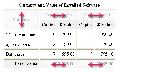
Figure 8-42.
Visualization of table with spanned rows and columns.
Coding the Table Structure
The following code begins the table description with a caption followed by the coding for the first row of the table. At this point, setting up the style sheet is not a consideration. Focus needs to be on the structure of the table and required column and row spanning.
<table><caption>Quantity and Value of Installed Software</caption><tr><td rowspan="2">Software</td><td colspan="2">Department A</td><td colspan="2">Department B</td></tr>Listing 8-36. Code for column header spanning.
Beginning at the top-left of the table in Figure 8-42, notice that the first cell spans two rows. Thus, this top-left cell is coded with rowspan="2" to combine it with the cell beneath to produce a single, combined cell. Furthermore, note that this cell contains no content, only the pair of <td></td> tags. By leaving the cell empty, cell borders are not displayed.
Moving from left to right across this first row, notice that the next cell, containing Department A, is not a single cell. It spans two horizontal cells. Therefore, the <td> tag contains colspan="2" to combine this cell with the one in the next column.
Moving to the right, you come to the cell containing the heading Department B. Again, this is not a single cell, but a spanned cell that crosses two columns. This <td> tag, like the previous one, contains the colspan="2" attribute.
You have now reached the end of the first row of the table. It is important to realize that, although you have coded only three cell descriptions, you have accounted for a total of five cells: the total number of columns in the full table. Always keep in mind this fact that you must describe as many rows and as many columns as there are in the full dimensions of the table.
Continuing with the coding for the second row of the table, this row contains the Copies and $ Value subheadings for their respective columns.
<tr><td>Copies</td><td>$ Value</td><td>Copies</td><td>$ Value</td></tr>Listing 8-37. Code for second row of table.

Again, begin at the left of the table and move to the right across the row. The first thing to notice is that the first cell in this row does not need to be coded. It has already been accounted for by the row spanning that took place for the cell above. Now move to the right to the next cell along the row. The next four cells are, in fact, regular non-spanned cells that are each described by a <td> tag. You come to the end of the second row having coded four cells, but still accounting for a total of five columns.
Coding for the third through fifth row of the table is added below.
<tr><td>Word Processors</td><td>10</td><td>700.00</td><td>15</td><td>1,050.00</td></tr><tr><td>Word Processors</td><td>12</td><td>780.00</td><td>18</td><td>1,170.00</td></tr><tr><td>Word Processors</td><td>7</td><td>595.00</td><td>9</td><td>765.00</td></tr>Listing 8-38. Code for third through fifth row of table.
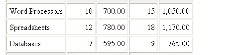
Here, there are five separate cells containing a row heading and the main information content of the table. There are no spanned cells which means that there are five <td> tags across the row. This same coding format can be followed for the next two rows of the table.
The final row of the table is a summary line presenting totals of the dollar amounts in the body of the table. This row is coded below.
<tr><td>Total Value</td><td colspan="2">$ 2,075.00</td><td colspan="2">$ 2,985.00</td></tr></table>Listing 8-39. Code for final row of table.

Again, trace across the row beginning with the first cell. This is a standard cell containing the text Total Value. Next, you come to a cell that is combined with the following cell and requiring the colspan="2" attribute. Finally, you encounter another cell that is combined with its following cell. You have coded three cell specification, but again have accounted for a total of five cells across the row.
Viewing the Table Structure
When the above coding is completed, the overall structure of the table and the cell contents are finished. This unstyled table is shown in Figure 8-43. Borders have been added to help visualize the cells. The issue at this point is whether you have correctly produced the table structure, ignoring for the moment any styling of the cells.
Quantity and Value of Installed Software Software Department A Department B Copies $ Value Copies $ Value Word Processors 10 700.00 15 1,050.00 Spreadsheets 12 780.00 18 1,170.00 Databases 7 595.00 9 765.00 Total Value $ 2,075.00 $ 2,985.00
Figure 8-43. Basic coding of table with spanned rows and columns.
Styling the Table
Now, it is a matter of adding a style sheet to decorate the table. In this example, shown in Listing 8-40, style classes are used to assign header, row, and footer styling. Class .HEAD is applied to the column headings, setting bold and centered text with a background color. Class .ROW formats each data row with right-aligned text, and class .LABEL overrides this row styling for the first cell in the row by aligning text labels to the left. Class .TOTAL formats the footer row with bold and right-aligned text with a background color.
<style type="text/css">table {border:outset 1px}table td {border:inset 1px; padding:5px}table caption {font:bold 12pt}.HEAD {font-weight:bold; text-align:center; vertical-align:middle;background-color:#F0F0F0}.ROW {text-align:right}.LABEL {text-align:left}.TOTAL {text-align:right; font-weight:bold;background-color:#F0F0F0}</style><table><caption>Quantity and Value of Installed Software</caption><trclass="HEAD"><td rowspan="2">Software</td><td colspan="2">Department A</td><td colspan="2">Department B</td></tr><trclass="HEAD"><td>Copies</td><td>$ Value</td><td>Copies</td><td>$ Value</td></tr><trclass="ROW"><tdclass="LABEL">Word Processors</td><td>10</td><td>700.00</td><td>15</td><td>1,050.00</td></tr><trclass="ROW"><tdclass="LABEL">Databases</td><td>7</td><td>595.00</td><td>9</td><td>765.00</td></tr><trclass="TOTAL"><td>Total Value</td><td colspan="2">$ 2,075.00</td><td colspan="2">$ 2,985.00</td></tr>Listing 8-40. Final code for table with style sheet attached.
What appeared to be a complex coding exercise turns out to be fairly easily managed by separating structure from styling. First, work systematically across the rows of the table, code all stand-alone cells and code cells that require spanning. Ignore cells that are encompassed by a previous span. Take a look at the row table, and make sure that its structure is correct. Finally, apply a style sheet to format those rows or cells that require styling.
TOP | NEXT: Table Groupings
8.8 - Table Groupings
Table Groupings
When working with large tables with varying cell sizes, alignments, and colors, you can bring a more orderly structure to the table by grouping rows. In this fashion, you can set structural and styling specifications for the groups, and have those features propagate automatically across the individual cells contained within the groups.
The table in Figure 8-44 makes use of the special table tags <thead>, <tbody>, and <tfoot> to classify and organize the rows of the table.
Sales Order Your Name
Your Address
City, ST 55555No. Description Quantity Price Amount Shipping 50.00 Sales Tax 155.77 Total $ 2,431.16 11111 Microsoft Windows XP Professional 2 169.99 339.98 22222 Microsoft Office XP Professional 2 449.99 999.98 33333 Adobe Photoshop 7.0 1 579.95 579.95 44444 HP PhotoSmart 7550 Printer 1 299.99 299.99 55555 USB Device Cable 1 5.49 5.49
Figure 8-44. Table with row groupings.
It is instructive to view the general layout of this table and its component parts in outline form. This view is produced below, and identifies the various grouped parts of the table as well as the major tags used to structure it.
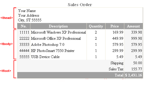
Figure 8-45.
Structural organization of a table.
There are three main structural parts to a table: the "table head," "table body," and "table foot," which are set apart within associated <thead>, <tbody>, and <tfoot> tags. The outline XHTML coding for these parts is shown below.
<table><caption>Sales Order</caption><thead>XHTML for table head</thead><tfoot>XHTML for table foot</tfoot><tbody>XHTML for table body</tbody></table>Listing 8-41. Code outline of head, body, and foot of a table.
When arranging the code for these sections, both the <thead> and <tfoot> tags must appear before the <tbody> tag.
The <thead> Tag - TOP
The <thead> section contains information that appears one time at the beginning of the table. It is coded very much like a normal set of headings. In this example, there are two rows comprising the heading. The first row contains name and address information that is placed in a single cell that spans the width of the table. The second row is a set of column headings.
<thead><tr><td colspan="5">Your Name<br/>Your Address<br/>City, ST 55555<br/></td></tr><tr><td>No.</td><td>Description</td><td>Quantity</td><td>Price</td><td>Amount</td></tr></thead>Listing 8-42. Code for
<thead>section of table.
The <tfoot> Tag - TOP
The table footer appears one time at the bottom of a table. It is identified with a <tfoot> tag. The present table contains three rows in the footer. All rows have a spanned label area and a single cell for data.
<tfoot><tr><td colspan="4">Shipping</td><td>50.00</td></tr><tr><td colspan="4">Sales Tax</td><td>155.77</td></tr><tr><td colspan="4">Total</td><td>$ 2,431.16</td></tr></tfoot>Listing 8-43. Code for
<tfoot>section of table.
The <tbody> Tag - TOP
The table body displays the main content of the table. It appears in the <tbody> section, and contains as many rows as there are data items to report. In the present table, data appear in five separate cells across the row.
<tbody><tr><td>11111</td><td>Microsoft Windows XP Professional</td><td>2</td><td>169.99</td><td>339.98</td></tr><tr><td>22222</td><td>Microsoft Office XP Professional</td><td>2</td><td>449.99</td><td>999.98</td></tr><tr><td>33333</td><td>Adobe Photoshop 7.0</td><td>1</td><td>579.95</td><td>579.95</td></tr><tr><td>44444</td><td>HP PhotoSmart 7550 Printer</td><td>1</td><td>299.99</td><td>299.99</td></tr><tr><td>55555</td><td>USB Device Cable</td><td>1</td><td>5.49</td><td>5.49</td></tr></tbody>Listing 8-44. Code for
<tbody>section of table.
After coding the three sections of the table, you might wish to view the output to make sure the table is properly structured before applying styles to it. Figure 8-46 shows the current structure of the example table with borders added to make the cells visible.
Sales Order Your Name
Your Address
City, ST 55555No. Description Quantity Price Amount Shipping 50.00 Sales Tax 155.77 Total $ 2,431.16 11111 Microsoft Windows XP Professional 2 169.99 339.98 22222 Microsoft Office XP Professional 2 449.99 999.98 33333 Adobe Photoshop 7.0 1 579.95 579.95 44444 HP PhotoSmart 7550 Printer 1 299.99 299.99 55555 USB Device Cable 1 5.49 5.49
Figure 8-46. Organization of unstyled table.
Applying Header Styles
Once the column groups and individual columns are styled, additional special styling may be needed for the <thead> section of a table. This is the case in the current table where the address lines (the cell in the row with id="ADDR") should be aligned left, and the column headings (the cells in the row with id="HEAD") should be centered, bold, and with background and text colors. This additional styling is added to the style sheet in Listing 8-48 and applied in Figure 8-49.
<style type="text/css">table {border:outset 1px; border-collapse:collapse}table caption {font:bold 14pt; color:#707070}table td {border:inset 1px; padding:3px}table tr#ADDR td {text-align:left; background-color:#FFFFFF}table tr#HEAD td {font-weight:bold; text-align:center;background-color:#A0A0A0; color:#FFFFFF}</style>Listing 8-48. Additional style sheet entries for
<thead>styling of example table.
Sales Order Your Name
Your Address
City, ST 55555No. Description Quantity Price Amount Shipping 50.00 Sales Tax 155.77 Total $ 2,431.16 11111 Microsoft Windows XP Professional 2 169.99 339.98 22222 Microsoft Office XP Professional 2 449.99 999.98 33333 Adobe Photoshop 7.0 1 579.95 579.95 44444 HP PhotoSmart 7550 Printer 1 299.99 299.99 55555 USB Device Cable 1 5.49 5.49
Figure 8-49. Table with
<thead>styling applied.
Applying Footer Styles
The table footer is styled in the same general fashion as the header. In this case, the "Shipping," "Sales Tax," and "Total" labels should be right aligned, and the total line should display in bold with background and text colors. These additions are made in Listing 8-49 and shown in Figure 8-50.
<style type="text/css">table {border:outset 1px; border-collapse:collapse}table caption {font:bold 14pt; color:#707070}table td {border:inset 1px; padding:3px}table tr#ADDR td {text-align:left; background-color:#FFFFFF}table tr#HEAD td {font-weight:bold; text-align:center;background-color:#A0A0A0; color:#FFFFFF}table tfoot td {text-align:right}table tfoot tr#TOTAL {font-weight:bold;background-color:#A0A0A0; color:#FFFFFF}</style>Listing 8-49. Additional style sheet entries for
<tfoot>styling of example table.
All cells in the footer section (table tfoot td) should be right aligned. The footer row identified by id="TOTAL" (table tfoot tr#TOTAL) should be bold with background and text colors. Again, if all rows and cells in the <tfoot> section are styled the same, then that styling can be applied through the single tfoot selector.
Sales Order Your Name
Your Address
City, ST 55555No. Description Quantity Price Amount Shipping 50.00 Sales Tax 155.77 Total $ 2,431.16 11111 Microsoft Windows XP Professional 2 169.99 339.98 22222 Microsoft Office XP Professional 2 449.99 999.98 33333 Adobe Photoshop 7.0 1 579.95 579.95 44444 HP PhotoSmart 7550 Printer 1 299.99 299.99 55555 USB Device Cable 1 5.49 5.49
Figure 8-50. Table with
<tfoot>styling applied.
Note that when you use table row groups, the <thead> and <tfoot> sections must be coded before the <tbody> section to pass W3C XHTML 1.1 validation.