11.3 - Choosing Colors
Page Colors
Colors draw attention to a Web page. They focus interest on page elements and help to highlight important information. Colors can also be distractive. Improperly used they can draw attention to themselves and away from central page content. One of the most important choices you make as a page designer, then, is a color scheme to complement or enhance information appearing on a Web page.
Color Wheel - TOP
A color wheel is a chart that shows how colors are related to make it easier to choose harmonious color combinations that attract attention to page content. The color wheel is divided into three categories of colors.
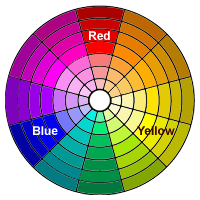 Figure 11-9. Color wheel.
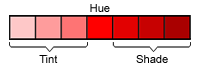 Figure 11-10. Tints and shades.
The primary colors are red, yellow, and blue. These are the foundation colors from which all other colors derive. They are called primary colors because no other colors can be mixed to create these colors. They are evenly spaced around the color wheel.
Secondary colors are produced by combining any two of the primary colors. The three secondary colors are orange (red + yellow), green (yellow + blue), and violet (red + blue).
Tertiary colors are produced by mixing a primary color and an adjacent secondary color. The six tertiary colors are red-orange, red-violet, yellow-green, yellow-orange, blue-green, and blue-violet.
The purest value of a color is its hue. A color's tint is a lighter value of the hue made by adding white; a color's shade is a darker value of the hue made by adding black.
Color Selection - TOP
When choosing colors for a website, it is best to select only a few colors. You do not want to overpower and detract from the information contained on the page; you want to complement or emphasize it. Generally, you will pick a dominant color along with other colors that are analogous to it or that contrast with it. There are standard color-matching schemes that can be followed in picking these colors. Additionally, tools like Coolors, allow you to quickly generate color palettes using integrated color theory.
Other useful color scheme tools include
Monochromatic
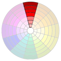
Figure 11-11. Monocromatic colors.
A monochromatic color scheme uses a single hue with various tints and shades for contrast. Normally you will pick darker colors for text presentation and lighter colors for backgrounds. The various tints and shadings range from bold to subtle, and you need to choose the combination that works well for the message you are trying to get across and the mood you are trying to set.
Monochromatic Table Colors
Section Hue Hex Value RGB Value Header Red (dark) #CC6666 204, 102, 102 Column Red (light) #FAC8C8 250, 200, 200 Background Red (light) #F6E1E1 246, 225, 225 Figure 11-12. Examples of monocromatic colors.
Analogous
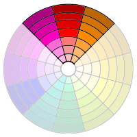
Figure 11-13. Analogous colors.
An analogous color scheme uses adjacent hues and their tints and shadings. All of the colors share a common hue, for example, red-violet, red, and red-orange. The presentation and feeling is similar to a monochromatic scheme with a larger assortment of hues from which to choose.
Analogous Table Colors
Section Hue Hex Value RGB Value Header Red-Violet (dark) #C4028F 196, 2, 143 Column Red-Orange (light) #FFAD5B 255, 173, 91 Background Red (light) #FFCCCC 255, 204, 204 Figure 11-14. Examples of analogous colors.
Complementary
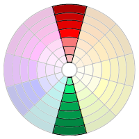
Figure 11-15. Complementary colors.
A complementary color scheme uses a hue on the opposite side of the color wheel from the dominant color. This color combination provides the greatest contrast and makes both colors more intense and brighter than when they are used alone.
Complementary Table Colors
Section Hue Hex Value RGB Value Header Red (dark) #C4028F 196, 2, 143 Column Green (dark) #02D0BF 2, 208, 191 Background Green (light) #D0F2E0 208, 242, 224 Figure 11-16. Examples of complementary colors.
Split-Complementary
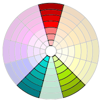
Figure 11-17. Split-complementary colors.
A split-complementary color scheme uses a hue along with two colors that are adjacent to its complement. For example, if the dominant color is red, then split-complementary hues are yellow-green and blue-green.
Split-Complementary Table Colors
Section Hue Hex Value RGB Value Header Red (light) #FF6666 255, 102, 102 Column Blue-Green (dark) #25EADA 37, 234, 218 Background Yellow-Green (light) #E6FBC6 230, 251, 198 Figure 11-18. Examples of split-complementary colors.
Triadic
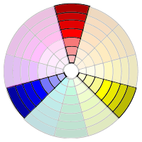
Figure 11-19. Triadic colors.
A triadic color scheme uses three hues that are evenly spaced from each other on the color wheel. For example, if the dominant color is red, then blue and yellow hues are the triadic complements. Like the complementary color scheme, this one also emphasizes the colors through their contrasts.
Triadic Table Colors
Section Hue Hex Value RGB Value Header Red (light) #FF7575 255, 117, 117 Column Blue (light) #7676FB 118, 118, 153 Background Yellow #FFFF99 255, 255, 153 Figure 11-20. Examples of triadic colors.
Achromatic
Although they do not appear in the color wheel, don't forget about black, white, and the range of gray tints that can be applied to highlight or emphasize page content. These achromatic tones can offer high contrast or subtle shading.
Achromatic Table Colors
Section Hue Hex Value RGB Value Header 50% Gray #818181 255, 117, 117 Column 25% Gray #C1C1C1 193, 193, 193 Background 5% Gray #F6F6F6 246, 256, 256 Figure 11-21. Examples of achromatic colors.
Selecting a Color Palette - TOP
A half-dozen or so colors is normally a good starting point for building a palette of analogous or complementary colors for a page color scheme. In some cases, you pick the colors based on preferences or existing standards.


 United States Grand Prix
Indianapolis - 2003
Figure 11-22. Selecting a triadic color scheme.
When working with photographs, a good starting point is to select colors based on those appearing in the picture. In the accompanying illustration, a palette of five colors, plus black and white, have been chosen from the picture. Various muted shades of red and blue—part of the triadic color scheme—produce the subtle contrast needed between text and background. The intent is to recede the text in order to bring the picture to attention. These colors were extracted from the photograph using the Photoshop eyedropper tool.
As a general rule, it is probably best to stay away from pure hues as is used in the second illustration. Pure colors tend to be garish, with high contrast that can confuse the eye as to the point of focus. In this case, the boldness of the text tends to draw attention away from the picture and towards the upper and lower portions of the illustration. If that is the look you are going for, then fine, although there are better ways to emphasize text without high-contrast colors.

 United States Grand Prix
Indianapolis - 2003
Figure 11-23. Selecting pure hues.
With 16 million or so colors to choose from, it can be difficult to pick the half-dozen you need for your pages. An effective way of choosing colors is with various types of color-wheel tools that are available. Tools like, Coolors, allow you to quickly generate color palettes using integrated color theory.