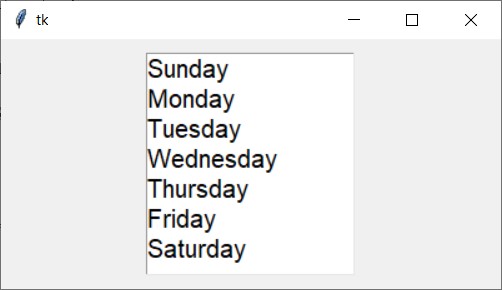
The ListBox widget is utilized for showcasing various items, all of which must adhere to the same font style and color. These items are expected to be of Text type. Users have the flexibility to select one or multiple items from the list based on their needs.
For example,
Output:
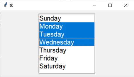
A ListBox widget enables users to select one or more items from a list. It offers various options to facilitate multiple selections. By setting the selectmode option to "multiple", users can select multiple items. Conversely, if selectmode is set to "single", only one item can be selected at a time.
The selectmode option of a Listbox widget can take on four values:
- single: Allows selection of a single line of text
- browse: The default option, permitting selection of one line of text
- multiple: Enables selection of multiple lines of text without the need for dragging from the first line to the last
- extended: Users can select and drag adjacent multiple lines of text
For example,
Output:
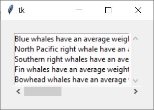
Additionally, vertical and horizontal scrollbars can be incorporated into the listbox widget.
Output: