Learning Objectives
- Understand the fundamentals of GUI (Graphical User Interface) design and its importance in software development.
- Demonstrate proficiency in using popular Python GUI frameworks such as Tkinter.
- Create interactive GUI applications using Python, incorporating features like buttons, labels, text fields, menus, and dialog boxes.
15-1. Overview
User Interface (UI) is the component of the computer system through which the user interacts.
Command Line Interface (CLI) presents a prompt where users input commands for execution. In CLI environments, programs dictate the sequence of events. Users are constrained to input data in the specific order requested by the program.
Graphical User Interface (GUI) facilitates user interaction with software via graphical elements displayed on the screen. In a GUI environment, events are driven by user actions. Users dictate the sequence of events by initiating actions. Users trigger events, and the program responds accordingly to those events.
15-2. tkinter Module for GUI programming
For many years, Tk/Tcl has been a fundamental component of Python, offering a dependable and cross-platform windowing toolkit accessible to Python developers through the tkinter package. Alongside tkinter, extensions like tkinter.tix and tkinter.ttk further enrich the toolkit's capabilities.
Tkinter serves as a streamlined object-oriented interface built upon Tcl/Tk. Utilizing tkinter eliminates the necessity of writing Tcl code for implementation. The tkinter package, also known as the "Tk interface," serves as the primary Python interface to the Tcl/Tk GUI toolkit. Both Tk and tkinter are widely accessible across Unix platforms, including macOS, and are also readily available on Windows systems.
Additionally, a widget is a graphical element within a GUI program that users can interact with or view.
| Widget | Description |
|---|---|
| Button | A clickable element that triggers an action when activated. |
| Canvas | A rectangular area where graphical content can be displayed and manipulated. |
| Checkbutton | A toggleable button representing binary options, either "on" or "off". |
| Entry | A single-line text input field for user keyboard input. |
| Frame | A container widget used to group and organize other widgets. |
| Label | A display area for text or images, typically presenting a single line of content. |
| Listbox | A widget presenting a list of selectable items to the user. |
| Menu | A dropdown list of options displayed upon clicking a Menubutton widget. |
| Menubutton | A button that reveals a menu of choices when clicked. |
| Message | A widget for displaying multi-line textual content. |
| Radiobutton | A selectable option often presented within groups where only one option can be chosen. |
| Scale | A slider widget allowing the user to select a value from a range. |
| Scrollbar | A widget providing scrolling functionality for other widgets. |
| Text | A multi-line text entry widget allowing for user input and display. |
| Toplevel | A container widget displayed in its own window, similar to a Frame but separate. |
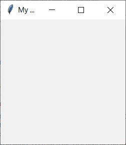
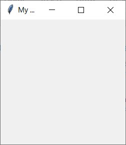
Create an empty window
This program creates an empty window.
Output:
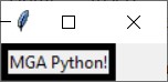
Label widget
Label is used to display an area for text or images, typically presenting a single line of content.
Example 1:
Output:
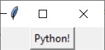
Example 2: pack
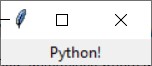
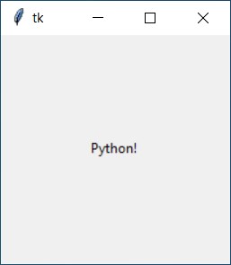
This example is to display ‘Python’ into the window. However, the text of ‘Python’ is not shown. So we should use pack to position and make it visible in the window.
Output:
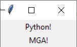
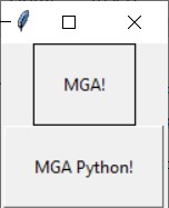
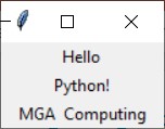
Example 3: multiple labels
This example shows multiple text in the window.
Output:
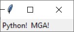
Example 4: side = ‘left’
This example shows the option side=’left’ to align the texts.
Output:
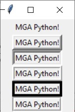
Example 5: borderwidth = 1
This example shows to add borders when creating a Label widget. You may utilize the borderwidth and relief parameters to exhibit a border surrounding the label. The borderwidth parameter determines the width of the border, measured in pixels, while the relief parameter specifies the style of the border.
Output:
Example 6: borderwidth = 5
Output:
Example 7: Relief Argument
There are a variety of values for relief arguments.
| Relief Argument | Description |
|---|---|
| relief='flat' | The border remains concealed, devoid of any 3D effects. |
| relief='raised' | The widget presents a raised 3D appearance. |
| relief='sunken' | The widget showcases a sunken 3D appearance. |
| relief='ridge' | The border surrounding the widget exhibits a raised 3D appearance. |
| relief='solid' | The border appears as a solid line, lacking any 3D effect. |
| relief='groove' | The border surrounding the widget manifests as a groove. |
For example,
Output:
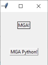
15-3. Padding
Padding refers to the space surrounding a widget. Internal padding is the space located around the inside edge of a widget, while external padding is the space surrounding the outside edge of a widget.
Internal padding
- For horizontal internal padding to a widget, provide the argument ipadx=n to the widget's pack
- For vertical internal padding, pass the argument ipady=n to the widget's pack
Output:
External padding
- For horizontal external padding to a widget, provide the argument padx=n to the widget's pack method.
- For vertical external padding, pass the argument pady=n to the widget's pack method.
Output:
15-4. Frame widget
A container designed to hold other widgets, offering utility in organizing and arranging groups of widgets within a window. The widgets to be contained are added to the frame widget, thus facilitating their organization and management within the frame.
For example,
In this example, label1 and label2 are included in TOP frame and label3 and label4 are included in BOTTOM frame.
Output:
15-5. Button widget
A widget is available for users to interact with, allowing them to initiate specific actions upon clicking. When designing a button, you have the option to define various attributes, including the text displayed on its face and a callback function. The callback function refers to a designated function or method that triggers when the user clicks the button, commonly referred to as an event handler.
For Example,
destroy() method is the callback function. This means that when the user clicks the button, the destroy() method is invoked, resulting in the program's termination.
Output:
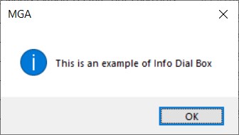
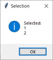
15-6. Info Dialog Box
An info dialog box is a graphical user interface element used to display information to the user. To create an info dialog box, you need to import the tkinter.messagebox module. Use the showinfo() function from this module, providing the title and message parameters. The title parameter sets the text displayed in the dialog box's title bar, while the message parameter contains the informational string displayed in the main part of the dialog box.
For Example,
Output:
15-7. Entry widget
An Entry widget is a rectangular area within a graphical user interface where users can input text. It serves as a means to collect user input in a GUI program. Typically, an Entry widget is accompanied by a button for submitting the entered data. The callback function attached to the button retrieves the data from the Entry widget(s) and performs necessary processing. To retrieve data from an Entry widget, the get() method is employed, which returns the entered text as a string.
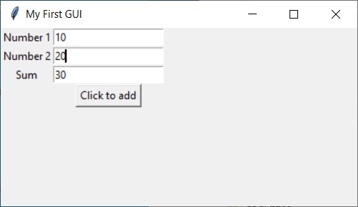
Example 1
This example demonstrates how to input two numbers, add them together, and display the result using an Entry widget.
Output:
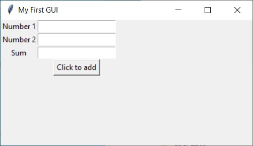
After entering two numbers, click Sum button.
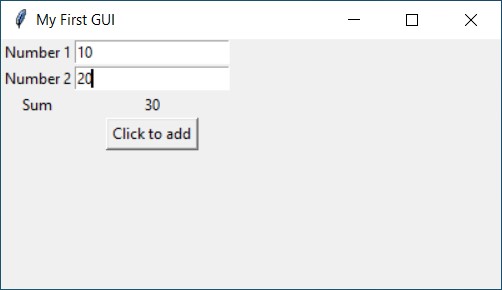
Example 2: StringVar
To display data, initiate a StringVar object and then establish a Label widget, linking it to the StringVar object. Following this, any data stored within the StringVar object will be promptly showcased in the Label widget.
Output:
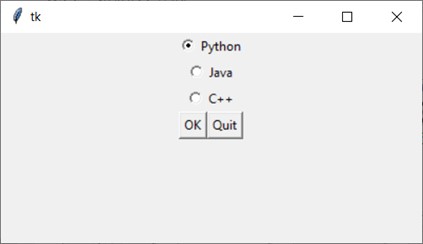
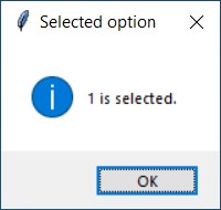
15-8. Radiobutton widget
Radiobutton widgets are generated using the Radiobutton class from the tkinter module. They operate as mutually exclusive options, meaning only one Radiobutton within a container can be selected at any particular moment.
The IntVar class is a component of the tkinter module that works in tandem with Radiobutton widgets. It facilitates the assignment of unique integers to each Radiobutton. When a Radiobutton is selected, its respective unique integer is stored within the IntVar object.
For example,
Output:
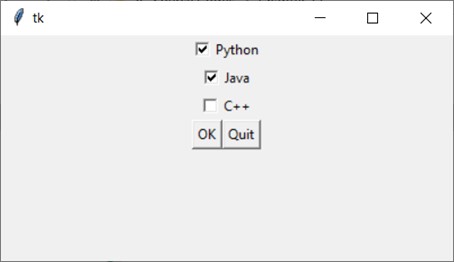
15-9. Checkbutton widget
A Checkbutton is comprised of a small box accompanied by a label positioned adjacent to it. The presence of a check mark signifies when it's selected. Users have the liberty to select any or all of the Checkbuttons displayed within a group. Unlike Radiobuttons, Checkbuttons are not mutually exclusive.
For example,
Output:
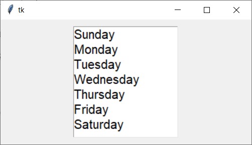
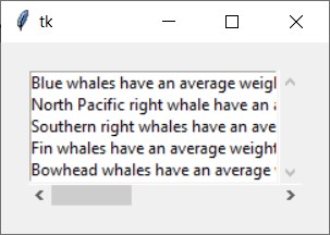
15-10. Listbox widget
The ListBox widget is utilized for showcasing various items, all of which must adhere to the same font style and color. These items are expected to be of Text type. Users have the flexibility to select one or multiple items from the list based on their needs.
For example,
Output:
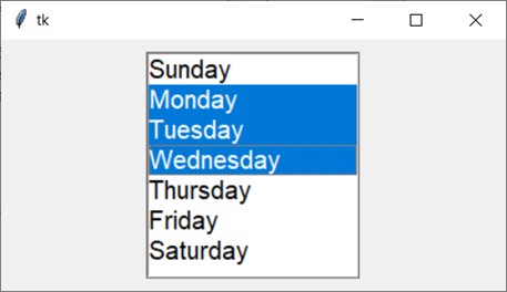
A ListBox widget enables users to select one or more items from a list. It offers various options to facilitate multiple selections. By setting the selectmode option to "multiple", users can select multiple items. Conversely, if selectmode is set to "single", only one item can be selected at a time.
The selectmode option of a Listbox widget can take on four values:
- single: Allows selection of a single line of text
- browse: The default option, permitting selection of one line of text
- multiple: Enables selection of multiple lines of text without the need for dragging from the first line to the last
- extended: Users can select and drag adjacent multiple lines of text
For example,
Output:
Additionally, vertical and horizontal scrollbars can be incorporated into the listbox widget.
Output:
15-11. Canvas widget
The Canvas widget serves as a blank rectangular space where you can create basic 2D shapes. Utilizing the Canvas widget's screen coordinate system, you specify the positioning of your graphics. The coordinates commence with the pixel at the upper-left corner of the screen represented as (0, 0), with X coordinates progressing from left to right and Y coordinates advancing from top to bottom.
The Canvas widget offers a variety of methods for drawing graphical shapes directly onto its surface. Some of the methods we will cover include:
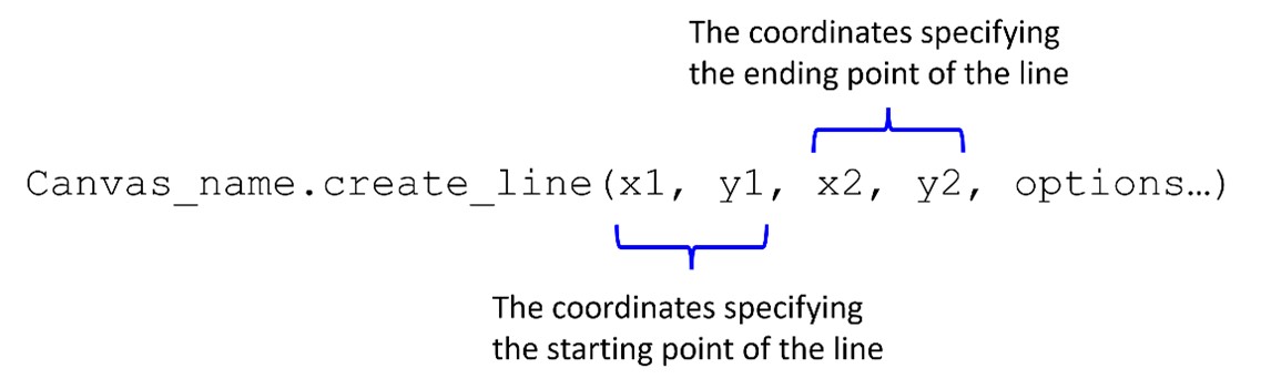
create_line
Output:
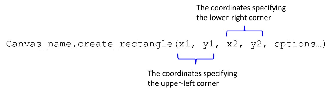
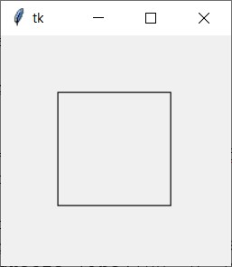
create_rectangle
Output:
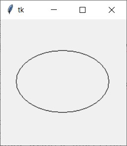
create_oval
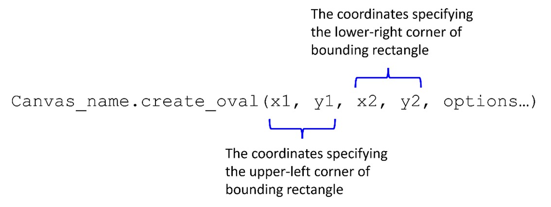
Output:
create_arc
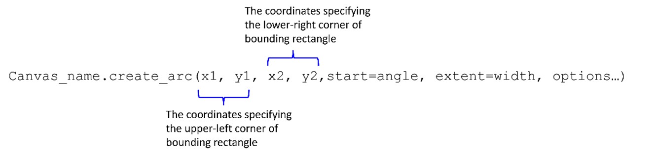
Output:
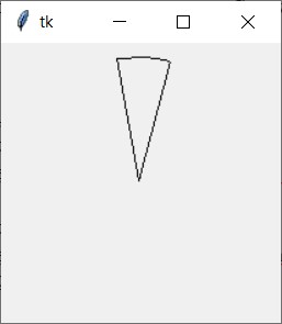
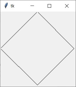
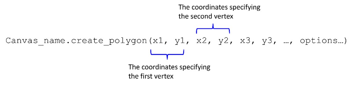
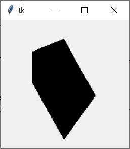
create_polygon
Output:
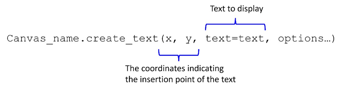
create_text
Output:
Summary
- The chapter then explores the foundational aspects of Tkinter, which serves as the default GUI toolkit bundled with Python.
- Utilizing tkinter.Tk() instantiates a blank window within the application.
- Label serves as designated areas for displaying text or images, typically containing a single line of content.
- The pack method is employed to both position and render widgets visible within the window.
- Various options of the pack method, such as side='left' and borderwidth, are utilized for alignment purposes.
- A multitude of values can be assigned to the relief argument to adjust the appearance of widgets.
- Padding refers to the space surrounding a widget, with internal padding located around the widget's inside edge, and external padding surrounding its outside edge.
- A frame widget functions as a container for other widgets, aiding in the organization and arrangement of widget groups within a window.
- Button widgets provide users with interactive elements to trigger specific actions upon clicking.
- Information dialog boxes are GUI components used for presenting information to users.
- Entry widgets are rectangular areas within GUIs where users can input text.
- Radiobutton widgets are instantiated using the Radiobutton class from the tkinter
- Checkbuttons consist of a small box accompanied by a label, indicating selection when marked.
- ListBox widgets are employed for displaying various items, all conforming to the same font style and color.
- The Canvas widget acts as a blank rectangular space within which basic 2D shapes can be created.
Programming Exercises
Exercise 1: Simple Calculator
Create a basic calculator GUI application with buttons for numbers (0-9), arithmetic operations (+, -, *, /), and a display area to show the result of calculations. Implement functionality to perform basic arithmetic operations when buttons are clicked.
Exercise 2: To-Do List Application
Develop a to-do list GUI application where users can add, edit, and remove tasks. Include input fields for adding tasks, a listbox or a scrollable text area to display tasks, and buttons to add, edit, and delete tasks.
Exercise 3: Temperature Converter
Build a temperature converter GUI application that allows users to convert between Celsius and Fahrenheit. Include entry fields for inputting temperatures, radio buttons to select the input and output units (Celsius or Fahrenheit), and a button to perform the conversion.
Exercise 4: Image Viewer
Create an image viewer GUI application that allows users to browse and display images from their computer. Include buttons for navigating between images (previous and next), a display area to show the selected image, and functionality to load images from the file system.
Exercise 5: Tic-Tac-Toe Game
Develop a GUI-based tic-tac-toe game where two players can take turns placing their marks (X or O) on a 3x3 grid. Implement logic to determine the winner or declare a draw, and include a reset button to start a new game.
Exercise 6: Currency Converter
Design a currency converter GUI application that enables users to convert between different currencies. Utilize dropdown menus to select the input and output currencies, input fields for entering the amount to convert, and a button to perform the conversion using real-time exchange rates.
Exercise 7: Password Generator
Create a password generator GUI application that generates random passwords based on user-defined criteria such as length and character types (uppercase, lowercase, digits, symbols). Include options to customize the password format and a button to generate a new password.