For many years, Tk/Tcl has been a fundamental component of Python, offering a dependable and cross-platform windowing toolkit accessible to Python developers through the tkinter package. Alongside tkinter, extensions like tkinter.tix and tkinter.ttk further enrich the toolkit's capabilities.
Tkinter serves as a streamlined object-oriented interface built upon Tcl/Tk. Utilizing tkinter eliminates the necessity of writing Tcl code for implementation. The tkinter package, also known as the "Tk interface," serves as the primary Python interface to the Tcl/Tk GUI toolkit. Both Tk and tkinter are widely accessible across Unix platforms, including macOS, and are also readily available on Windows systems.
Additionally, a widget is a graphical element within a GUI program that users can interact with or view.
| Widget | Description |
|---|---|
| Button | A clickable element that triggers an action when activated. |
| Canvas | A rectangular area where graphical content can be displayed and manipulated. |
| Checkbutton | A toggleable button representing binary options, either "on" or "off". |
| Entry | A single-line text input field for user keyboard input. |
| Frame | A container widget used to group and organize other widgets. |
| Label | A display area for text or images, typically presenting a single line of content. |
| Listbox | A widget presenting a list of selectable items to the user. |
| Menu | A dropdown list of options displayed upon clicking a Menubutton widget. |
| Menubutton | A button that reveals a menu of choices when clicked. |
| Message | A widget for displaying multi-line textual content. |
| Radiobutton | A selectable option often presented within groups where only one option can be chosen. |
| Scale | A slider widget allowing the user to select a value from a range. |
| Scrollbar | A widget providing scrolling functionality for other widgets. |
| Text | A multi-line text entry widget allowing for user input and display. |
| Toplevel | A container widget displayed in its own window, similar to a Frame but separate. |
Create an empty window
This program creates an empty window.
Output:
Label widget
Label is used to display an area for text or images, typically presenting a single line of content.
Example 1:
Output:
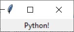
Example 2: pack
This example is to display ‘Python’ into the window. However, the text of ‘Python’ is not shown. So we should use pack to position and make it visible in the window.
Output:
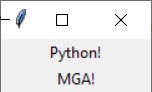
Example 3: multiple labels
This example shows multiple text in the window.
Output:
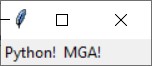
Example 4: side = ‘left’
This example shows the option side=’left’ to align the texts.
Output:
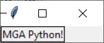
Example 5: borderwidth = 1
This example shows to add borders when creating a Label widget. You may utilize the borderwidth and relief parameters to exhibit a border surrounding the label. The borderwidth parameter determines the width of the border, measured in pixels, while the relief parameter specifies the style of the border.
Output:
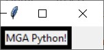
Example 6: borderwidth = 5
Output:
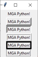
Example 7: Relief Argument
There are a variety of values for relief arguments.
| Relief Argument | Description |
|---|---|
| relief='flat' | The border remains concealed, devoid of any 3D effects. |
| relief='raised' | The widget presents a raised 3D appearance. |
| relief='sunken' | The widget showcases a sunken 3D appearance. |
| relief='ridge' | The border surrounding the widget exhibits a raised 3D appearance. |
| relief='solid' | The border appears as a solid line, lacking any 3D effect. |
| relief='groove' | The border surrounding the widget manifests as a groove. |
For example,
Output: